Free with trial Oil gas refinery or petrochemical plant. Include arrow, graph or bar chart. Decrease trend or low of production, market price, demand, supply. Concept of business, industry, fuel, power energy. Bar chart decrease illustrations Oil gas refinery or petrochemical plant with concept of business. Oil gas refinery or petrochemical plant. Include arrow, graph or bar chart. Decrease trend or low of production, market price, demand, supply. Concept of business, industry, fuel, power energy
Free with trial Chess king symbolizing leadership beside a declining bar graph for strategy, business performance. Ideal for growth analysis, planning, decision-making, leadership vision, competition, management. Bar chart decrease illustrations Strategic planning concept with chess king and declining bar chart for business analysis insights. Chess king symbolizing leadership beside a declining bar graph for strategy, business performance. Ideal for growth analysis, planning, decision-making, leadership vision, competition, management
Free with trial Tablet displaying a downward trending bar chart and arrow icon. Bar chart decrease vectors Tablet displaying a downward trending bar chart and arrow icon
Free with trial A visually striking image capturing a bar chart, line graph, and pie chart meticulously drawn in the wet sand on a beach. The artwork is illuminated by the warm, golden light of a sunset, with gentle waves lapping at the shore. This represents concepts of financial growth, market analysis, and business success in a unique, natural setting. The image evokes themes of planning, progress, and the cyclical nature of markets. Bar chart decrease illustrations Financial Growth Chart and Pie Chart Drawn in Sand at Sunset. A visually striking image capturing a bar chart, line graph, and pie chart meticulously drawn in the wet sand on a beach. The artwork is illuminated by the warm, golden light of a sunset, with gentle waves lapping at the shore. This represents concepts of financial growth, market analysis, and business success in a unique, natural setting. The image evokes themes of planning, progress, and the cyclical nature of markets.
Free with trial A graphic illustration featuring two distinct charts on a white background. The upper chart displays three descending lines in black, red, and green, each ending with a downward-pointing arrow. Below this, a bar chart shows three black bars of increasing height, with arrows pointing upwards from the tallest bars. A stylized black graphic element resembling diverging paths or a funnel is positioned. Bar chart decrease vectors Downward and upward trending graphs with arrows chart. A graphic illustration featuring two distinct charts on a white background. The upper chart displays three descending lines in black, red, and green, each ending with a downward-pointing arrow. Below this, a bar chart shows three black bars of increasing height, with arrows pointing upwards from the tallest bars. A stylized black graphic element resembling diverging paths or a funnel is positioned
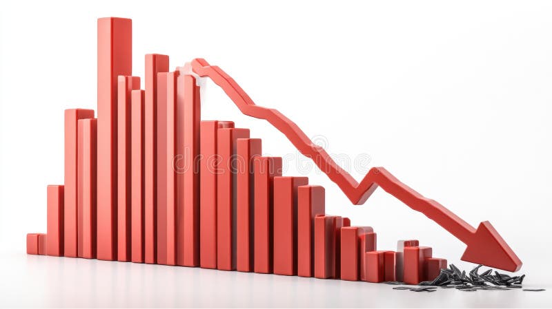
Free with trial A 3D rendering of a bar graph depicting a sharp decline in values. The red bars decrease in size, culminating in a large downward red arrow, symbolizing a significant economic downturn or market crash. The broken pieces at the bottom represent the loss or damage incurred. Bar chart decrease illustrations Red Bar Graph Showing Decline. A 3D rendering of a bar graph depicting a sharp decline in values. The red bars decrease in size, culminating in a large downward red arrow, symbolizing a significant economic downturn or market crash. The broken pieces at the bottom represent the loss or damage incurred.
Free with trial Red bar graph on a dark background depicts a downward trend, highlighted by a descending arrow. Accompanied by bold text reading "ECONOMIC CRISIS" at the bottom. The bars decrease in height from left to right, illustrating a decline, with strong visual emphasis through the use of a vibrant red against a muted backdrop. The style is straightforward and impactful, conveying a sense of financial downturn or economic challenges. Bar chart decrease illustrations Economic Crisis Chart with Declining Bar Graph and Arrow. Red bar graph on a dark background depicts a downward trend, highlighted by a descending arrow. Accompanied by bold text reading "ECONOMIC CRISIS" at the bottom. The bars decrease in height from left to right, illustrating a decline, with strong visual emphasis through the use of a vibrant red against a muted backdrop. The style is straightforward and impactful, conveying a sense of financial downturn or economic challenges.
Free with trial Simple lineart icon of an eye looking at a bar chart, representing market analysis. Bar chart decrease vectors Human eye monitoring business bar chart icon. Simple lineart icon of an eye looking at a bar chart, representing market analysis
Free with trial This 3D bar graph, generated by AI, visually represents a sharp market decline. The red bars show a dramatic decrease in value, culminating in a broken arrow symbolizing a complete market crash. The image powerfully illustrates economic downturn. Bar chart decrease illustrations Declining Bar Graph: Market Crash. This 3D bar graph, generated by AI, visually represents a sharp market decline. The red bars show a dramatic decrease in value, culminating in a broken arrow symbolizing a complete market crash. The image powerfully illustrates economic downturn.
Free with trial This vibrant illustration depicts financial growth, showcasing a dramatic upward trend after an initial decline. The 3D bar chart and upward arrow, generated by AI, symbolize overcoming challenges and achieving significant financial success. The gold coin further emphasizes the positive outcome. Bar chart decrease illustrations AI-Generated Financial Growth Chart. This vibrant illustration depicts financial growth, showcasing a dramatic upward trend after an initial decline. The 3D bar chart and upward arrow, generated by AI, symbolize overcoming challenges and achieving significant financial success. The gold coin further emphasizes the positive outcome.
Free with trial A candlestick chart showing a significant downward trend. The chart features black candlesticks indicating price fluctuations over time, with red, green, and orange lines tracing different moving averages. A bar graph at the bottom provides additional data. This image can be used to represent financial loss, market downturns, or economic recession. Bar chart decrease illustrations Downward Trend Candlestick Chart. A candlestick chart showing a significant downward trend. The chart features black candlesticks indicating price fluctuations over time, with red, green, and orange lines tracing different moving averages. A bar graph at the bottom provides additional data. This image can be used to represent financial loss, market downturns, or economic recession.
Free with trial Chart showcasing progress. The last bar stands out as a green arrow, symbolising positive growth. Accompanied by cash, it's a powerful representation of financial success. Bar chart decrease vectors Financial Growth Chart with Positive Momentum. Chart showcasing progress. The last bar stands out as a green arrow, symbolising positive growth. Accompanied by cash, it's a powerful representation of financial success...
Free with trial An isometric illustration depicting a blue bar chart showing growth, with a red arrow forming a slide that goes downwards, symbolizing a business decline or setback. Bar chart decrease illustrations Business growth chart with a downward slide. An isometric illustration depicting a blue bar chart showing growth, with a red arrow forming a slide that goes downwards, symbolizing a business decline or setback
Free with trial Red bar chart with a gray arrow pointing down representing financial loss. Bar chart decrease vectors Red chart arrow pointing down representing financial loss. Red bar chart with a gray arrow pointing down representing financial loss
Free with trial A group of the red bar and the line graph shows feelings that fall down, lower, losing, downward, and bear stock market. Background for the economy and data analysis. Bar chart decrease vectors Red Bar Chart and Graph downtrend abstract background. A group of the red bar and the line graph shows feelings that fall down, lower, losing, downward, and bear stock market. Background for the economy and data analysis
Free with trial Vibrant bar graph illustrates business growth and decline with upward and downward trending lines. Perfect for presentations or reports. Bar chart decrease illustrations Colorful Bar Graph Chart Showing Growth and Decline. Vibrant bar graph illustrates business growth and decline with upward and downward trending lines. Perfect for presentations or reports
Free with trial Glowing orange chart illustrating a downward trend, with bar graph and line graph, set against a dark blue backdrop. Bar chart decrease illustrations Glowing Downward Trend Chart on Dark Blue Background. Glowing orange chart illustrating a downward trend, with bar graph and line graph, set against a dark blue backdrop
Free with trial A series of black bar graphs are shown with downward-pointing arrows. Some arrows are green, indicating a slight decline, while others are red, signifying a more significant drop. The visual represents financial or data trends of decrease. Bar chart decrease illustrations Bar Graphs with Downward Arrows in Green and Red downward trend. A series of black bar graphs are shown with downward-pointing arrows. Some arrows are green, indicating a slight decline, while others are red, signifying a more significant drop. The visual represents financial or data trends of decrease
Free with trial 3D colorful bar chart, pie chart, rising arrow, dollar sign, and stacks of coins illustrate financial growth and success. Perfect for business, finance, and investment presentations. Bar chart decrease illustrations Financial Growth Chart with Dollar Sign and Coin Stacks. 3D colorful bar chart, pie chart, rising arrow, dollar sign, and stacks of coins illustrate financial growth and success. Perfect for business, finance, and investment presentations.
Free with trial Bar chart showing declining performance and negative trend. Bar chart decrease vectors Bar chart showing declining performance and negative trend
Free with trial This 3D rendered bar graph, generated by AI, visually represents a downward trend. The red bars progressively decrease in height, illustrating a clear decline. Perfect for illustrating concepts related to loss, decrease, or decline in presentations and reports. Bar chart decrease illustrations Declining Bar Graph. This 3D rendered bar graph, generated by AI, visually represents a downward trend. The red bars progressively decrease in height, illustrating a clear decline. Perfect for illustrating concepts related to loss, decrease, or decline in presentations and reports.
Free with trial Description: A 3D rendering of a businessman figure presenting a bar chart showing upward growth trend on a whiteboard. The chart illustrates business success and progress. Bar chart decrease illustrations Businessman Presenting Positive Growth Chart on Whiteboard. Description: A 3D rendering of a businessman figure presenting a bar chart showing upward growth trend on a whiteboard. The chart illustrates business success and progress.
Free with trial A vibrant red 3D bar chart on a white background shows a steady, dramatic decline, symbolizing financial loss, recession, or negative business results. Bar chart decrease illustrations Stark Red 3D Bar Graph Descending Sharply, Isolated on White. A vibrant red 3D bar chart on a white background shows a steady, dramatic decline, symbolizing financial loss, recession, or negative business results.
Free with trial Falling Bar Chart Graphic Indicating Downward Trend and Loss. Bar chart decrease vectors Falling Bar Chart Graphic Indicating Downward Trend and Loss
Free with trial Conceptual graphic of a productivity decline. A blue bar chart shows decreasing values with a downward arrow indicating failure, crisis, and poor business performance. Bar chart decrease illustrations Decreasing Productivity Bar Chart with Downward Trend Arrow. Conceptual graphic of a productivity decline. A blue bar chart shows decreasing values with a downward arrow indicating failure, crisis, and poor business performance
Free with trial This image shows a bar graph depicting a downward trend. A red arrow highlights the decrease in quarterly sales from Q1 to Q4, indicating negative growth and financial loss. Bar chart decrease illustrations Declining Bar Graph with Red Arrow Depicts Sales Performance. This image shows a bar graph depicting a downward trend. A red arrow highlights the decrease in quarterly sales from Q1 to Q4, indicating negative growth and financial loss.
Free with trial This image displays a dynamic business analytics dashboard featuring both bar and line graphs. The bar chart illustrates varying percentages (15%, 50%, 75%, 85%), suggesting performance metrics or growth stages. The line chart, with its intersecting blue lines and data points, represents trends, fluctuations, and comparisons over time or across different categories. The clean, modern design makes it ideal for financial reports, business presentations, and data visualization concepts. Bar chart decrease illustrations Business Growth and Performance Analysis with Bar and Line Charts. This image displays a dynamic business analytics dashboard featuring both bar and line graphs. The bar chart illustrates varying percentages (15%, 50%, 75%, 85%), suggesting performance metrics or growth stages. The line chart, with its intersecting blue lines and data points, represents trends, fluctuations, and comparisons over time or across different categories. The clean, modern design makes it ideal for financial reports, business presentations, and data visualization concepts.
Free with trial A 3D bar graph with a red line graph indicating a significant decrease, isolated on a clean white background. Bar chart decrease illustrations Bar graph showing downward trend isolated on white background. A 3D bar graph with a red line graph indicating a significant decrease, isolated on a clean white background
Free with trial Digita blue bar charts descend steadily across a digital grid, illustrating a decline in financial performance and market trends. Downward arrows emphasize loss, negative growth, and economic challenges, while smooth transitions and a tech-inspired layout enhance the visual impact of the data downturn. Bar chart decrease illustrations Digital blue bar chart with decreasing business concept. Digita blue bar charts descend steadily across a digital grid, illustrating a decline in financial performance and market trends. Downward arrows emphasize loss, negative growth, and economic challenges, while smooth transitions and a tech-inspired layout enhance the visual impact of the data downturn.
Free with trial Hand drawn bar chart illustration showing downward trend with arrow. Bar chart decrease vectors Hand drawn bar chart illustration showing downward trend with arrow
Free with trial Decreasing bar chart diagram with down arrow showing negative growth. Bar chart decrease vectors Decreasing bar chart diagram with down arrow showing negative growth
Free with trial Bar chart with upward trend, sad face, and analytics dashboard highlights challenges in progress or data performance. Ideal for financial difficulty, business risk, loss assessment, data analysis. Bar chart decrease vectors Rising Bar Graph with Sad Face Symbolizing Negative Growth or Challenges in Analytics. Bar chart with upward trend, sad face, and analytics dashboard highlights challenges in progress or data performance. Ideal for financial difficulty, business risk, loss assessment, data analysis
Free with trial A red arrow indicates a downward trend over a colorful bar graph, isolated on a clean white background. Bar chart decrease illustrations Red downward trend arrow over bar chart isolated on white background. A red arrow indicates a downward trend over a colorful bar graph, isolated on a clean white background
Free with trial This image showcases a vibrant infographic with 3D bar, pie, and line charts. The colorful elements are displayed on a teal platform, ideal for presentations or reports. Bar chart decrease illustrations Colorful 3D Bar Chart, Pie Chart, and Line Graph Infographic on Teal Platform. This image showcases a vibrant infographic with 3D bar, pie, and line charts. The colorful elements are displayed on a teal platform, ideal for presentations or reports.
Free with trial A 3D bar chart with a red arrow showing a downward trend. This image symbolizes economic decline, financial issues, and negative business performance. Bar chart decrease illustrations Red arrow showing downward trend on a 3D bar chart representing economic decline. A 3D bar chart with a red arrow showing a downward trend. This image symbolizes economic decline, financial issues, and negative business performance.
Free with trial Dollar coin next to declining bar graph and directional arrow illustrating financial downturn. Ideal for finance, economics, investment, stock market, loss, budget analysis, simple flat metaphor. Bar chart decrease illustrations Dollar Sign Coin and Declining Bar Chart with Arrow Indicating Financial Downward Trend. Dollar coin next to declining bar graph and directional arrow illustrating financial downturn. Ideal for finance, economics, investment, stock market, loss, budget analysis, simple flat metaphor
Free with trial A visual representation of data showing a decline over a period. The blue bars are arranged in descending order of height, each marked with numerical indicators, suggesting a decrease in value or quantity. Bar chart decrease illustrations Blue bar chart showing decreasing trend over time with numerical labels. A visual representation of data showing a decline over a period. The blue bars are arranged in descending order of height, each marked with numerical indicators, suggesting a decrease in value or quantity
Free with trial Simple bar chart graphic with rising and falling columns of varying heights. Bar chart decrease vectors Simple bar chart graphic with rising and falling columns of varying heights
Free with trial Falling bar chart with downward arrow signifying decline and negative trend. Bar chart decrease vectors Falling bar chart with downward arrow signifying decline and negative trend
Free with trial Teal bar chart illustration for data visualization and statistical analysis. Bar chart decrease vectors Teal bar chart illustration for data visualization and statistical analysis
Free with trial Decreasing Bar Chart with Downward Arrow Representing Declining Market Sales. Bar chart decrease vectors Decreasing Bar Chart with Downward Arrow Representing Declining Market Sales
Free with trial Hand drawn bar chart illustration showing data statistics and business growth. Bar chart decrease vectors Hand drawn bar chart illustration showing data statistics and business growth
Free with trial A 3D rendering features a bar graph with three vertical bars in blue and yellow. Above the graph, a molecular structure is depicted with a central yellow sphere connected to three blue spheres by white rods. The entire graphic is isolated on a clean white background. Bar chart decrease illustrations 3D bar graph with molecular structure above on a white background chart data. A 3D rendering features a bar graph with three vertical bars in blue and yellow. Above the graph, a molecular structure is depicted with a central yellow sphere connected to three blue spheres by white rods. The entire graphic is isolated on a clean white background
Free with trial Trend chart icons. Rising and falling bars. Arrow and bar graph. Economic data symbols. EPS 10. Bar chart decrease vectors Trend chart icons. Rising and falling bars. Arrow and bar graph. Economic data symbols.
Free with trial Pastel-colored bar chart and pie chart representing data and statistics, perfectly suitable for business presentations and reports. The 3D graphic is set against a plain white background, enhancing its visual appeal. Bar chart decrease illustrations Colorful 3D Bar and Pie Charts on White Cube Base: Business Data Visualization. Pastel-colored bar chart and pie chart representing data and statistics, perfectly suitable for business presentations and reports. The 3D graphic is set against a plain white background, enhancing its visual appeal.
Free with trial Signed document with a frown face and declining bar chart symbolizing failure, loss, rejection, or performance drop. Ideal for business, finance, loss, analysis, feedback strategy simple landing. Bar chart decrease vectors Document with Signature, Sad Face, and Bar Graph Highlighting Decline in Performance or Approval. Signed document with a frown face and declining bar chart. Signed document with a frown face and declining bar chart symbolizing failure, loss, rejection, or performance drop. Ideal for business, finance, loss, analysis, feedback strategy simple landing
Free with trial A 3D render illustrates a downward trending bar chart. Five light blue vertical bars of decreasing height are arranged from left to right. A bright yellow line with an arrow at its end descends across the bars, indicating a negative trend. The background is a solid, soft pink. Bar chart decrease illustrations Downward Trending Bar Chart with Yellow Arrow on a Pink Background graph data. A 3D render illustrates a downward trending bar chart. Five light blue vertical bars of decreasing height are arranged from left to right. A bright yellow line with an arrow at its end descends across the bars, indicating a negative trend. The background is a solid, soft pink
Free with trial Decreasing Bar Chart with Falling Arrow Illustrates Economic Downturn, Recession. Bar chart decrease vectors Decreasing Bar Chart with Falling Arrow Illustrates Economic Downturn, Recession
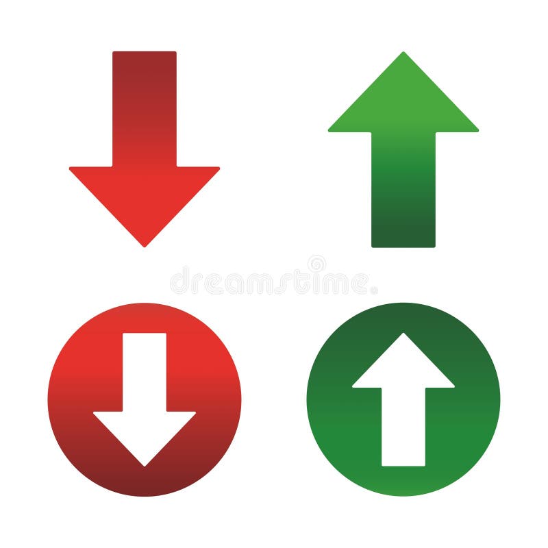
Free with trial Up and Down sign with green and red arrows set vector illustration. Set of a Concept of sales bar chart symbol icon with arrow moving down and sales bar chart with arrow moving up. Bar chart decrease vectors Up and Down sign with green and red arrows set vector illustration. Set of a Concept of sales bar chart symbol icon with arrows. Up and Down sign with green and red arrows set vector illustration. Set of a Concept of sales bar chart symbol icon with arrow moving down and sales bar chart with arrow moving up.
Free with trial Bar chart showing a steep downward trend and a descending arrow indicating decline. Bar chart decrease vectors Bar chart showing a steep downward trend and a descending arrow indicating decline
Free with trial Dark grey descending bar chart with arrow indicating decline on white background. Bar chart decrease illustrations Dark grey descending bar chart with arrow indicating decline on white background
Free with trial Descending Bar Chart and Downward Arrow Signifying Business Loss and Economic Downturn. Bar chart decrease vectors Descending Bar Chart and Downward Arrow Signifying Business Loss and Economic Downturn
Free with trial Hand drawn bar chart with declining arrow showing economic recession and financial loss. Bar chart decrease vectors Hand drawn bar chart with declining arrow showing economic recession and financial loss
Free with trial Close-up view of a computer monitor displaying a vibrant bar chart, indicating data analysis and progress tracking ,Generative ai. Bar chart decrease illustrations Computer monitor displaying a colorful bar chart for data analysis and progress tracking. Close-up view of a computer monitor displaying a vibrant bar chart, indicating data analysis and progress tracking ,Generative ai
Free with trial Red bar chart displays performance metrics on a table ,Generative ai. Bar chart decrease illustrations Red bar chart illustrating performance metrics on a table, data analysis and visualization. Red bar chart displays performance metrics on a table ,Generative ai
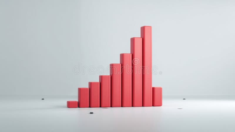
Free with trial A minimalist 3D render displays three rounded rectangular bars representing a bar graph. The tallest bar is a soft blue, followed by a medium green bar, and the shortest is a light pink bar. They are arranged in descending order of height and stand on a plain white background, suggesting data visualization or progress. Bar chart decrease illustrations Three colorful 3D bar graph elements in blue green and pink on a white background chart. A minimalist 3D render displays three rounded rectangular bars representing a bar graph. The tallest bar is a soft blue, followed by a medium green bar, and the shortest is a light pink bar. They are arranged in descending order of height and stand on a plain white background, suggesting data visualization or progress
Free with trial This image features a red stock market decline chart with a dark background. It represents a financial crisis concept with a descending bar graph, indicating a negative trend in the market. The use of red highlights the severity of the decline and signals a potential risk in the investment landscape. Bar chart decrease illustrations Red Stock Market Decline Chart with Dark Background representing Financial Crisis Concept. This image features a red stock market decline chart with a dark background. It represents a financial crisis concept with a descending bar graph, indicating a negative trend in the market. The use of red highlights the severity of the decline and signals a potential risk in the investment landscape
Free with trial Declining bar chart with arrow pointing down depicts business loss, failure, negative trends. Bar chart decrease vectors Declining bar chart with arrow pointing down depicts business loss, failure, negative trends
Free with trial This image depicts a stock market decline with a red bar chart against a dark background, illustrating a financial crisis concept. The chart shows a downward trend, indicating negative market performance. Bar chart decrease illustrations Red Stock Market Decline Chart Displaying Financial Crisis on Dark Background. This image depicts a stock market decline with a red bar chart against a dark background, illustrating a financial crisis concept. The chart shows a downward trend, indicating negative market performance
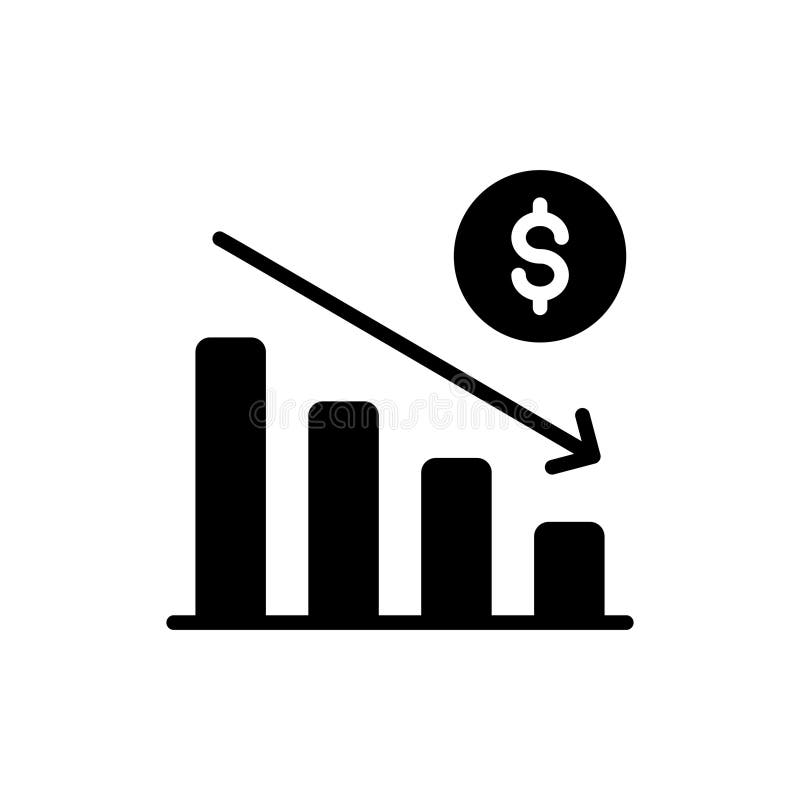
Free with trial Bar chart showing downward trend with dollar symbol. Bar chart decrease vectors Bar chart showing downward trend with dollar symbol
Free with trial Bar chart showing downward trend with dollar symbol. Bar chart decrease vectors Bar chart showing downward trend with dollar symbol
Free with trial Bar chart showing downward trend with dollar symbol. Bar chart decrease vectors Bar chart showing downward trend with dollar symbol
Free with trial Bar chart showing downward trend with dollar symbol. Bar chart decrease vectors Bar chart showing downward trend with dollar symbol
Free with trial Financial Business Decline Chart illustrates economic recession, market downturn, or corporate loss. Hand-drawn orange downward trend on a dark blue chalkboard with white bar graph offers ample copy space. Perfect for financial reports, business presentations, news articles, and advertising campaigns. Bar chart decrease illustrations Financial Business Decline Chart Hand Drawing Downward Trend on Blue Background Copy Space. Financial Business Decline Chart illustrates economic recession, market downturn, or corporate loss. Hand-drawn orange downward trend on a dark blue chalkboard with white bar graph offers ample copy space. Perfect for financial reports, business presentations, news articles, and advertising campaigns.
Free with trial Declining bar chart with a downward arrow icon representing financial loss, crisis, and failure. Bar chart decrease vectors Declining bar chart with a downward arrow icon representing financial loss, crisis, and failure
Free with trial A red stock market chart declines sharply against a blurred dark city background. This image illustrates a financial crisis and economic downturn, showing a dramatic fall in market values. Bar chart decrease illustrations Red stock market crash with bar chart and blurred city background depicting financial decline. A red stock market chart declines sharply against a blurred dark city background. This image illustrates a financial crisis and economic downturn, showing a dramatic fall in market values
Free with trial A 3D bar chart illustrating a declining trend, perfect for business, finance, and data visualization presentations. Bar chart decrease illustrations Colorful 3D bar graph showing a downward trend in business growth and financial data analysis. A 3D bar chart illustrating a declining trend, perfect for business, finance, and data visualization presentations