Free with trial This vector file contains business chart icons including rising bar graphs, falling graphs, and pie chart symbols illustrating data trends in a simple style professional and clear mood. Generative AI. Bar chart decrease vectors Business chart icons set with rising and falling graphs pie chart symbols vector illustration. This vector file contains business chart icons including rising bar graphs, falling graphs, and pie chart symbols illustrating data trends in a simple style professional and clear mood. Generative AI
Free with trial A set of black and white icons representing different types of business and financial charts including bar graphs line graphs and pie charts. Bar chart decrease vectors Collection of various business and financial chart icons including bar graphs line graphs and pie charts. A set of black and white icons representing different types of business and financial charts including bar graphs line graphs and pie charts
Free with trial A vivid red stock market bar chart decline is displayed against a dark background. This image conveys a financial crisis or market downturn concept. Bar chart decrease illustrations Red Financial Stock Market Crash with Bar Chart Decline in Dark Background Concept. A vivid red stock market bar chart decline is displayed against a dark background. This image conveys a financial crisis or market downturn concept
Free with trial A minimalist vertical bar graph on a gray background visually represents the alarming eighty percent decline in Arctic ice volume, with labeled x-axis stating '80% Decline' and y-axis titled 'Arctic Ice Volume', where bars decrease from bottom to top to illustrate dramatic reduction over time for environmental reports, scientific presentations, climate change articles, educational materials, and. Bar chart decrease illustrations Vertical bar graph showing an eighty percent decline in Arctic ice volume with minimalist design on gray background for climate. A minimalist vertical bar graph on a gray background visually represents the alarming eighty percent decline in Arctic ice volume, with labeled x-axis stating '80% Decline' and y-axis titled 'Arctic Ice Volume', where bars decrease from bottom to top to illustrate dramatic reduction over time for environmental reports, scientific presentations, climate change articles, educational materials, and
Free with trial Three-dimensional cubes arranged in a bar chart formation, representing data or progress. The cubes are colored blue, green, and pink, and are positioned in descending order of height from left to right. They are rendered with soft edges and cast subtle shadows on the white background. Bar chart decrease illustrations Three 3D Bar Chart Cubes in Ascending Order Keywords: bar chart, graph, data, statistics. Three-dimensional cubes arranged in a bar chart formation, representing data or progress. The cubes are colored blue, green, and pink, and are positioned in descending order of height from left to right. They are rendered with soft edges and cast subtle shadows on the white background
Free with trial A 3D representation of a bar chart shows a series of purple bars increasing in height from left to right. However, a yellow arrow curves downwards from the top of the chart, indicating a negative trend or decline. A single gold coin is positioned above the tallest bar, suggesting a connection to financial performance. The entire graphic is presented on a white background. Bar chart decrease illustrations 3D Bar Chart with Downward Trend Arrow and Gold Coin Keywords: business, finance, chart, graph, bar chart, data, statistics, trend. A 3D representation of a bar chart shows a series of purple bars increasing in height from left to right. However, a yellow arrow curves downwards from the top of the chart, indicating a negative trend or decline. A single gold coin is positioned above the tallest bar, suggesting a connection to financial performance. The entire graphic is presented on a white background
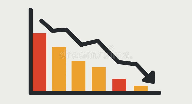
Free with trial This image depicts a bar chart with progressively shorter bars from left to right, indicating a downward trend. A large blue arrow points diagonally from the top left to the bottom right, emphasizing the decline. The visual is often used to represent a decrease in values, performance, or market trends. Bar chart decrease illustrations Graphic illustration showing a declining trend with a downward arrow. This image depicts a bar chart with progressively shorter bars from left to right, indicating a downward trend. A large blue arrow points diagonally from the top left to the bottom right, emphasizing the decline. The visual is often used to represent a decrease in values, performance, or market trends
Free with trial This image depicts a candlestick chart, a type of financial chart used to describe price movements of securities, derivatives, or currencies. The chart shows a series of green and red vertical bars, with each bar representing a specific time period. The green bars indicate a price increase, while the red bars indicate a price decrease. Each bar has a rectangular body and thin lines, or wicks,. Bar chart decrease illustrations Candlestick chart showing the rise and fall of stock prices over time. This image depicts a candlestick chart, a type of financial chart used to describe price movements of securities, derivatives, or currencies. The chart shows a series of green and red vertical bars, with each bar representing a specific time period. The green bars indicate a price increase, while the red bars indicate a price decrease. Each bar has a rectangular body and thin lines, or wicks,
Free with trial Black bar graph with decreasing heights indicating a downward trend on a white background. Bar chart decrease illustrations Black bar graph showing downward trend on white background chart statistics. Black bar graph with decreasing heights indicating a downward trend on a white background
Free with trial The image depicts a bar chart with a downward trend, illustrating a decrease in values or performance over time. An arrow points downward from the last bar to a green dollar sign, symbolizing a decline in financial metrics or economic performance. The visual emphasizes a negative trend in monetary terms or financial health. Bar chart decrease illustrations Graphic showing decline in value or performance with dollar symbol emphasis. The image depicts a bar chart with a downward trend, illustrating a decrease in values or performance over time. An arrow points downward from the last bar to a green dollar sign, symbolizing a decline in financial metrics or economic performance. The visual emphasizes a negative trend in monetary terms or financial health
Free with trial Black icon of a bar graph with a downward arrow on a computer monitor screen. Clear details and vibrant colors. Bar chart decrease illustrations Black icon of bar graph with downward arrow on a computer monitor chart data. Black icon of a bar graph with a downward arrow on a computer monitor screen. Clear details and vibrant colors
Free with trial The image shows a bar graph with a red line indicating a downward trend. The bars decrease in height from left to right, suggesting a significant decline in the measured data over time. Bar chart decrease illustrations A downward trend graph illustrating a significant decrease in data over time. The image shows a bar graph with a red line indicating a downward trend. The bars decrease in height from left to right, suggesting a significant decline in the measured data over time
Free with trial Falling Bar Chart Showing Decline with Downward Arrow, Financial Loss Indicator. Bar chart decrease vectors Falling Bar Chart Showing Decline with Downward Arrow, Financial Loss Indicator
Free with trial The image depicts a 3D bar chart with blue steps increasing in height, representing growth or progress. A red arrow curves upward on the left side, symbolizing an upward trend or improvement, while a red arrow curves downward on the right side, indicating a decline or negative trend. This visual contrast highlights the duality of progress and setbacks. Bar chart decrease illustrations Graphic showing contrasting upward and downward trends in a step-based chart. The image depicts a 3D bar chart with blue steps increasing in height, representing growth or progress. A red arrow curves upward on the left side, symbolizing an upward trend or improvement, while a red arrow curves downward on the right side, indicating a decline or negative trend. This visual contrast highlights the duality of progress and setbacks
Free with trial Black chart with stop sign, representing a stop in economic growth. Bar chart decrease vectors Stop growing bar chart icon, simple style. Black chart with stop sign, representing a stop in economic growth
Free with trial This vector illustration shows a financial chart with green bar graphs, arrows indicating downfalls, a dollar coin and money bag. It conveys a financial concept. Bar chart decrease vectors Financial Chart Showing Market Trends with Dollar Signs and Green Arrows. This vector illustration shows a financial chart with green bar graphs, arrows indicating downfalls, a dollar coin and money bag. It conveys a financial concept.
Free with trial 3D pie chart illustrating data segments with percentage values, alongside a bar graph in the background, showcasing financial or business data. Bar chart decrease illustrations 3D pie chart illustrating data segments with percentage values, alongside a bar graph in the background, showcasing financial or
Free with trial Red arrow declining on bar graph, business finance chart, downward trend, recession, financial data, blue background. Bar chart decrease illustrations Red arrow graph showing decline, business finance chart, downward trend, recession. Red arrow declining on bar graph, business finance chart, downward trend, recession, financial data, blue background
Free with trial A visual representation of a steep financial or performance decrease, indicated by a series of descending bars and directional arrows. Bar chart decrease illustrations 3D bar chart showing a significant decline from 100% to 10% with downward arrows. A visual representation of a steep financial or performance decrease, indicated by a series of descending bars and directional arrows
Free with trial A black bar graph showing a downward trend with an arrow pointing down. Clear details and vibrant colors enhan. Bar chart decrease illustrations Black bar graph with a downward trending arrow on white background chart decline. A black bar graph showing a downward trend with an arrow pointing down. Clear details and vibrant colors enhan
Free with trial Hand drawn bar chart illustration showing business decline with a downward red arrow. Bar chart decrease illustrations Hand drawn bar chart illustration showing business decline with a downward red arrow
Free with trial 3D render of green and red bar chart icons with upward and downward arrows symbolizing business growth and financial decline or loss. Bar chart decrease illustrations Green Growth and Red Decline Bar Chart Icons Representing Business Financial Trends. 3D render of green and red bar chart icons with upward and downward arrows symbolizing business growth and financial decline or loss
Free with trial A 3D bar graph with red bars of decreasing height from left to right, accompanied by a red arrow that trends downward, indicating a decline or decrease in the represented data over a certain period. Bar chart decrease illustrations A bar graph showing a decline in values over time with a red arrow trending downward. A 3D bar graph with red bars of decreasing height from left to right, accompanied by a red arrow that trends downward, indicating a decline or decrease in the represented data over a certain period
Free with trial Simple black icon of a declining bar chart with a downward arrow showing financial loss. Bar chart decrease vectors Simple black icon of a declining bar chart with a downward arrow showing financial loss
Free with trial The image shows a wooden easel holding a whiteboard with a declining trend chart. The chart features a combination of red vertical bars and a downward-sloping red line, indicating a decrease in values over time. The easel stands on a light gray surface, and the chart appears to be used for visual presentations or data analysis. Bar chart decrease illustrations Declining trend chart displayed on an easel with red bar and line graph elements. The image shows a wooden easel holding a whiteboard with a declining trend chart. The chart features a combination of red vertical bars and a downward-sloping red line, indicating a decrease in values over time. The easel stands on a light gray surface, and the chart appears to be used for visual presentations or data analysis
Free with trial A vibrant neon bar graph shows financial growth. The data visualization uses blue, green, and purple hues against a dark background. Modern and abstract design. Bar chart decrease illustrations Neon bar graph data visualization financial growth chart illustration generative ai. A vibrant neon bar graph shows financial growth. The data visualization uses blue, green, and purple hues against a dark background. Modern and abstract design
Free with trial A 3D rendering shows a bar graph of five columns in pink, blue, and yellow hues illustrating decrease or loss, set against a transparent background. Bar chart decrease vectors Colorful bar graph illustration presenting downward trend on transparent background. A 3D rendering shows a bar graph of five columns in pink, blue, and yellow hues illustrating decrease or loss, set against a transparent background.
Free with trial A bar graph depicting a significant decrease in value or performance, highlighted by a prominent red arrow pointing downwards, indicating a negative trend. Bar chart decrease illustrations Bar graph illustrating a downward trend with a red arrow isolated on white background. A bar graph depicting a significant decrease in value or performance, highlighted by a prominent red arrow pointing downwards, indicating a negative trend
Free with trial The image shows a bar graph with green bars decreasing in height from left to right. A red arrow is superimposed over the bars, pointing downward, indicating a decline in value or performance. Bar chart decrease illustrations A downward trending bar graph with a red arrow indicating a decrease in value. The image shows a bar graph with green bars decreasing in height from left to right. A red arrow is superimposed over the bars, pointing downward, indicating a decline in value or performance
Free with trial Close up of businessman hand touching a falling arrow and bar chart. Business Loss and Risk Management. Bar chart decrease illustrations Close up of businessman hand touching a falling arrow and bar chart. Business Loss and Risk Management
Free with trial A white bar graph icon with bars of different heights is displayed within a black circle, representing data and analytics. Bar chart decrease illustrations White bar graph icon with varying height bars inside a black circle chart statistics. A white bar graph icon with bars of different heights is displayed within a black circle, representing data and analytics
Free with trial A collection of minimalist vector icons representing gradient bar charts with upward and downward trends. The icons use red and blue colors to indicate increasing and decreasing trends. These icons are suitable for financial reports, business presentations, analytics dashboards, and data visualization projects. The clean design features smooth gradients and modern styles, perfect for professional. Bar chart decrease illustrations Gradient bar chart icon set with increasing and decreasing trends in red and blue colors. A collection of minimalist vector icons representing gradient bar. A collection of minimalist vector icons representing gradient bar charts with upward and downward trends. The icons use red and blue colors to indicate increasing and decreasing trends. These icons are suitable for financial reports, business presentations, analytics dashboards, and data visualization projects. The clean design features smooth gradients and modern styles, perfect for professional
Free with trial 3D bar and line chart showing stock market performance with percentage gains and candlestick patterns. Bar chart decrease vectors Financial stock market growth chart with percentage gains and candlestick indicators. 3D bar and line chart showing stock market performance with percentage gains and candlestick patterns
Free with trial The image depicts a 3D bar graph with red bars, showing a clear downward trend. The bars decrease in height from left to right, indicating a significant decline in the measured data. An arrow points downwards, emphasizing the negative trend. Bar chart decrease illustrations A downward trending graph illustrating a significant decrease in data points over time. The image depicts a 3D bar graph with red bars, showing a clear downward trend. The bars decrease in height from left to right, indicating a significant decline in the measured data. An arrow points downwards, emphasizing the negative trend
Free with trial Downward Trend Bar Chart Illustration Indicating Decline Or Loss In Business Performance. Bar chart decrease illustrations Downward Trend Bar Chart Illustration Indicating Decline Or Loss In Business Performance
Free with trial A black bar graph icon illustrating a downward trend with a down arrow on a white background. Bar chart decrease illustrations Black bar graph icon showing a downward trend with an arrow on white background chart. A black bar graph icon illustrating a downward trend with a down arrow on a white background
Free with trial A white bar graph icon with a metallic silver rim is presented within a black circle on a dark gray background. Bar chart decrease illustrations White bar graph icon with metallic rim inside a black circle on a dark background chart. A white bar graph icon with a metallic silver rim is presented within a black circle on a dark gray background
Free with trial Bar chart with decreasing arrow icon symbolizing recession downturn and business failure. Bar chart decrease vectors Bar chart with decreasing arrow icon symbolizing recession downturn and business failure
Free with trial This image depicts a bar chart transitioning from green to red bars, representing a shift from positive growth to decline. Overlaid green and red line graphs emphasize the upward trend followed by a downward trend, symbolizing financial success turning into loss, often seen in market analysis or business performance evaluations. Bar chart decrease vectors Graphic illustration of financial growth and subsequent decline using bar and line charts. This image depicts a bar chart transitioning from green to red bars, representing a shift from positive growth to decline. Overlaid green and red line graphs emphasize the upward trend followed by a downward trend, symbolizing financial success turning into loss, often seen in market analysis or business performance evaluations
Free with trial Colorful bar chart graph with long shadow in circular background represents data analytics. Bar chart decrease vectors Colorful bar chart graph with long shadow in circular background represents data analytics
Free with trial A hand displays a green bar graph illustrating a downward trend in CO2 levels, symbolizing environmental protection and carbon reduction. Bar chart decrease illustrations Hand holding a bar graph showing a decrease in CO2 emissions against a green leafy background. A hand displays a green bar graph illustrating a downward trend in CO2 levels, symbolizing environmental protection and carbon reduction
Free with trial A 3D render of a golden arrow curving upwards and to the right, positioned over a bar chart composed of alternating silver and gold vertical bars. The bars decrease in height from left to right, while the arrow signifies a strong upward trend. The background is white, emphasizing the financial concept. Bar chart decrease illustrations Golden arrow rising above silver and gold bar chart symbolizing financial growth and success. A 3D render of a golden arrow curving upwards and to the right, positioned over a bar chart composed of alternating silver and gold vertical bars. The bars decrease in height from left to right, while the arrow signifies a strong upward trend. The background is white, emphasizing the financial concept
Free with trial Pink bar chart report on wooden table displaying progress data analysis ,Generative ai. Bar chart decrease illustrations Pink bar chart report displaying progress data analysis on wooden table for business insights. Pink bar chart report on wooden table displaying progress data analysis ,Generative ai
Free with trial The image depicts a red bar graph on a transparent background with a downward trend, indicating a decrease in values. The graph features a series of red bars of varying heights, with a red arrow pointing downwards to emphasize the decline. Bar chart decrease illustrations A red bar graph showing a significant decline in values over time with a downward trend arrow. The image depicts a red bar graph on a transparent background with a downward trend, indicating a decrease in values. The graph features a series of red bars of varying heights, with a red arrow pointing downwards to emphasize the decline
Free with trial Cartoon bar graph on an easel with a red arrow indicating a downward trend. Clear details and vib. Bar chart decrease illustrations Cartoon Bar Graph Showing Downward Trend with Red Arrow chart bar chart. Cartoon bar graph on an easel with a red arrow indicating a downward trend. Clear details and vib
Free with trial Vector icon of a bar chart and graph showing a downward trend financial crisis and recession concept. Bar chart decrease vectors Vector icon of a bar chart and graph showing a downward trend financial crisis and recession concept
Free with trial Man points red arrow on bar chart for analysis professional highlights data trend with arrow on chart,Generative AI. Bar chart decrease illustrations Man points red arrow on bar chart for analysis professional highlights data trend with arrow on chart
Free with trial A digital illustration of a bar graph with yellow bars decreasing in height from left to right, overlaid with a jagged red line connecting the top of each bar and ending in a downward-pointing arrow, symbolizing a negative trend or loss. Bar chart decrease illustrations A downward trending bar chart showing a consistent decline in performance metrics over a period. A digital illustration of a bar graph with yellow bars decreasing in height from left to right, overlaid with a jagged red line connecting the top of each bar and ending in a downward-pointing arrow, symbolizing a negative trend or loss
Free with trial A digital illustration of a bar graph with yellow bars decreasing in height from left to right, overlaid with a jagged red line connecting the top of each bar and ending in a downward-pointing arrow, symbolizing a negative trend or loss. Bar chart decrease illustrations A downward trending bar chart showing a consistent decline in performance metrics over a period. A digital illustration of a bar graph with yellow bars decreasing in height from left to right, overlaid with a jagged red line connecting the top of each bar and ending in a downward-pointing arrow, symbolizing a negative trend or loss
Free with trial 3D rendered financial graph with percentage signs showing downward trend. Falling arrow, bar chart, economic crisis, losses, financial decline, market crash, budget deficit, investment. Bar chart decrease illustrations 3D rendered financial graph with percentage signs showing downward trend. Falling arrow, bar chart, economic crisis, losses
Free with trial The image depicts a bar graph with blue bars that increase in height initially, then gradually decrease, symbolizing growth followed by decline. An upward-pointing arrow overlays the graph, indicating an overall upward trend or potential future growth despite the current decline in the bars' heights. This visual is often used in business, finance, and analytics to illustrate performance trends. Bar chart decrease illustrations Growth trend represented by increasing and then decreasing blue bar graph with upward arrow. The image depicts a bar graph with blue bars that increase in height initially, then gradually decrease, symbolizing growth followed by decline. An upward-pointing arrow overlays the graph, indicating an overall upward trend or potential future growth despite the current decline in the bars' heights. This visual is often used in business, finance, and analytics to illustrate performance trends
Free with trial A 3D rendered red arrow points downward across a white grid background with blue bar graph elements. The bars decrease in height from left to right, indicating a downward trend. Bar chart decrease illustrations Red arrow graph chart showing decline on white grid background with blue bars downward trend. A 3D rendered red arrow points downward across a white grid background with blue bar graph elements. The bars decrease in height from left to right, indicating a downward trend
Free with trial This image shows a candlestick chart, which is a type of financial chart used to describe price movements of securities, derivatives, or currencies. Each candlestick typically shows one day's worth of price data, with green bars indicating an increase in price and red bars indicating a decrease. The chart provides a visual representation of the opening, closing, high, and low prices for each. Bar chart decrease illustrations A candlestick chart displaying stock market price movements over time with green and red bars. This image shows a candlestick chart, which is a type of financial chart used to describe price movements of securities, derivatives, or currencies. Each candlestick typically shows one day's worth of price data, with green bars indicating an increase in price and red bars indicating a decrease. The chart provides a visual representation of the opening, closing, high, and low prices for each
Free with trial A flat, high-contrast, black-and-white icon depicting a bar graph with a downward-pointing arrow. The bars represent a data set that is shrinking or declining over time, with the final arrow emphasizing a negative or losing trend in business or financial metrics. Bar chart decrease vectors A minimalist black and white icon showing a downward bar chart indicating a significant loss trend. A flat, high-contrast, black-and-white icon depicting a bar graph with a downward-pointing arrow. The bars represent a data set that is shrinking or declining over time, with the final arrow emphasizing a negative or losing trend in business or financial metrics
Free with trial Hand Drawn Bar Chart Line Graph with Downtrend Arrow Showcasing Loss and Negative Economic Growth. Bar chart decrease vectors Hand Drawn Bar Chart Line Graph with Downtrend Arrow Showcasing Loss and Negative Economic Growth
Free with trial The image shows a 3D bar graph with blue bars of varying heights. Two large red arrows cross over the graph: one pointing upward to the right, symbolizing growth or increase, and the other pointing downward to the right, symbolizing decline or decrease. This visual metaphor emphasizes conflicting trends or mixed signals in data. Bar chart decrease illustrations Contradictory growth and decline indicators represented by a bar graph with crossed arrows. The image shows a 3D bar graph with blue bars of varying heights. Two large red arrows cross over the graph: one pointing upward to the right, symbolizing growth or increase, and the other pointing downward to the right, symbolizing decline or decrease. This visual metaphor emphasizes conflicting trends or mixed signals in data
Free with trial This image features a series of black oil barrels in the foreground with the word oil clearly displayed on their ends, set against a dark background featuring a downward-trending bar chart and a sharp red arrow indicating a major decrease in value or production, symbolizing an economic crisis or market downturn in the petroleum energy sector. Bar chart decrease illustrations A visual representation of the significant decline in global oil prices and market demand trends. This image features a series of black oil barrels in the foreground with the word oil clearly displayed on their ends, set against a dark background featuring a downward-trending bar chart and a sharp red arrow indicating a major decrease in value or production, symbolizing an economic crisis or market downturn in the petroleum energy sector
Free with trial A person in a blue suit holds a red bar graph with white arrows pointing downwards over their open palm. A bright light emanates from beneath the graph. The background is a blurred gray texture. business, finance, graph. man in blue suit holding red downward trending bar graph with white arrows business finance chart. Bar chart decrease illustrations Man in blue suit holding red downward trending bar graph with white arrows business finance chart
Free with trial A visual representation of a stock market crash, showcasing a downward trend with a red line and bar graph, indicating financial loss and economic downturn. it is a risk analysis chart. Bar chart decrease illustrations Stock market crash graph, financial analysis, investment risk, economic downturn, recession chart, loss trend. a visual representation of a stock market crash, showcasing a downward trend with a red line and bar graph, indicating financial loss and economic downturn. it is a risk analysis chart.
Free with trial Illustration symbolizing economic decline with a descending bar graph and dollar sign. Bar chart decrease vectors Economic downturn concept with bar chart. Illustration symbolizing economic decline with a descending bar graph and dollar sign
Free with trial A set of twenty-two black chart icons, illustrating various graph types on a white background. The icons feature line graphs, bar graphs, and pie charts, each depicting trends such as growth, decline, and fluctuations. Magnifying glass icons are used to represent analysis. The charts convey concepts of data visualization, statistical analysis, and business metrics tracking. The minimalistic design is characterized by simple, clean lines and solid fill, suitable for use in reports, presentations, or digital interfaces. Bar chart decrease vectors Increase and decrease glyph solid icons collection. A set of twenty-two black chart icons, illustrating various graph types on a white background. The icons feature line graphs, bar graphs, and pie charts, each depicting trends such as growth, decline, and fluctuations. Magnifying glass icons are used to represent analysis. The charts convey concepts of data visualization, statistical analysis, and business metrics tracking. The minimalistic design is characterized by simple, clean lines and solid fill, suitable for use in reports, presentations, or digital interfaces.
Free with trial Visualize complex market trends and strategy using this metallic, AI-generated bar chart illustration. Perfect for financial reports, planning presentations, and investor materials that require a sophisticated, high-impact visual representation of business growth, decline, and future success. Bar chart decrease illustrations Conceptual 3D business bar chart illustrating market performance, showing initial decline followed by upward growth. Visualize complex market trends and strategy using this metallic, AI-generated bar chart illustration. Perfect for financial reports, planning presentations, and investor materials that require a sophisticated, high-impact visual representation of business growth, decline, and future success.
Free with trial Hand Drawn Pink Bar Chart Illustration Showing Rise and Fall of Data Trends with Arrows Symbolizing Up and Down Fluctuations. Bar chart decrease vectors Hand Drawn Pink Bar Chart Illustration Showing Rise and Fall of Data Trends with Arrows Symbolizing Up and Down Fluctuations
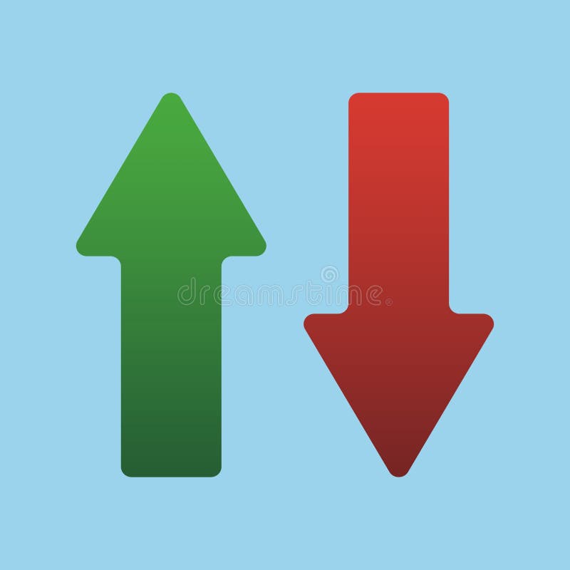
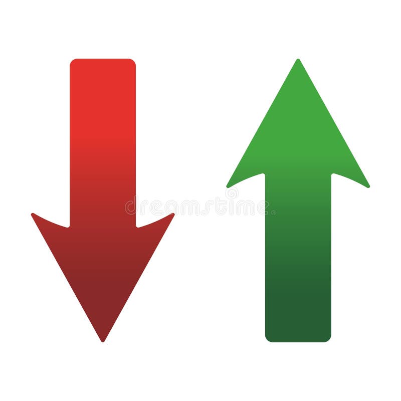
Free with trial Up and Down sign with green and red arrows isolated on a blue background vector illustration. Concept of sales bar chart symbol icon with arrow moving down and sales bar chart with arrow moving up. Bar chart decrease vectors Up and Down sign with green and red arrows vector illustration. Concept of sales bar chart symbol icon with arrows. Up and Down sign with green and red arrows isolated on a blue background vector illustration. Concept of sales bar chart symbol icon with arrow moving down and sales bar chart with arrow moving up.
Free with trial Up and Down sign with green and red arrows vector illustration. Concept of sales bar chart symbol icon with arrow moving down and sales bar chart with arrow moving up. Bar chart decrease vectors Up and Down sign with green and red arrows vector illustration. Concept of sales bar chart symbol icon with arrows. Up and Down sign with green and red arrows vector illustration. Concept of sales bar chart symbol icon with arrow moving down and sales bar chart with arrow moving up.
Free with trial Up and Down sign with green and red arrows vector illustration. Concept of sales bar chart symbol icon with arrow moving down and sales bar chart with arrow moving up. Bar chart decrease vectors Up and Down sign with green and red arrows vector illustration. Concept of sales bar chart symbol icon with arrows. Up and Down sign with green and red arrows vector illustration. Concept of sales bar chart symbol icon with arrow moving down and sales bar chart with arrow moving up.
Free with trial 3D rendering of a bar graph illustrating a downward trend with blue bars decreasing in height and a red line graph charting the decline set against a dark backdrop signifying business loss economic downturn and financial risk. Bar chart decrease illustrations 3D Bar Chart Showing Downward Trend with Red Line Graph Illustrating Business Loss and Economic Decline on Dark Background. 3D rendering of a bar graph illustrating a downward trend with blue bars decreasing in height and a red line graph charting the decline set against a dark backdrop signifying business loss economic downturn and financial risk
Free with trial Striking AI-generated visualization of a sharp financial crisis. This 3D render, featuring a bar chart and a glowing downward arrow, clearly communicates economic distress and market volatility, providing essential data imagery for investors and businesses tracking performance decline. Bar chart decrease illustrations Conceptual 3D bar chart illustrating drastic market collapse and financial loss with a glowing downward arrow on a neutral backgro. Striking AI-generated visualization of a sharp financial crisis. This 3D render, featuring a bar chart and a glowing downward arrow, clearly communicates economic distress and market volatility, providing essential data imagery for investors and businesses tracking performance decline.
Free with trial Red arrow going down stock icon on white background. Decrease, Bankruptcy, financial market crash icon for your web site design, logo, app, UI. graph chart downtrend symbol. chart going down sign. Bar chart decrease vectors Red arrow going down stock icon on white background. Decrease, Bankruptcy, financial market crash icon
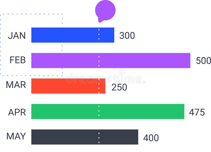
Free with trial Colorful horizontal bar chart is displaying monthly statistics from january to may, indicating trends and performance with a speech bubble above. Bar chart decrease vectors Colorful horizontal bar chart is displaying monthly statistics from january to may, indicating trends and performance
Free with trial Colorful horizontal bar chart is displaying monthly statistics from january to may, indicating trends and performance with a speech bubble above. Bar chart decrease vectors Colorful horizontal bar chart is displaying monthly statistics from january to may, indicating trends and performance
Free with trial Up and Down sign with blue and red arrows vector illustration. Concept of sales bar chart symbol icon with arrow moving down and sales bar chart with arrow moving up. Bar chart decrease vectors Up and Down sign with blue and red arrows vector illustration. Concept of sales bar chart symbol
Free with trial Stock market trading technical analysis bar chart fall banner. Business candlestick graph exchange down trend. Economic crisis and investment loss graph. Trader financial index crash. Money losing eps. Bar chart decrease vectors Stock market trading technical analysis bar chart fall banner. Business candlestick graph exchange down trend. Economic
Free with trial Stock market trading technical analysis bar chart fall banner. Business candlestick graph exchange down trend. Economic downturn and investment loss graph. Trader financial index crash and bankruptcy. Bar chart decrease illustrations Stock market trading technical analysis bar chart fall banner. Business candlestick graph exchange down trend. Economy. Stock market trading technical analysis bar chart fall banner. Business candlestick graph exchange down trend. Economic downturn and investment loss graph. Trader financial index crash and bankruptcy
Free with trial Stock market trading technical analysis bar chart fall banner. Business candlestick graph exchange down trend. Economic downturn and investment loss graph. Trader financial index crash and bankruptcy. Bar chart decrease vectors Stock market trading technical analysis bar chart fall banner. Business candlestick graph exchange down trend. Economy. Stock market trading technical analysis bar chart fall banner. Business candlestick graph exchange down trend. Economic downturn and investment loss graph. Trader financial index crash and bankruptcy
Free with trial Up and Down sign with green and red arrows vector illustration. Concept of sales bar chart symbol icon with arrow moving down and sales bar chart with arrow moving up. Bar chart decrease vectors Up and Down sign with green and red arrows vector illustration. Concept of sales bar chart symbol icon with arrows. Up and Down sign with green and red arrows vector illustration. Concept of sales bar chart symbol icon with arrow moving down and sales bar chart with arrow moving up.
Free with trial Reduction chart icon Vector symbol or sign set collection in black and white outline. Bar chart decrease vectors Decline Chart Icon Illustrating Decrease in Performance, Economic Downturn, and Analytical Data. Reduction chart icon Vector symbol or sign set collection in black and white outline
Free with trial This image shows a bar chart with a downward trend line, indicating economic decline. Vector illustration design using ai tool. Bar chart decrease vectors Economic recession chart. This image shows a bar chart with a downward trend line, indicating economic decline. Vector illustration design using ai tool.
Free with trial This colorful bar graph, generated by AI, depicts a downward trend using vibrant red, green, and yellow paint. The melting paint adds a dynamic, visually engaging element to the standard bar chart format, showcasing data decline creatively. Bar chart decrease illustrations Melting Bar Graph. This colorful bar graph, generated by AI, depicts a downward trend using vibrant red, green, and yellow paint. The melting paint adds a dynamic, visually engaging element to the standard bar chart format, showcasing data decline creatively.
Free with trial 3D illustration of a bar graph showing a declining trend. Red bars of decreasing height are set against a backdrop of a light gray frame. The image is perfect for presentations, reports, or any visual representation of negative growth, decline, or decrease in data. Suitable for use in business, finance, and educational contexts. Bar chart decrease vectors Declining Trend Bar Graph. 3D illustration of a bar graph showing a declining trend. Red bars of decreasing height are set against a backdrop of a light gray frame. The image is perfect for presentations, reports, or any visual representation of negative growth, decline, or decrease in data. Suitable for use in business, finance, and educational contexts.