Free with trial Simple line art business icons set featuring a magnifying glass, minus symbol, pie chart, and rising bar graph for financial data analysis. Bar chart decrease vectors Simple line art business icons set featuring a magnifying glass, minus symbol, pie chart, and rising bar graph for
Free with trial A miniature businessman figure stands next to a large descending bar graph made of vibrant red, orange, and yellow blocks against a clean neutral background. 3D Render style. Bar chart decrease illustrations Businessman Looking at Descending Bar Chart - Minimalist. A miniature businessman figure stands next to a large descending bar graph made of vibrant red, orange, and yellow blocks against a clean neutral background. 3D Render style.
Free with trial 3D rendered pyramid chart with a pie chart overlay and data icons on a light background. Useful for infographics and business presentations. Bar chart decrease illustrations 3d pyramid infographic with pie chart and data icons. 3D rendered pyramid chart with a pie chart overlay and data icons on a light background. Useful for. 3D rendered pyramid chart with a pie chart overlay and data icons on a light background. Useful for infographics and business presentations
Free with trial This 3D rendering shows a bar graph of increasing value, represented by white bars, alongside stacks of gold coins, visually depicting financial growth. The image was generated by AI, showcasing the potential of AI in visualizing financial data. Bar chart decrease illustrations AI-Generated Financial Growth Chart. This 3D rendering shows a bar graph of increasing value, represented by white bars, alongside stacks of gold coins, visually depicting financial growth. The image was generated by AI, showcasing the potential of AI in visualizing financial data.
Free with trial Real-Time Market Data Analysis with Candlestick Chart vector concept seamless pattern. Bar chart decrease vectors Real-Time Market Data Analysis with Candlestick Chart vector seamless pattern
Free with trial Bar graph with a downward arrow on a school hallway floor. Concept of declining performance, budget cuts, or failure in education and student outcomes. Bar chart decrease illustrations Bar graph with a downward arrow on a school hallway floor. Concept of declining performance, budget cuts, or failure in education
Free with trial Set of 16 black and white graph icons in a 4x4 grid. Each icon depicts variations of bar charts with upward and downward arrows, suggesting growth or decline. Some include additional elements like magnifying glasses, checkmarks, and data points connected by lines. Icons vary slightly in design, representing different data trends with simple, bold lines on a white background, ideal for business and statistical representation. Bar chart decrease vectors Graph icon set. Increase and decrease graph icon. Growth icon. Graph chart icons. Icon set. 16 icons. Set of 16 black and white graph icons in a 4x4 grid. Each icon depicts variations of bar charts with upward and downward arrows, suggesting growth or decline. Some include additional elements like magnifying glasses, checkmarks, and data points connected by lines. Icons vary slightly in design, representing different data trends with simple, bold lines on a white background, ideal for business and statistical representation.
Free with trial A set of declining bar and line graphs displayed on a grid background. 3D Rendering. Concept of financial decline and analysis. Bar chart decrease illustrations Declining Bar and Line Graphs on Grid Background. 3D Rendering. A set of declining bar and line graphs displayed on a grid background. 3D Rendering. Concept of financial decline and analysis
Free with trial Four distinct blue bar charts, each adorned with euro symbols, visually representing financial data with trends of both growth and decline, isolated on a white background. Bar chart decrease vectors Four blue bar charts with euro symbols showing growth and decline, isolated on transparent background. Four distinct blue bar charts, each adorned with euro symbols, visually representing financial data with trends of both growth and decline, isolated on a white background
Free with trial Series bars shrink left to right. Bold arrow points downward. Strong visual drop emphasis. Business decline concept. Bar chart decrease vectors Downward trend bar chart with falling arrow graphic illustration. Series bars shrink left to right. Bold arrow points downward. Strong visual drop emphasis. Business decline concept
Free with trial Illuminated descending bar graph against a gradient blue background suggesting decline. Generative AI. Bar chart decrease illustrations Illuminated descending bar graph against a gradient blue background suggesting decline
Free with trial Series bars shrink left to right. Bold arrow points downward. Strong visual drop emphasis. Business decline concept. Bar chart decrease vectors Downward trend bar chart with falling arrow graphic illustration. Series bars shrink left to right. Bold arrow points downward. Strong visual drop emphasis. Business decline concept
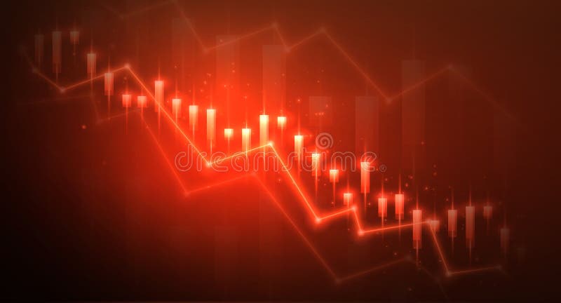
Free with trial This minimalist graphic illustration features a bold red line chart indicating a significant decline in value. The visual includes a currency symbol and bar segments set against a clean background to represent economic loss or market downturn. The sharp downward arrow emphasizes a negative trajectory in fiscal data and business analytics. Bar chart decrease vectors A red line graph showing a downward trend in financial performance. This minimalist graphic illustration features a bold red line chart indicating a significant decline in value. The visual includes a currency symbol and bar segments set against a clean background to represent economic loss or market downturn. The sharp downward arrow emphasizes a negative trajectory in fiscal data and business analytics
Free with trial Computer with Candlestick Chart vector Crypto Investment concept icon or design element. Bar chart decrease vectors Computer with Candlestick Chart vector Crypto Investment icon or design element
Free with trial Simple 3D bar graph with colored bars on a white background, representing data comparison. Bar chart decrease illustrations Colorful Bar Graph Illustration on White. Simple 3D bar graph with colored bars on a white background, representing data comparison
Free with trial 3D Illustration of Abstract Bar Graph finance. Bar chart decrease illustrations 3D Illustration of Abstract Bar Graph
Free with trial Graphic showing a downward trend with blue bars and red line chart. Bars decrease in size from left to right. Bar chart decrease illustrations Declining bar and line chart illustration. Graphic showing a downward trend with blue bars and red line chart. Bars decrease in size from left to right
Free with trial Business decline trend illustrated with wooden blocks forming a bar chart, indicating financial loss, recession, or market downturn. Features red down arrows on a bright yellow background with ample copy space. Perfect for reports, web banners, and marketing materials. Bar chart decrease illustrations Business Decline Trend Wooden Blocks Chart Red Down Arrows Bright Yellow Background Copy Space. Business decline trend illustrated with wooden blocks forming a bar chart, indicating financial loss, recession, or market downturn. Features red down arrows on a bright yellow background with ample copy space. Perfect for reports, web banners, and marketing materials.
Free with trial Market Data Analysis with Candlestick Chart vector concept colored icon or design element. Bar chart decrease vectors Market Data Analysis with Candlestick Chart vector colored icon or design element
Free with trial This 3D illustration features a vertical bar graph with columns of varying heights, indicating a clear decline in performance. Bright red arrows point downward, emphasizing the negative trend and loss of value. The clean, minimalist design uses a simple color palette against a neutral background, making it ideal for financial or business presentations. Bar chart decrease vectors A three dimensional bar chart showing a downward trend with red arrows. This 3D illustration features a vertical bar graph with columns of varying heights, indicating a clear decline in performance. Bright red arrows point downward, emphasizing the negative trend and loss of value. The clean, minimalist design uses a simple color palette against a neutral background, making it ideal for financial or business presentations
Free with trial A minimalist icon showing a computer monitor displaying a user profile next to a declining bar chart. Bar chart decrease vectors User Data Decline on Computer Monitor Icon. A minimalist icon showing a computer monitor displaying a user profile next to a declining bar chart
Free with trial Growth and decline graph report icon illustration. Financial chart arrow up and down symbol on black circle. Bar chart decrease vectors Growth and decline graph report icon. Financial chart arrow up and down symbol on black circle
Free with trial Business decline bar graph concept drawn with chalk on a dark blackboard, illustrating decreasing performance and strategic reduction. Features a bright yellow downward arrow, white chalk elements, and ample copy space. Bar chart decrease illustrations Business Decline Bar Graph Chalk Drawing Downward Yellow Arrow Strategy Concept Dark Background. Business decline bar graph concept drawn with chalk on a dark blackboard, illustrating decreasing performance and strategic reduction. Features a bright yellow downward arrow, white chalk elements, and ample copy space.
Free with trial This vibrant 3D bar graph features various colorful bars with an upward arrow, symbolizing growth and success in financial and business metrics Generative Ai. Bar chart decrease illustrations Colorful 3D Bar Graph Showing Growth with Upward Arrow Design. This vibrant 3D bar graph features various colorful bars with an upward arrow, symbolizing growth and success in financial and business metrics Generative Ai
Free with trial The image features a bar graph with red and yellow bars against a transparent background with a grid pattern. The red bars are taller than the yellow ones, and a large red downward arrow extends from the top of the graph, indicating a decline. The graph appears to be three-dimensional, with shadows adding depth to the bars. Bar chart decrease vectors Red and yellow bar graph with downward arrow. The image features a bar graph with red and yellow bars against a transparent background with a grid pattern. The red bars are taller than the yellow ones, and a large red downward arrow extends from the top of the graph, indicating a decline. The graph appears to be three-dimensional, with shadows adding depth to the bars
Free with trial A red fuel nozzle atop a tall column stands beside a descending bar graph, suggesting declining fuel sales or production. The scene is rendered in 3D against a white background. Bar chart decrease illustrations Falling Fuel Prices Chart with Gas. A red fuel nozzle atop a tall column stands beside a descending bar graph, suggesting declining fuel sales or production. The scene is rendered in 3D against a white background
Free with trial A 3d bar graph with rainbow colors and an orange arrow pointing downwards to indicate a decline or decrease in trend. the bars are arranged in a descending order with the tallest bar on the left and the shortest on the right. the background is plain white. Bar chart decrease illustrations A colorful bar graph showing a decline in trend. a 3d bar graph with rainbow colors and an orange arrow pointing downwards to indicate a decline or decrease in trend. the bars are arranged in a descending order with the tallest bar on the left and the shortest on the right. the background is plain white
Free with trial A bar graph with yellow bars and a red line shows a downward trend over time. the red line connects the tops of the bars and has an arrow at the end pointing down. Bar chart decrease illustrations A bar graph shows a downward trend over time. a bar graph with yellow bars and a red line shows a downward trend over time. the red line connects the tops of the bars and has an arrow at the end pointing down
Free with trial The image depicts a bar graph with a downward trend. The bars start tall on the left and progressively decrease in height towards the right. A yellow arrow at the top of the graph points downward, emphasizing the decline. Bar chart decrease illustrations Decreasing bar graph. The image depicts a bar graph with a downward trend. The bars start tall on the left and progressively decrease in height towards the right. A yellow arrow at the top of the graph points downward, emphasizing the decline
Free with trial A flat-style illustration depicting a falling bar graph, combined with a sad face emoji and recovery arrow for financial analysis. Bar chart decrease vectors Decreasing bar graph with sad face emoji and upwards arrow showing potential recovery. A flat-style illustration depicting a falling bar graph, combined with a sad face emoji and recovery arrow for financial analysis.
Free with trial A bar chart showing a downward trend is painted on an artist's canvas, symbolizing an economic downturn. The red arrow emphasizes the decline. Bar chart decrease illustrations Economic downturn depicted on artist\'s canvas. A bar chart showing a downward trend is painted on an artist's canvas, symbolizing an economic downturn. The red arrow emphasizes the decline
Free with trial Shiny blue bar graph depicts growth then decline, presented on a financial document Useful for showcasing data analysis and reporting. Bar chart decrease illustrations Analyzing Business Graph Illustration Showing Decrease and Growth Statistics Report. Shiny blue bar graph depicts growth then decline, presented on a financial document Useful for showcasing data analysis and reporting
Free with trial This image depicts a graph with fluctuating data trends over time, represented by both a line chart and bar chart. Bar chart decrease illustrations Graph showing fluctuating data trends over time. This image depicts a graph with fluctuating data trends over time, represented by both a line chart and bar chart
Free with trial Three blue bars decreasing in height with a red downward zigzag arrow on the right side. Bar chart decrease illustrations Declining bar chart with downward arrow graphic. Three blue bars decreasing in height with a red downward zigzag arrow on the right side
Free with trial A versatile collection of flat vector icons illustrating concepts of decline, decrease, and loss. This set features various graphics, including downward-pointing arrows, negative trend line graphs, and falling bar charts in multiple colors. These symbols are perfect for representing financial crisis, economic recession, stock market crash, business failure, or any form of reduction. Ideal for use in infographics, presentations, financial reports, websites, and data visualization projects, these modern icons effectively communicate negative trends and downturns. Isolated on a white background for easy integration into any design. Bar chart decrease illustrations Financial Decline and Recession Vector Icon Set. A versatile collection of flat vector icons illustrating concepts of decline, decrease, and loss. This set features various graphics, including downward-pointing arrows, negative trend line graphs, and falling bar charts in multiple colors. These symbols are perfect for representing financial crisis, economic recession, stock market crash, business failure, or any form of reduction. Ideal for use in infographics, presentations, financial reports, websites, and data visualization projects, these modern icons effectively communicate negative trends and downturns. Isolated on a white background for easy integration into any design.
Free with trial This abstract image features a silhouette of a bar graph against a clean white background. The bars vary in height and width, creating a dynamic, wave-like pattern that rises towards the center and then gradually descends. The overall impression is one of growth, progress, or data visualization. This versatile graphic can be used for concepts related to business, finance, technology, statistics, or any subject requiring a visual representation of change and trends. Bar chart decrease vectors Abstract Silhouette Bar Graph with Rising Trend. This abstract image features a silhouette of a bar graph against a clean white background. The bars vary in height and width, creating a dynamic, wave-like pattern that rises towards the center and then gradually descends. The overall impression is one of growth, progress, or data visualization. This versatile graphic can be used for concepts related to business, finance, technology, statistics, or any subject requiring a visual representation of change and trends.
Free with trial A blue arrow pointing upwards next to a bar graph, some bars are broken, symbolizing growth and decline in a business or market. Bar chart decrease illustrations Blue Arrow and Bar Graph Showing Growth and Decline. A blue arrow pointing upwards next to a bar graph, some bars are broken, symbolizing growth and decline in a business or market
Free with trial Trend Line and Candlestick Chart vector Crypto Trading concept colored icon or design element. Bar chart decrease vectors Trend Line and Candlestick Chart vector Crypto Trading colored icon or design element
Free with trial An abstract graphic featuring a series of vertical bars with rounded tops, arranged in varying heights along a horizontal base. The bars display a smooth gradient color transition, starting with blue on the left and shifting to purple and pink on the right. Set against a clean white background, this modern and minimalist design evokes concepts of data visualization, statistical analysis, or an audio equalizer. It's ideal for illustrating growth, progress, or comparative data in presentations, infographics, web design, or technology-related content. Bar chart decrease vectors Abstract Gradient Bar Chart or Equalizer Graphic. An abstract graphic featuring a series of vertical bars with rounded tops, arranged in varying heights along a horizontal base. The bars display a smooth gradient color transition, starting with blue on the left and shifting to purple and pink on the right. Set against a clean white background, this modern and minimalist design evokes concepts of data visualization, statistical analysis, or an audio equalizer. It's ideal for illustrating growth, progress, or comparative data in presentations, infographics, web design, or technology-related content.
Free with trial A smartphone screen showcases a modern fintech application featuring a blue and white interface with a declining stock market chart in the top left corner, accompanied by various performance graphs and analytical tools including a portfolio dashboard with spending insights, pie charts, and bar graphs illustrating investment distributions, all designed for comprehensive financial data analysis and. Bar chart decrease illustrations Mobile phone screen displaying fintech app with stock market charts and financial dashboard analytics. A smartphone screen showcases a modern fintech application featuring a blue and white interface with a declining stock market chart in the top left corner, accompanied by various performance graphs and analytical tools including a portfolio dashboard with spending insights, pie charts, and bar graphs illustrating investment distributions, all designed for comprehensive financial data analysis and
Free with trial Financial-themed illustration featuring bar and line graphs with upward trends, a red percentage symbol, and a pie chart with dollar signs. A laptop displays an arrow with coins, suggesting growth. Circular icons with arrows indicate increase and decrease, emphasizing data fluctuation. The background is light blue. Bar chart decrease vectors Charts and diagram icon set. Charts and graphs. Pie , Line , Candlestick Chart. Planning and visualization of statistics. Financial-themed illustration featuring bar and line graphs with upward trends, a red percentage symbol, and a pie chart with dollar signs. A laptop displays an arrow with coins, suggesting growth. Circular icons with arrows indicate increase and decrease, emphasizing data fluctuation. The background is light blue.
Free with trial A vertical bar graph on a solid blue background displays a declining trend with the tallest bar representing 80% at the bottom and progressively shorter bars ascending to the top, visually representing a decrease in the percentage of people diagnosed with cancer for use in medical reports, health presentations, statistical analysis, and educational materials about disease prevalence and public. Bar chart decrease illustrations A vertical bar graph with decreasing blue bars showing a decline in cancer diagnosis rates on a blue background. A vertical bar graph on a solid blue background displays a declining trend with the tallest bar representing 80% at the bottom and progressively shorter bars ascending to the top, visually representing a decrease in the percentage of people diagnosed with cancer for use in medical reports, health presentations, statistical analysis, and educational materials about disease prevalence and public
Free with trial Bar chart showing decline, red arrow points down, financial crisis, recession, negative growth. Bar chart decrease illustrations Downward trend graph with white bars and red arrow. Bar chart showing decline, red arrow points down, financial crisis, recession, negative growth
Free with trial Bar graph with blue arrow pointing down 3D illustration isolated on transparent background. Bar chart decrease illustrations Bar graph with blue arrow pointing down 3D
Free with trial A striking red arrow pointing downwards illustrates a significant economic downturn or market crash, superimposed over a green bar chart and line graph. Bar chart decrease illustrations Economic Downturn and Market Crash Concept with Red Decreasing Arrow and Chart. A striking red arrow pointing downwards illustrates a significant economic downturn or market crash, superimposed over a green bar chart and line graph
Free with trial Set of black and white vector icons featuring downward trending bar graphs, magnifying glass analysis, and presentation charts illustrating data decline. Generative AI. Bar chart decrease vectors Black and white icons of declining bar graph data and analysis. Set of black and white vector icons featuring downward trending bar graphs, magnifying glass analysis, and presentation charts illustrating data decline. Generative AI
Free with trial Graph line icon. Neumorphic, Flat shadow, 3d buttons. Column chart sign. Growth diagram symbol. Line graph chart icon. Social media icons. Vector. Bar chart decrease vectors Graph line icon. Column chart sign. Neumorphic buttons. Vector. Graph line icon. Neumorphic, Flat shadow, 3d buttons. Column chart sign. Growth diagram symbol. Line graph chart icon. Social media icons. Vector
Free with trial A clean, flat design illustration of a bar graph depicting a significant downward trend, highlighted by a bold blue arrow pointing downwards. Bar chart decrease illustrations A bar graph showing a downward trend with a blue arrow. A clean, flat design illustration of a bar graph depicting a significant downward trend, highlighted by a bold blue arrow pointing downwards
Free with trial A line art illustration isolated on white background displays business performance indicators: a speedometer, arrows, a bar graph, and a line graph, all in a minimalist style. Bar chart decrease vectors Vector art of line art illustration of business performance indicators featuring a speedometer, arrows, bar graph, and line graph. A line art illustration isolated on white background displays business performance indicators: a speedometer, arrows, a bar graph, and a line graph, all in a minimalist style
Free with trial Dollar down arrow chart icon design vector flat on white background. Bar chart decrease vectors Dollar down arrow chart icon design vector flat on white background
Free with trial A clean, minimalist 3D rendering of a descending bar graph composed of sleek, white rectangular prisms. The graph is set against a bright, neutral background, creating a modern and versatile image ideal for presentations, reports, or website design related to business, finance, or data visualization. The image offers a clean, uncluttered aesthetic. Bar chart decrease illustrations Abstract White Bar Graph: Minimalist 3D Render. A clean, minimalist 3D rendering of a descending bar graph composed of sleek, white rectangular prisms. The graph is set against a bright, neutral background, creating a modern and versatile image ideal for presentations, reports, or website design related to business, finance, or data visualization. The image offers a clean, uncluttered aesthetic.
Free with trial A visual representation of sound level using a colorful bar graph, with a sound wave and a speaker icon indicating audio. Bar chart decrease illustrations Volume Bar Graph with Sound Wave and Speaker Icon. A visual representation of sound level using a colorful bar graph, with a sound wave and a speaker icon indicating audio
Free with trial Candlestick Chart inside Magnifier vector Investing and Trading concept colored seamless pattern. Bar chart decrease vectors Candlestick Chart inside Magnifier vector Investing and Trading colored seamless pattern
Free with trial A grid of diverse icons representing different types of charts and graphs, including bar, line, and pie charts, symbolizing data analysis and business performance metrics. Bar chart decrease vectors Collection of various business and financial chart icons. A grid of diverse icons representing different types of charts and graphs, including bar, line, and pie charts, symbolizing data analysis and business performance metrics
Free with trial A vibrant bar graph graphic with a gradient of colors, representing data visualization and statistical analysis. The bars vary in height, indicating different values or categories. The image is set against a clean white background, making it suitable for a variety of applications, including presentations, reports, and website design. The color palette adds visual interest and can be used to represent trends, comparisons, or performance metrics. Bar chart decrease illustrations Colorful Bar Graph Illustrating Data and Statistics. A vibrant bar graph graphic with a gradient of colors, representing data visualization and statistical analysis. The bars vary in height, indicating different values or categories. The image is set against a clean white background, making it suitable for a variety of applications, including presentations, reports, and website design. The color palette adds visual interest and can be used to represent trends, comparisons, or performance metrics.
Free with trial This minimalist graphic illustration features a vertical bar chart with a prominent red arrow indicating a declining trend. The bars are rendered in varying shades of gray, arranged in descending order of height. A small blue globe icon is positioned near the arrow, symbolizing international or worldwide context. The overall design is clean, professional and suitable for business or financial. Bar chart decrease vectors A simple bar chart showing a downward trend with a global icon on a white background. This minimalist graphic illustration features a vertical bar chart with a prominent red arrow indicating a declining trend. The bars are rendered in varying shades of gray, arranged in descending order of height. A small blue globe icon is positioned near the arrow, symbolizing international or worldwide context. The overall design is clean, professional and suitable for business or financial
Free with trial The image features a 3D bar graph showing an upward trend in growth, represented by increasing bar heights, followed by a sharp decline indicated by a downward arrow. A green upward arrow emphasizes the growth phase, while a downward arrow highlights the decline phase. Bar chart decrease illustrations Growth and decline illustrated with bar graph and arrows. The image features a 3D bar graph showing an upward trend in growth, represented by increasing bar heights, followed by a sharp decline indicated by a downward arrow. A green upward arrow emphasizes the growth phase, while a downward arrow highlights the decline phase
Free with trial This image showcases vibrant 3D bar and pie charts illustrating upward trending business growth and financial success. Perfect for presentations or reports. Bar chart decrease illustrations Colorful 3D Bar Charts and Pie Charts Showing Business Growth. This image showcases vibrant 3D bar and pie charts illustrating upward trending business growth and financial success. Perfect for presentations or reports.
Free with trial 3D graphic depicts a steeply declining bar graph in red hues, showing economic loss. A downward-sloping arrow extends over the bars, illustrating the negative trend. The text reads "-40% PROFIT," emphasizing financial decline. The bars decrease in height from left to right, indicating progressive loss. The background is a dark grid, enhancing the focus on the graph. The visual conveys the concept of significant profit reduction and economic downturn. Bar chart decrease illustrations 3D Financial Concept of Profit Loss and Economic Decline. 3D graphic depicts a steeply declining bar graph in red hues, showing economic loss. A downward-sloping arrow extends over the bars, illustrating the negative trend. The text reads "-40% PROFIT," emphasizing financial decline. The bars decrease in height from left to right, indicating progressive loss. The background is a dark grid, enhancing the focus on the graph. The visual conveys the concept of significant profit reduction and economic downturn.
Free with trial A collection of nine flat vector icons for data visualization including bar graphs, line charts, pie charts, and performance meters isolated on a white background. Bar chart decrease vectors Simple black data analysis and business chart icon set. A collection of nine flat vector icons for data visualization including bar graphs, line charts, pie charts, and performance meters isolated on a white background
Free with trial Stock and economic crisis graph background. Trade exchange, financial decrease, bed business strategy, digital asset, loss investment fund, online broker, stock collapse and crisis concept. Bar chart decrease illustrations Stock and economic crisis graph background. Trade exchange, financial decrease
Free with trial Simple Bar Chart Showing Business Growth and Data Trends. Bar chart decrease vectors Simple Bar Chart Showing Business Growth and Data Trends
Free with trial Simple line art business icons set featuring a magnifying glass, minus symbol, pie chart, and rising bar graph for financial data analysis. Bar chart decrease illustrations Simple line art business icons set featuring a magnifying glass, minus symbol, pie chart, and rising bar graph for
Free with trial 3d bar graph illustrating financial growth with upward green arrow and downward red arrows indicating trends. Bar chart decrease vectors Bar graph rising with arrows showing increase decrease. 3d bar graph illustrating financial growth with upward green arrow and downward red arrows indicating trends
Free with trial Green and red candles of the graph chart of the share market. Bar chart decrease illustrations Green and red candles of graph chart of share market. green and red candles of the graph chart of the share market.
Free with trial The image depicts a bar graph on an easel with a prominent red downward arrow overlaying it. The bars in the graph show a decreasing trend from left to right, indicating a decline in values. The background is plain and gray, focusing attention on the graph and the red arrow. Bar chart decrease illustrations Downward trend in bar graph with a prominent red arrow. The image depicts a bar graph on an easel with a prominent red downward arrow overlaying it. The bars in the graph show a decreasing trend from left to right, indicating a decline in values. The background is plain and gray, focusing attention on the graph and the red arrow
Free with trial A 3D white cloud floats above a series of decreasing tealcolored bars on a teal background The bars decrease in size from left to right The cloud consists of multiple rounded shapes The background is a uniform teal color. Bar chart decrease illustrations 3D cloud floating above decreasing teal bar chart graph. A 3D white cloud floats above a series of decreasing tealcolored bars on a teal background The bars decrease in size from left to right The cloud consists of multiple rounded shapes The background is a uniform teal color.
Free with trial A minimalist black and white icon representing a bar graph. The graph features several vertical bars of varying heights, arranged in a sequence that initially ascends to a peak and then descends. This versatile graphic symbolizes data, statistics, growth, decline, trends, and analysis. Its clean design makes it suitable for presentations, reports, websites, and applications related to finance, business, technology, and research. Bar chart decrease vectors Black Bar Graph Icon with Ascending and Descending Bars. A minimalist black and white icon representing a bar graph. The graph features several vertical bars of varying heights, arranged in a sequence that initially ascends to a peak and then descends. This versatile graphic symbolizes data, statistics, growth, decline, trends, and analysis. Its clean design makes it suitable for presentations, reports, websites, and applications related to finance, business, technology, and research.
Free with trial Modern, minimalistic chart icon for business and finance. Bar chart decrease vectors Modern, minimalistic chart icon for business and finance
Free with trial This is an isometric 3D illustration depicting a dynamic data visualization. It features a combination of bar charts and a line graph, showcasing rising trends and fluctuating data points. The color palette includes shades of blue, teal, and coral, creating a modern and professional aesthetic. This graphic is ideal for representing financial reports, business analytics, market trends, growth, and performance metrics in a visually engaging and easy-to-understand format. Bar chart decrease illustrations Isometric 3D Bar and Line Graph with Data Visualization. This is an isometric 3D illustration depicting a dynamic data visualization. It features a combination of bar charts and a line graph, showcasing rising trends and fluctuating data points. The color palette includes shades of blue, teal, and coral, creating a modern and professional aesthetic. This graphic is ideal for representing financial reports, business analytics, market trends, growth, and performance metrics in a visually engaging and easy-to-understand format.
Free with trial Graph line icon. Halftone dotted pattern. Gradient icon with grain shadow. Column chart sign. Growth diagram symbol. Line graph chart icon. Various designs. Vector. Bar chart decrease vectors Graph line icon. Column chart sign. Halftone dotted pattern. Vector. Graph line icon. Halftone dotted pattern. Gradient icon with grain shadow. Column chart sign. Growth diagram symbol. Line graph chart icon. Various designs. Vector
Free with trial A graphic illustration of a downward trend represented by a bar chart and a descending arrow within a black-rimmed circle. The chart consists of three black bars of decreasing height, with a thick black arrow pointing diagonally downwards from the shortest bar. The icon is set against a plain white background. Bar chart decrease illustrations Black Downward Trend Graph Icon with Arrow in Circle on White Background chart data. A graphic illustration of a downward trend represented by a bar chart and a descending arrow within a black-rimmed circle. The chart consists of three black bars of decreasing height, with a thick black arrow pointing diagonally downwards from the shortest bar. The icon is set against a plain white background
Free with trial Blue bar graph showing a downward trend with a yellow percentage sign and marker Visualize financial loss or negative growth in presentations and reports. Bar chart decrease illustrations Declining Bar Graph with Percentage Sign Depicting Economic Downturn. Blue bar graph showing a downward trend with a yellow percentage sign and marker Visualize financial loss or negative growth in presentations and reports
Free with trial A simple outline graphic showing a magnifying glass over a chart with a pie chart and bar graph, with a downward. Bar chart decrease illustrations Declining Sales Analysis Magnifying Glass, Chart, Arrow Down. A simple outline graphic showing a magnifying glass over a chart with a pie chart and bar graph, with a downward.
Free with trial Candlestick Chart inside Magnifier vector Investing and Trading concept colored icon or logo element. Bar chart decrease vectors Candlestick Chart inside Magnifier vector Investing and Trading colored icon or logo element
Free with trial This image features a collection of various black and white icons representing statistical graphics and charts. The icons include bar graphs, line graphs, and pie charts. The central image is a composite of a bar graph with an upward trending line graph and a pie chart. Surrounding this central image are smaller icons of similar graphs and charts. Bar chart decrease illustrations Collection of black and white statistical graphics and charts. This image features a collection of various black and white icons representing statistical graphics and charts. The icons include bar graphs, line graphs, and pie charts. The central image is a composite of a bar graph with an upward trending line graph and a pie chart. Surrounding this central image are smaller icons of similar graphs and charts
Free with trial Financial chart arrow up and down icon isolated on white background. Growth and decline graph sign symbol illustration. Bar chart decrease vectors Financial chart arrow up and down icon isolated on white background. Growth and decline graph sign symbol
Free with trial The image shows two bar charts side by side, each representing different financial trends. The chart on the left, depicted in green, shows an upward trend with increasing bar heights and an upward-pointing arrow, indicating growth. The chart on the right, depicted in red, shows a downward trend with decreasing bar heights and a downward-pointing arrow, indicating decline. Both charts use a 3D. Bar chart decrease illustrations Contrasting trends in financial growth and decline charts. The image shows two bar charts side by side, each representing different financial trends. The chart on the left, depicted in green, shows an upward trend with increasing bar heights and an upward-pointing arrow, indicating growth. The chart on the right, depicted in red, shows a downward trend with decreasing bar heights and a downward-pointing arrow, indicating decline. Both charts use a 3D