Free with trial Trend and Candlestick Chart vector Crypto Investment concept seamless pattern. Bar chart decrease vectors Trend and Candlestick Chart vector Crypto Investment seamless pattern
Free with trial A simple graphic showing a downward trend with a red line graph and several vertical bars of varying heights and colors. Bar chart decrease vectors Downward trending bar and line graph chart data. A simple graphic showing a downward trend with a red line graph and several vertical bars of varying heights and colors
Free with trial Three line graphs, data visualization, chart comparison. Bar chart decrease vectors Three line graphs, data visualization, chart comparison
Free with trial Decreasing bar graph in ice cube. 3d illustration. Bar chart decrease illustrations Decreasing bar graph in ice cube
Free with trial Descending white cylinder steps. Empty podium for product display. Bar chart and business decline or failure. Financial profit loss and economic crisis. 3D render. Bar chart decrease illustrations Descending white cylinder steps. Empty podium for product display
Free with trial Candlestick Chart vector Crypto Trading and Price Action concept icon or symbol. Bar chart decrease vectors Candlestick Chart vector Crypto Trading and Price Action icon or symbol
Free with trial Three orange bar graphs illustrating different data patterns increasing, decreasing, and varied. Ideal for presentations or data visualization. Simple and visually appealing design. Bar chart decrease illustrations Orange Bar Graph Variations. Three orange bar graphs illustrating different data patterns increasing, decreasing, and varied. Ideal for presentations or data visualization. Simple and visually appealing design.
Free with trial A row of colorful wooden blocks, resembling a bar graph, sits on a dark wooden surface. The blocks are various heights and colors, creating a visually appealing and potentially symbolic representation of growth or data. Bar chart decrease illustrations Colorful Wooden Blocks Chart. A row of colorful wooden blocks, resembling a bar graph, sits on a dark wooden surface. The blocks are various heights and colors, creating a visually appealing and potentially symbolic representation of growth or data.
Free with trial The image shows a neon-style graph illustrating a business downturn. the graph features an orange line depicting a downward trend, punctuated by blue vertical lines that may represent key milestones or events. the background is dark, emphasizing the neon glow of the graph elements. the graph suggests a decline in business performance, with the orange line representing a decrease in value or profit over time. Bar chart decrease illustrations Business downturn neon chart illustration. the image shows a neon-style graph illustrating a business downturn. the graph features an orange line depicting a downward trend, punctuated by blue vertical lines that may represent key milestones or events. the background is dark, emphasizing the neon glow of the graph elements. the graph suggests a decline in business performance, with the orange line representing a decrease in value or profit over time.
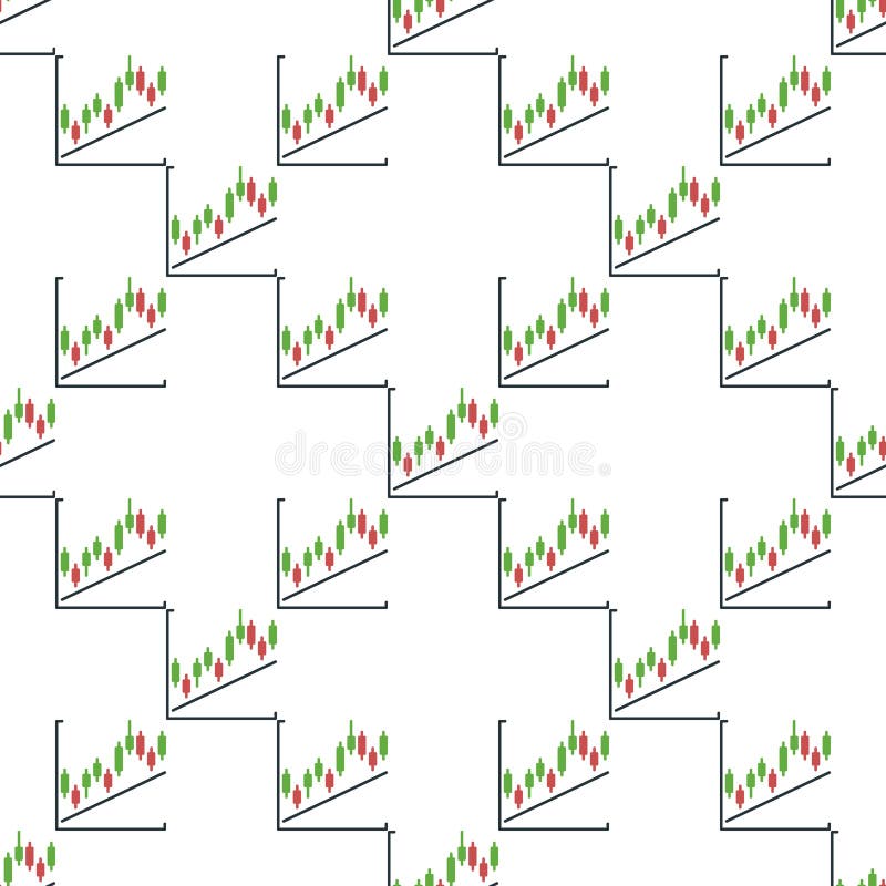
Free with trial Range or Levels Breakout vector Candlestick Chart concept colored seamless pattern. Bar chart decrease vectors Range or Levels Breakout vector Candlestick Chart colored seamless pattern
Free with trial Real-Time Market Data Analysis with Candlestick Chart vector concept icon or symbol. Bar chart decrease vectors Real-Time Market Data Analysis with Candlestick Chart vector icon or symbol
Free with trial Loss money arrow bar graph icon on white background depicting financial decline. Bar chart decrease illustrations Loss money arrow bar graph icon
Free with trial This image shows a simple isometric bar graph, generated by AI. It features four black bars of varying heights against a white background, suitable for use as a minimalist graphic or logo. The clean design allows for versatile application in various contexts. Bar chart decrease illustrations AI-Generated Isometric Bar Graph. This image shows a simple isometric bar graph, generated by AI. It features four black bars of varying heights against a white background, suitable for use as a minimalist graphic or logo. The clean design allows for versatile application in various contexts.
Free with trial Candlestick Chart Analysis vector Crypto Trading concept colored icon or logo element. Bar chart decrease vectors Candlestick Chart Analysis vector Crypto Trading colored icon or logo element
Free with trial USD dollar value decline and devaluation. Bar graph made of holes in yellow paper is revealing us dollar banknotes of decreasing values. 3d render. Bar chart decrease illustrations Us dollar decreasing value concept with bar graph on yellow background. USD dollar value decline and devaluation. Bar graph made of holes in yellow paper is revealing us dollar banknotes of decreasing values. 3d render
Free with trial Range or Levels Breakout vector Candlestick Chart concept colored icon or design element. Bar chart decrease vectors Range or Levels Breakout vector Candlestick Chart colored icon or design element
Free with trial Candlestick Chart on PC Screen vector Crypto Investment concept colored icon or symbol. Bar chart decrease vectors Candlestick Chart on PC Screen vector Crypto Investment colored icon or symbol
Free with trial A visual representation of a business downturn. This blue bar chart with a descending arrow illustrates a period of negative growth, financial loss, or economic recession. Bar chart decrease vectors Business Decline Graph Vector Icon. A visual representation of a business downturn. This blue bar chart with a descending arrow illustrates a period of negative growth, financial loss, or economic recession
Free with trial Woman looking worried near bar chart with declining arrows, broken piggy bank, and shattered coin, on light abstract background. Concept of economic failure. Vector illustration. Bar chart decrease vectors Financial crisis with broken piggy bank. Vector illustration. Woman looking worried near bar chart with declining arrows, broken piggy bank, and shattered coin, on light abstract background. Concept of economic failure. Vector illustration
Free with trial Trend Line and Candlestick Chart vector Crypto Trading concept colored seamless pattern. Bar chart decrease vectors Trend Line and Candlestick Chart vector Crypto Trading colored seamless pattern
Free with trial Checklist line icon. Neumorphic, Green gradient, 3d pin buttons. Graph chart sign. Growth diagram symbol. Line icons. Neumorphic buttons with outline signs. Vector. Bar chart decrease vectors Checklist line icon. Graph chart sign. Line icons. Vector. Checklist line icon. Neumorphic, Green gradient, 3d pin buttons. Graph chart sign. Growth diagram symbol. Line icons. Neumorphic buttons with outline signs. Vector
Free with trial Decreasing bar graph behind magnifying glass. 3d render. Bar chart decrease illustrations Decreasing bar graph behind magnifying glass
Free with trial Candlestick Chart on PC Screen vector Crypto Investment concept colored seamless pattern. Bar chart decrease vectors Candlestick Chart on PC Screen vector Crypto Investment colored seamless pattern
Free with trial Graphic illustration of a downward trending red arrow over blue and red vertical bar graph on a light grey background. Image. Bar chart decrease illustrations Bar Graph with Decreasing Trend Line. Graphic illustration of a downward trending red arrow over blue and red vertical bar graph on a light grey background. Image
Free with trial Crypto Trading Data Visualization vector Candlestick Chart concept colored icon or symbol. Bar chart decrease vectors Crypto Trading Data Visualization vector Candlestick Chart colored icon or symbol
Free with trial This image shows a whiteboard displaying a bar graph with a downward trend, generated by AI. The graph illustrates a clear decline in performance over time, potentially indicating financial losses or market setbacks. The simple, clean presentation highlights the severity of the decrease. Bar chart decrease illustrations Declining Business Graph. This image shows a whiteboard displaying a bar graph with a downward trend, generated by AI. The graph illustrates a clear decline in performance over time, potentially indicating financial losses or market setbacks. The simple, clean presentation highlights the severity of the decrease.
Free with trial Economics Financial Loss Analytics chart vector illustration. Bar chart decrease vectors Economics Financial Loss Analytics chart
Free with trial A bar chart representing a sharp decline makes a dramatic splash in clear water. This conceptual image visualizes a financial crisis, liquidity problems, or the impactful consequences of negative data and market failure. Bar chart decrease illustrations Economic Downturn Graph Splashing Down. A bar chart representing a sharp decline makes a dramatic splash in clear water. This conceptual image visualizes a financial crisis, liquidity problems, or the impactful consequences of negative data and market failure
Free with trial Crypto Trading Data Visualization vector Candlestick Chart concept colored seamless pattern. Bar chart decrease vectors Crypto Trading Data Visualization vector Candlestick Chart colored seamless pattern
Free with trial A versatile set of business and finance icons isolated on a white background. This collection features various data visualization elements, including bar charts, line graphs, pie charts, and diagrams. The clean, vector style represents concepts like statistical analysis, market growth, financial reporting, and economic trends. These infographic elements are perfect for presentations, business reports, websites, and marketing materials to illustrate progress, performance, and data-driven insights. Bar chart decrease vectors Business and Finance Chart and Graph Icon Set. A versatile set of business and finance icons isolated on a white background. This collection features various data visualization elements, including bar charts, line graphs, pie charts, and diagrams. The clean, vector style represents concepts like statistical analysis, market growth, financial reporting, and economic trends. These infographic elements are perfect for presentations, business reports, websites, and marketing materials to illustrate progress, performance, and data-driven insights.
Free with trial A modern flat design icon representing financial data analysis and market trends. This vector illustration features a combination of a green bar chart and a dark grey line graph, showing fluctuations in performance. An upward arrow indicates initial growth, followed by a volatile trend line symbolizing concepts like market instability, economic changes, profit and loss, or business analytics. This versatile graphic is perfect for infographics, financial reports, presentations, websites, and applications related to business, finance, statistics, and economics. Isolated on a white background for easy use. Bar chart decrease vectors Financial Market Fluctuation Graph Icon. A modern flat design icon representing financial data analysis and market trends. This vector illustration features a combination of a green bar chart and a dark grey line graph, showing fluctuations in performance. An upward arrow indicates initial growth, followed by a volatile trend line symbolizing concepts like market instability, economic changes, profit and loss, or business analytics. This versatile graphic is perfect for infographics, financial reports, presentations, websites, and applications related to business, finance, statistics, and economics. Isolated on a white background for easy use.
Free with trial This image showcases two contrasting bar charts, constructed from red and white blocks, generated by AI. One chart depicts growth, while the other illustrates decline, offering a visual representation of opposing trends. The use of color and simple shapes makes it easily understandable. Bar chart decrease illustrations AI-Generated Block Charts: Growth & Decline. This image showcases two contrasting bar charts, constructed from red and white blocks, generated by AI. One chart depicts growth, while the other illustrates decline, offering a visual representation of opposing trends. The use of color and simple shapes makes it easily understandable.
Free with trial A conceptual image illustrating a decline in the cocoa market. In the foreground, a pile of raw cocoa beans sits on a white surface. Behind them, a 3D bar chart shows a steep downward trend, with tall green bars transitioning to shorter red bars, symbolizing falling prices, reduced production, or financial loss. This graphic is ideal for representing economic downturns, agricultural commodity trading, market analysis, business reports, and news related to the chocolate industry's performance, supply chain issues, or crop failure. Bar chart decrease illustrations Cocoa Market Decline with Beans and Graph. A conceptual image illustrating a decline in the cocoa market. In the foreground, a pile of raw cocoa beans sits on a white surface. Behind them, a 3D bar chart shows a steep downward trend, with tall green bars transitioning to shorter red bars, symbolizing falling prices, reduced production, or financial loss. This graphic is ideal for representing economic downturns, agricultural commodity trading, market analysis, business reports, and news related to the chocolate industry's performance, supply chain issues, or crop failure.
Free with trial Decreasing bar graph isolated on white background. Investment statistics. Economic data. Financial report. Interest rate. Business concept. Top view. 3d render. Bar chart decrease illustrations Decreasing bar graph isolated on white background
Free with trial This image presents a set of four icons depicting different types of bar charts with upward and downward trends. These icons are commonly used to visually represent growth, decline, progress, and regression in various contexts, such as business, finance, and data analysis. Bar chart decrease vectors Collection of Growth and Decline Chart Icons. This image presents a set of four icons depicting different types of bar charts with upward and downward trends. These icons are commonly used to visually represent growth, decline, progress, and regression in various contexts, such as business, finance, and data analysis.
Free with trial Simple vector icon representing a bar graph with a big arrow pointing down. Bar chart decrease illustrations Big arrow pointing down on a decreasing bar graph icon. Simple vector icon representing a bar graph with a big arrow pointing down
Free with trial Red decreasing bar graph on light gray background. Investment statistics. Economic data. Financial report. Interest rate. Business concept. Top view. 3d render. Bar chart decrease illustrations Red decreasing bar graph on light gray background
Free with trial Bitcoin chart icons set outline vector. Benefit fintech. Cash coin thin line color flat on white. Bar chart decrease vectors Bitcoin chart icons set vector color line. Bitcoin chart icons set outline vector. Benefit fintech. Cash coin thin line color flat on white
Free with trial A vibrant, 3D bar graph with colorful blocks rises against a white background. This modern infographic uses geometric shapes to represent data trends, making it a perfect visual for presentations, rep. Bar chart decrease illustrations Colorful Bar Graph. A vibrant, 3D bar graph with colorful blocks rises against a white background. This modern infographic uses geometric shapes to represent data trends, making it a perfect visual for presentations, rep
Free with trial A conceptual 3D illustration depicting a white growth arrow on a collapsing bar chart. The crumbling blocks and debris symbolize a dramatic failure or downturn. This powerful metaphor represents concepts such as financial crisis, economic recession, stock market crash, business bankruptcy, or unsustainable growth built on a fragile foundation. The minimalist gray background focuses attention on the central theme of collapse and risk, making it ideal for financial reports, business presentations, and articles about economic instability. Bar chart decrease illustrations Economic Crisis and Crumbling Growth Chart. A conceptual 3D illustration depicting a white growth arrow on a collapsing bar chart. The crumbling blocks and debris symbolize a dramatic failure or downturn. This powerful metaphor represents concepts such as financial crisis, economic recession, stock market crash, business bankruptcy, or unsustainable growth built on a fragile foundation. The minimalist gray background focuses attention on the central theme of collapse and risk, making it ideal for financial reports, business presentations, and articles about economic instability.
Free with trial A modern, colorful bar chart illustrates a downward trend in financial performance or statistical data. Bar chart decrease illustrations Financial Data Analysis Graph Illustration. A modern, colorful bar chart illustrates a downward trend in financial performance or statistical data
Free with trial Online Candlestick Chart vector Professional Financial Trading concept colored seamless pattern. Bar chart decrease vectors Online Candlestick Chart vector Professional Financial Trading colored seamless pattern
Free with trial An illustrative concept of economic downturn, where a declining bar graph with a red arrow rests on a precarious, floating island. Bar chart decrease vectors Financial Crisis Chart on a Floating Island. An illustrative concept of economic downturn, where a declining bar graph with a red arrow rests on a precarious, floating island
Free with trial Decreasing graph line icon. Neumorphic, Green gradient, 3d pin buttons. Column chart sign. Crisis diagram symbol. Line icons. Neumorphic buttons with outline signs. Vector. Bar chart decrease illustrations Decreasing graph line icon. Crisis chart sign. Line icons. Vector. Decreasing graph line icon. Neumorphic, Green gradient, 3d pin buttons. Column chart sign. Crisis diagram symbol. Line icons. Neumorphic buttons with outline signs. Vector
Free with trial Magnifier with Candlestick Chart vector Successful Stock Market Investing concept icon or symbol. Bar chart decrease vectors Magnifier with Candlestick Chart vector Successful Stock Market Investing icon or symbol
Free with trial Stock Market Data Visualization vector Cryptocurrency Candlestick Chart concept seamless pattern. Bar chart decrease vectors Stock Market Data Visualization vector Cryptocurrency Candlestick Chart seamless pattern
Free with trial Decrease graph icon in generic style. Statistic illustration concept. Bar chart decrease vectors Decrease graph icon in generic style. Statistic concept. Decrease graph icon in generic style. Statistic illustration concept
Free with trial Statistics icon set, bar diagram illustration, business graph logo icon vector. Bar chart decrease vectors Statistics icon set, bar diagram illustration, business graph logo icon vector
Free with trial A comprehensive collection of black and white icons representing various financial and business charts, including bar, line, and pie graphs, for data visualization. Bar chart decrease vectors Assortment of financial and business chart icons. A comprehensive collection of black and white icons representing various financial and business charts, including bar, line, and pie graphs, for data visualization
Free with trial A 3D render illustrating the concept of financial decline and economic crisis. The image features a bar chart with progressively smaller bars and a prominent red arrow pointing downwards, signifying a sharp downturn. This visual metaphor represents a stock market crash, business failure, investment loss, or recession. The minimalist design on a yellow background is perfect for financial reports, business presentations, economic news articles, and web graphics discussing negative growth, losses, or bankruptcy. A small stack of coins reinforces the monetary theme. Bar chart decrease illustrations 3D Financial Decline Graph with Downward Arrow. A 3D render illustrating the concept of financial decline and economic crisis. The image features a bar chart with progressively smaller bars and a prominent red arrow pointing downwards, signifying a sharp downturn. This visual metaphor represents a stock market crash, business failure, investment loss, or recession. The minimalist design on a yellow background is perfect for financial reports, business presentations, economic news articles, and web graphics discussing negative growth, losses, or bankruptcy. A small stack of coins reinforces the monetary theme.
Free with trial Simple vector showing a decreasing bar graph with an earth icon, representing the concept of global recession. Bar chart decrease illustrations Global economy showing decreasing bar graph and earth icon. Simple vector showing a decreasing bar graph with an earth icon, representing the concept of global recession
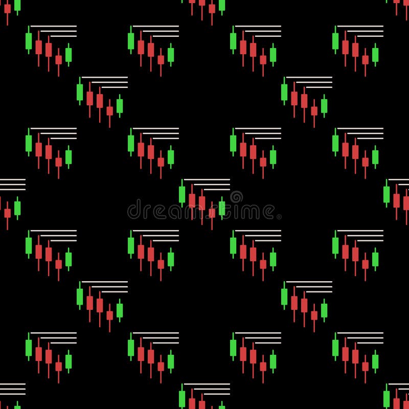
Free with trial Red and Green Candlestick Chart vector Crypto Trading and Price Action concept colored seamless pattern. Bar chart decrease vectors Red and Green Candlestick Chart vector Crypto Trading and Price Action colored seamless pattern
Free with trial Green marble bar graph showing a downward trend. Created with the help of Generative AI tools. Bar chart decrease illustrations Green marble bar graph showing a downward trend.
Free with trial Stock Market Data Visualization vector Cryptocurrency Candlestick Chart concept icon or logo element. Bar chart decrease vectors Stock Market Data Visualization vector Cryptocurrency Candlestick Chart icon or logo element
Free with trial Online Candlestick Chart vector Professional Financial Trading concept colored icon or design element. Bar chart decrease vectors Online Candlestick Chart vector Professional Financial Trading colored icon or design element
Free with trial A 3D rendered image of a bar graph disintegrating into dust, symbolizing economic decline or market crash. This powerful visual metaphor, generated by AI, highlights the fragility of growth and the potential for sudden collapse. Bar chart decrease illustrations Collapsing Growth Chart. A 3D rendered image of a bar graph disintegrating into dust, symbolizing economic decline or market crash. This powerful visual metaphor, generated by AI, highlights the fragility of growth and the potential for sudden collapse.
Free with trial Purple gradient bar graph is showing a negative trend with a downward arrow. Bar chart decrease vectors Purple gradient bar graph showing negative trend with downward arrow
Free with trial Red bar graph with decreasing values. Generative AI. Bar chart decrease illustrations Red bar graph with decreasing values
Free with trial A clean, flat design illustration featuring a collection of icons related to social media engagement and data analysis. The set includes a pie chart, bar graphs showing upward trends, a line graph with a heart icon and an upward arrow, another line graph with data points, a speech bubble with the word 'LIKE' and abstract shapes, and a thumbs-up icon with a notification count. These graphics are ideal for representing concepts like growth, popularity, analytics, and user feedback in digital marketing, business reports, and web design. Bar chart decrease illustrations Social Media Metrics and Data Visualization Icons. A clean, flat design illustration featuring a collection of icons related to social media engagement and data analysis. The set includes a pie chart, bar graphs showing upward trends, a line graph with a heart icon and an upward arrow, another line graph with data points, a speech bubble with the word 'LIKE' and abstract shapes, and a thumbs-up icon with a notification count. These graphics are ideal for representing concepts like growth, popularity, analytics, and user feedback in digital marketing, business reports, and web design.
Free with trial Business graphic chart line, round and candlestick graph trend with glassmorphism effect. Transparent blur glass on gradient arrow vector set. Financial diagram on black. Marketing analytics. Bar chart decrease illustrations Business graphic chart line round and candlestick graph trend with glassmorphism effect vector set, arrows on black. Business graphic chart line, round and candlestick graph trend with glassmorphism effect. Transparent blur glass on gradient arrow vector set. Financial diagram on black. Marketing analytics
Free with trial Colorful bar and pie charts illustrate data analysis white background. Bar chart decrease illustrations Colorful bar and pie charts illustrate data analysis
Free with trial A girl stands confidently, pointing at a finance chart displayed on a large screen. Her expression is focused and determined, highlighting key trends and data that drive her presentation. Bar chart decrease illustrations The girl is pointing at the finance chart. A girl stands confidently, pointing at a finance chart displayed on a large screen. Her expression is focused and determined, highlighting key trends and data that drive her presentation.
Free with trial Red and Green Candlestick Chart vector Crypto Trading and Price Action concept colored icon or logo element. Bar chart decrease vectors Red and Green Candlestick Chart vector Crypto Trading and Price Action colored icon or logo element
Free with trial Falling Performance Shown in 3D Business Data Chart - 3D chart displays a decline in business performance, highlighting negative growth. Bar chart decrease illustrations Falling Performance Shown in 3D Business Data Chart
Free with trial Down Trend Line Outline Arrow Pointing Downward Decrease Profits Sales Market Business Finance Black White Icon Sign Symbol Vector Illustration Artwork. Bar chart decrease vectors Down Trend Line Outline Arrow Pointing Downward Decrease Profits Sales Market Business Finance Black White Icon
Free with trial A bar chart made of wooden blocks sits on an open book in a classic library, symbolizing a decline in business performance, economic recession, or falling educational standards. Bar chart decrease illustrations Economic Decline Graph on an Open Book in a Library. A bar chart made of wooden blocks sits on an open book in a classic library, symbolizing a decline in business performance, economic recession, or falling educational standards
Free with trial A 3D rendered icon featuring a golden bar graph with a downward trend line and a red arrow indicating a decrease. The graph is set on a black circular background with a prominent gold rim. This symbol represents financial decline, loss, or negative performance. Bar chart decrease illustrations Golden Graph with Downward Trend Arrow on Black Circle with Gold Rim chart falling. A 3D rendered icon featuring a golden bar graph with a downward trend line. A 3D rendered icon featuring a golden bar graph with a downward trend line and a red arrow indicating a decrease. The graph is set on a black circular background with a prominent gold rim. This symbol represents financial decline, loss, or negative performance
Free with trial Red metallic bars show a downward trend against a colorful bokeh background. Perfect for illustrating financial reports or presentations. Bar chart decrease illustrations Decreasing Bar Graph Chart Showing Financial Decline. Red metallic bars show a downward trend against a colorful bokeh background. Perfect for illustrating financial reports or presentations
Free with trial This simple bar graph is depicting market analysis with colorful bars. Bar chart decrease vectors Colorful bar graph showing market growth and success. This simple bar graph is depicting market analysis with colorful bars
Free with trial A vibrant 3D representation of a business graph and chart, showcasing data analysis and financial trends with colorful bars and a dynamic line, isolated on a clean white background. Bar chart decrease illustrations 3d graph and chart icons isolated on white background. A vibrant 3D representation of a business graph and chart, showcasing data analysis and financial trends with colorful bars and a dynamic line, isolated on a clean white background
Free with trial Checklist line icon. Continuous line with 3d star. Graph chart sign. Growth diagram symbol. 3d star in speech bubble. Checklist single line ribbon. Loop curve pattern. Vector. Bar chart decrease vectors Checklist line icon. Graph chart sign. Continuous line with 3d star. Vector. Checklist line icon. Continuous line with 3d star. Graph chart sign. Growth diagram symbol. 3d star in speech bubble. Checklist single line ribbon. Loop curve pattern. Vector
Free with trial Dollar coin beside a bar graph showing downward trend under a cloud. Ideal for finance, economy, investment, loss, analytics, business performance, global market. Simple flat metaphor. Bar chart decrease vectors Dollar Coin and Declining Bar Graph Representing Financial Loss Concept. Dollar coin beside a bar graph showing downward trend under a cloud. Ideal for finance, economy, investment, loss, analytics, business performance, global market. Simple flat metaphor
Free with trial A stylized chart with bars and a line graph is displayed in a soft speech bubble against a simple background great for business or infographic presentations. Bar chart decrease illustrations Analyzing Data Chart in Speech Bubble for Presentation. A stylized chart with bars and a line graph is displayed in a soft speech bubble against a simple background great for business or infographic presentations
Free with trial Falling red bar graph shows decreasing interest rates with a red arrow pointing down, accompanied by a clipboard with an interest report, set against a light background, useful for financial and economic themes. Bar chart decrease illustrations Declining Red Bar Graph with Red Arrow and Interest Report. Falling red bar graph shows decreasing interest rates with a red arrow pointing down, accompanied by a clipboard with an interest report, set against a light background, useful for financial and economic themes
Free with trial Simple line art illustration of a bar graph with a downward trend, symbolizing negative growth. Bar chart decrease illustrations Declining bar graph showing negative trend with arrow pointing down. Simple line art illustration of a bar graph with a downward trend, symbolizing negative growth
Free with trial Line icon of a flip chart showing decreasing bars, suggesting a negative trend during a business presentation. Bar chart decrease vectors Flip chart showing decreasing bars graphic for business presentation. Line icon of a flip chart showing decreasing bars, suggesting a negative trend during a business presentation
Free with trial Decrease graph icon on black square. Statistic illustration concept. Bar chart decrease vectors Decrease graph icon on black square. Statistic concept. Decrease graph icon on black square. Statistic illustration concept
Free with trial 3d cylinder chart showing downward trend. Business and finance decline vector illustration. Bar chart decrease vectors 3d cylinder chart showing downward trend. Business and finance decline illustration
Free with trial A detailed financial chart is presented with numerous vertical bars and multiple overlapping line graphs in blue, white, and orange. Red and green arrows indicate downward and upward movements, respectively, with specific numerical data points displayed. The overall trend shows fluctuations but a general upward trajectory towards the right. Bar chart decrease illustrations Detailed Financial Chart with Upward and Downward Trends. A detailed financial chart is presented with numerous vertical bars and multiple overlapping line graphs in blue, white, and orange. Red and green arrows indicate downward and upward movements, respectively, with specific numerical data points displayed. The overall trend shows fluctuations but a general upward trajectory towards the right
Free with trial Statistics line icon. Neumorphic, Blue gradient, 3d pin buttons. Column chart sign. Growth graph diagram symbol. Line icons. Neumorphic buttons with outline signs. Vector. Bar chart decrease illustrations Statistics line icon. Column graph chart sign. Line icons. Vector. Statistics line icon. Neumorphic, Blue gradient, 3d pin buttons. Column chart sign. Growth graph diagram symbol. Line icons. Neumorphic buttons with outline signs. Vector