Free with trial Two lines are representing data progression over time, one blue and one black, creating a visual representation of trends and a key intersection point is marked with a blue circle. Data analysis decrease vectors Two lines are representing data progression over time, one blue and one black, creating a visual representation of
Free with trial A dynamic 3D illustration of a glossy red arrow pointing downwards in a jagged, volatile path. Isolated on a white background, this graphic icon is a powerful symbol for negative concepts. It represents decline, decrease, failure, loss, and crisis. This visual is perfect for illustrating stock market crashes, economic recession, financial downturns, poor business performance, or any downward trend in data and statistics. An ideal element for reports, presentations, and financial news, with ample copy space. Data analysis decrease illustrations Red Jagged Arrow of Decline - Financial Crisis Concept. A dynamic 3D illustration of a glossy red arrow pointing downwards in a jagged, volatile path. Isolated on a white background, this graphic icon is a powerful symbol for negative concepts. It represents decline, decrease, failure, loss, and crisis. This visual is perfect for illustrating stock market crashes, economic recession, financial downturns, poor business performance, or any downward trend in data and statistics. An ideal element for reports, presentations, and financial news, with ample copy space.
Free with trial Bear or bearish market trend in crypto currency or stocks. Trade exchange background, down arrow graph for decrease in rates. Cryptocurrency price chart, blockchain technology. Global economy crash. , AI. Data analysis decrease illustrations Bear or bearish market trend in crypto currency or stocks. Trade exchange background, down arrow graph for decrease in rates.
Free with trial A neon dollar sign with an arrow pointing down symbolizes financial loss, economic downturn, or decrease in value. The design is modern and visually striking. Data analysis decrease vectors Vector art of neon dollar sign pointing down, symbolizing financial loss, economic downturn, or decrease in value with a modern. A neon dollar sign with an arrow pointing down symbolizes financial loss, economic downturn, or decrease in value. The design is modern and visually striking
Free with trial Two lines are representing increasing and declining trends over a grid background, symbolizing market analysis, financial performance, or business progress. Data analysis decrease illustrations Two lines are representing increasing and declining trends over a grid background, symbolizing market analysis
Free with trial A three-dimensional chart displaying colorful lines and coin representations illustrates trends in data, highlighting key financial insights and fluctuations over time. Data analysis decrease illustrations Trend Analysis with Colorful Graph Lines and Currency Coins Representing Data Points on a Three-Dimensional Chart. A three-dimensional chart displaying colorful lines and coin representations illustrates trends in data, highlighting key financial insights and fluctuations over time
Free with trial This vibrant bar graph displays data trends through colorful segments, ideal for marketing and business presentations. Utilize this minimalistic design for impactful insights. Data analysis decrease illustrations Colorful Bar Graph Showing Data Trends with Various Heights and Colors in a Minimalistic Style for Business and Marketing. This vibrant bar graph displays data trends through colorful segments, ideal for marketing and business presentations. Utilize this minimalistic design for impactful insights
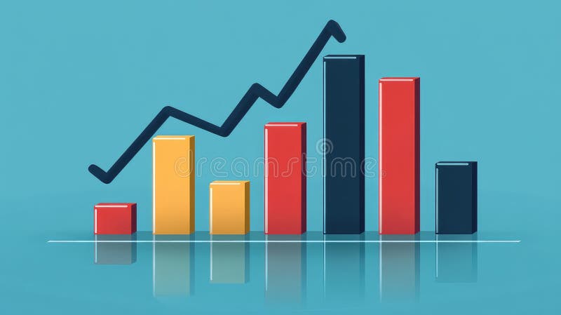
Free with trial A modern data visualization featuring a line graph and bar chart, ideal for illustrating business trends and performance metrics in reports and presentations. Data analysis decrease illustrations Data visualization with a line graph and bar chart representing trends and comparisons in a clear and modern style for business. A modern data visualization featuring a line graph and bar chart, ideal for illustrating business trends and performance metrics in reports and presentations
Free with trial This vibrant image features a collection of colorful 3D bar graphs representing data trends, perfect for visualizing statistics in business presentations and analyses. Data analysis decrease illustrations Colorful Bar Graph with 3D Shapes Representing Data Trends and Visualizing Statistics in Business and Finance Environments. This vibrant image features a collection of colorful 3D bar graphs representing data trends, perfect for visualizing statistics in business presentations and analyses
Free with trial Gross Domestic Product (GDP) text on a world map, indicating economic analysis direction with up and down arrows, symbolizing global investment and financial trends. Data analysis decrease illustrations Gross Domestic Product GDP text in center of global map with arrows indicating economic analysis direction of stock and investment. Gross Domestic Product (GDP) text on a world map, indicating economic analysis direction with up and down arrows, symbolizing global investment and financial trends
Free with trial Financial success and investment strategy depicted through Gross Domestic Product GDP, stock market analysis, currency fluctuations, banking, and accounting. Data analysis decrease illustrations Gross Domestic Product GDP concept displaying economic analysis, stock market trends, and financial growth for intelligent invest. Financial success and investment strategy depicted through Gross Domestic Product GDP, stock market analysis, currency fluctuations, banking, and accounting
Free with trial Red percent decrease arrow and green percent increase arrow. Interest rates inflation economy concept. Up and down arrows for financial market change. Price decrease increase symbol. Data analysis decrease illustrations Red percent decrease arrow and green percent increase arrow represent interest rates inflation economy. Red percent decrease arrow and green percent increase arrow. Interest rates inflation economy concept. Up and down arrows for financial market change. Price decrease increase symbol
Free with trial Colorful bar charts are presenting statistical trends and business performance data across different time periods. Possibly days of the week. Using a vibrant color scheme of blue. Purple. And orange. Data analysis decrease illustrations Colorful bar charts are presenting statistical trends and business performance data across different time periods
Free with trial Four colorful bar charts are displayed on a graph, representing trends, statistics, and timeline data, with a potential focus on business infographics elements. Data analysis decrease illustrations Four colorful bar charts are displayed on a graph, representing trends, statistics, and timeline data, with a potential
Free with trial This impactful image features a large, bold red downward arrow on a pristine white background, perfect for conveying a decrease or decline in data. Ideal for use in presentations, reports, and graphs, this professional design element is a clear and effective visual aid. The simplified design and sharp focus on the arrow ensure maximum visual impact and clarity. Whether illustrating a shrinking. Data analysis decrease illustrations Powerful Red Downward Arrow Graphic A Clean Professional Visual Aid for Presentations Reports and Graphs. This impactful image features a large, bold red downward arrow on a pristine white background, perfect for conveying a decrease or decline in data. Ideal for use in presentations, reports, and graphs, this professional design element is a clear and effective visual aid. The simplified design and sharp focus on the arrow ensure maximum visual impact and clarity. Whether illustrating a shrinking
Free with trial This abstract data visualization features smooth blue waves representing trends and fluctuations, ideal for business reports, finance presentations, and analytical insights. Data analysis decrease illustrations Abstract Blue Data Visualization Depicting Trends and Fluctuations in Graphical Format for Business and Finance Presentations. This abstract data visualization. This abstract data visualization features smooth blue waves representing trends and fluctuations, ideal for business reports, finance presentations, and analytical insights
Free with trial Statistic graph progress, financial profit growth, increase, and decrease line icons set. Infographic charts with arrows, circles, and bars thin black outline symbols vector illustration. Data analysis decrease vectors Statistic graph progress, financial profit growth, increase and decrease line icons set. Statistic graph progress, financial profit growth, increase, and decrease line icons set. Infographic charts with arrows, circles, and bars thin black outline symbols vector illustration.
Free with trial Dynamic red and blue stock market graph with data points and financial charts on a dark background. Generative AI. Data analysis decrease illustrations Dynamic red and blue stock market graph with data points and financial charts on a dark background
Free with trial Data analytics descending line graphic outline icon in white and black colors. data analytics descending line graphic flat vector icon from business collection for web, mobile apps and ui. Data analysis decrease vectors Data analytics descending line graphic outline icon in white and black colors. data analytics descending line graphic flat vector
Free with trial Vibrant and colorful bar chart illustrating various data metrics, perfect for business or marketing use, highlighting trends and insights visually engaging for audiences. Data analysis decrease illustrations Colorful Bar Chart Showing Data Variations in a Bright and Engaging Style Suitable for Business Presentations or Marketing. Vibrant and colorful bar chart illustrating various data metrics, perfect for business or marketing use, highlighting trends and insights visually engaging for audiences
Free with trial This vibrant bar graph showcases varying heights for data visualization, perfect for representing trends in finance or business analysis against a clean white background. Data analysis decrease illustrations Colorful Bar Graph with Varying Heights Representing Data Trends and Insights in a Minimalist Art Style on White Background. This vibrant bar graph showcases varying heights for data visualization, perfect for representing trends in finance or business analysis against a clean white background
Free with trial A visually appealing line graph illustrates data fluctuations and trends over time. The minimalist design makes it suitable for presentations and reports in various fields. Data analysis decrease illustrations Line graph depicting data trends with fluctuations and peaks over time in a minimalist style, showcasing analytical insights and. A visually appealing line graph illustrates data fluctuations and trends over time. The minimalist design makes it suitable for presentations and reports in various fields
Free with trial Featuring four vibrant business charts illustrating increasing, decreasing, fluctuating, and peaking trends, perfect for enhancing presentations and reports with clear visual data analysis. Data analysis decrease vectors Featuring four vibrant business charts illustrating increasing, decreasing, fluctuating, and peaking trends, perfect for
Free with trial Sine waves analysis outline icon in white and black colors. sine waves analysis flat vector icon from analytics collection for web, mobile apps and ui. Data analysis decrease vectors Sine waves analysis outline icon in white and black colors. sine waves analysis flat vector icon from analytics collection for web
Free with trial This vibrant line graph showcases multiple data series, illustrating trends and fluctuations over time with a clear light grid background, perfect for reports. Data analysis decrease illustrations Colorful Line Graph Representing Data Trends Over Time with Multiple Data Series and Fluctuating Values on a Light Grid Background. This vibrant line graph showcases multiple data series, illustrating trends and fluctuations over time with a clear light grid background, perfect for reports
Free with trial Two colorful lines are representing data points over time, creating a visual representation of trends and fluctuations, with a highlighted period marked in red. Data analysis decrease vectors Two colorful lines are representing data points over time, creating a visual representation of trends and fluctuations
Free with trial These clean, isolated upward and downward green and red arrows are ideal for illustrating various data visualization concepts. Perfect for presentations, reports, infographics, and marketing materials, they effectively communicate growth and decline trends in business, finance, or any field requiring visual representation of progress. The simple, modern design ensures the focus remains on the. Data analysis decrease illustrations Simple Green and Red Arrows Isolated Vector Graphics for Visualizing Growth and Decline Trends in Business Data. These clean, isolated upward and downward green and red arrows are ideal for illustrating various data visualization concepts. Perfect for presentations, reports, infographics, and marketing materials, they effectively communicate growth and decline trends in business, finance, or any field requiring visual representation of progress. The simple, modern design ensures the focus remains on the
Free with trial Chart bars down, icon in line design. Chart, bars, down, decrease, drop, decline, graph on white background vector. Chart bars down editable stroke icon. Data analysis decrease vectors Chart bars down, icon in line design. Chart, bars, down, decrease, drop, decline, graph on white background vector
Free with trial Graph depicting 3D line and bar data visualization in red, white background, financial trends concept. Data analysis decrease illustrations Graph showing 3D line and bar data visualization in red, white background, financial trends concept
Free with trial This vibrant 3D bar graph showcases data trends with a colorful aesthetic, perfect for presentations in business, finance, or technology sectors emphasizing analytics. Data analysis decrease illustrations Colorful Bar Graph Visualization of Data Trends in Modern Business Environment with 3D Perspective and Vibrant Gradient Colors. This vibrant 3D bar graph showcases data trends with a colorful aesthetic, perfect for presentations in business, finance, or technology sectors emphasizing analytics
Free with trial Featuring four vibrant business charts illustrating increasing, decreasing, fluctuating, and peaking trends, perfect for enhancing presentations and reports with clear visual data analysis. Data analysis decrease illustrations Featuring four vibrant business charts illustrating increasing, decreasing, fluctuating, and peaking trends, perfect for
Free with trial Stock Market Graph With City Lights Background Financial Data, Investment, Trading Concept. , Generated by AI. Data analysis decrease illustrations Stock Market Graph With City Lights Background Financial Data, Investment, Trading Concept.
Free with trial Two colorful lines are representing data points over time, creating a visual representation of trends and fluctuations, with a highlighted period marked in red. Data analysis decrease illustrations Two colorful lines are representing data points over time, creating a visual representation of trends and fluctuations
Free with trial Stock market trading technical analysis bar chart fall banner. Business failure candlestick graph exchange down trend. Economic downturn and investment loss graph. Trader financial index crash. Eps. Data analysis decrease vectors Stock market trading technical analysis bar chart fall banner. Business failure candlestick graph exchange down trend
Free with trial A futuristic bear walking through a glowing urban cityscape with stock market data charts and graphs symbolizing a bearish financial market trend. Generative AI. Data analysis decrease illustrations A futuristic bear walking through a glowing urban cityscape with stock market data charts and graphs symbolizing a bearish
Free with trial Graphical depiction of declining gold prices Three labeled gold bars on line graph showing downturn trend Red arrow indicates decrease against grid patterned background, suggesting financial or economic analysis related to gold markets For Social Media Post Size. Data analysis decrease illustrations Declining gold prices depicted with red arrow, gold bars, downturn trend. Graphical depiction of declining gold prices Three labeled gold bars on line graph showing downturn trend Red arrow indicates decrease against grid patterned background, suggesting financial or economic analysis related to gold markets For Social Media Post Size
Free with trial Graphical depiction of declining gold prices Three labeled gold bars on line graph showing downturn trend Red arrow indicates decrease against grid patterned background, suggesting financial or economic analysis related to gold markets. Data analysis decrease illustrations Declining gold prices depicted with red arrow, gold bars, downturn trend. Graphical depiction of declining gold prices Three labeled gold bars on line graph showing downturn trend Red arrow indicates decrease against grid patterned background, suggesting financial or economic analysis related to gold markets
Free with trial Financial data shows downward trend. Spreadsheet exhibits economic decline. Magnifying glass focuses on, negative indicators. Business recession impacting market. Stock loss visible. Data analysis decrease illustrations Financial data shows downward trend. Spreadsheet exhibits economic decline. Magnifying glass focuses on negative indicators. Financial data shows downward trend. Spreadsheet exhibits economic decline. Magnifying glass focuses on, negative indicators. Business recession impacting market. Stock loss visible.
Free with trial Magnifying glass focuses on declining spreadsheet numbers during economic downturn. Financial data shows significant drop in figures. Business analyst examines, alarming trend. Data analysis decrease illustrations Magnifying glass focuses on declining spreadsheet numbers during economic downturn. Financial data shows significant drop in
Free with trial Stock market trading technical analysis bar chart fall banner. Business candlestick graph exchange down trend. Economic downturn and investment loss graph. Trader financial index crash and bankruptcy. Data analysis decrease illustrations Stock market trading technical analysis bar chart fall banner. Business candlestick graph exchange down trend. Economy. Stock market trading technical analysis bar chart fall banner. Business candlestick graph exchange down trend. Economic downturn and investment loss graph. Trader financial index crash and bankruptcy
Free with trial Stock market trading technical analysis bar chart fall banner. Business candlestick graph exchange down trend. Economic downturn and investment loss graph. Trader financial index crash and bankruptcy. Data analysis decrease vectors Stock market trading technical analysis bar chart fall banner. Business candlestick graph exchange down trend. Economy. Stock market trading technical analysis bar chart fall banner. Business candlestick graph exchange down trend. Economic downturn and investment loss graph. Trader financial index crash and bankruptcy
Free with trial Tree illustration with bar graph depicting decrease in carbon emissions from wood pellets, Generated by AI. Data analysis decrease illustrations Tree illustration with bar graph depicting decrease in carbon emissions from wood pellets
Free with trial Flat Design Illustration of NPL Risk Analysis with Declining Bar Chart, Highlighting Financial Trends and Risks. Ideal. Data analysis decrease illustrations Flat Design Illustration of NPL Risk Analysis with Declining Bar Chart, Highlighting Financial Trends and Risks. Ideal
Free with trial Economic crisis financial downturn analysis magnifying glass examines dollar bill with lightning bolt surrounded by falling stock charts and coins abstract background Vector illustration. Data analysis decrease vectors Economic crisis financial downturn analysis magnifying glass examines dollar bill with lightning bolt surrounded by
Free with trial A close-up view of a monitor displaying complex financial data, including stock market charts and numerical values. Stock market Data Displayed on a Monitor. Data analysis decrease illustrations Stock market Data Displayed on a Monitor
Free with trial A chart displaying data trends on a white background. 3D Rendering. Data analysis decrease illustrations Graphical representation of data trends. 3D Rendering. A chart displaying data trends on a white background. 3D Rendering
Free with trial Downward trend line color icon. Statistical chart, metric analysis. Performance decrease, data visualization. Isolated vector illustration. Flat colorful symbol design. Editable stroke. Data analysis decrease vectors Downward trend line color icon
Free with trial Tree illustration with bar graph displaying decrease in carbon emissions from wood pellets, Generated by AI. Data analysis decrease illustrations Tree illustration with bar graph displaying decrease in carbon emissions from wood pellets
Free with trial Tree illustration with bar graph displaying decrease in carbon emissions from wood pellets, Generated by AI. Data analysis decrease illustrations Tree illustration with bar graph displaying decrease in carbon emissions from wood pellets
Free with trial Graph chart infographic report set with statistic arrow data elements for financial market analysis and planning in business performance research for your illustration. Data analysis decrease vectors Graph chart infographic report set
Free with trial Graph chart infographic report set with statistic arrow data elements for financial market analysis and planning in business performance research for your illustration. Data analysis decrease vectors Graph chart infographic report set
Free with trial Graph chart infographic report set with statistic arrow data elements for financial market analysis and planning in business performance research for your illustration. Data analysis decrease vectors Graph chart infographic report set
Free with trial Tree illustration with bar graph displaying decrease in carbon emissions from wood pellets, Generated by AI. Data analysis decrease illustrations Tree illustration with bar graph displaying decrease in carbon emissions from wood pellets
Free with trial A close-up of a magnifying glass revealing intricate lines of code, generated by AI. The image evokes a sense of mystery and technological advancement, hinting at the power and potential of artificial intelligence in data analysis and cybersecurity. Data analysis decrease illustrations AI Magnifies Code. A close-up of a magnifying glass revealing intricate lines of code, generated by AI. The image evokes a sense of mystery and technological advancement, hinting at the power and potential of artificial intelligence in data analysis and cybersecurity.
Free with trial Company graphs data illustration time valleys, volatility market, background trend company graphs data. Data analysis decrease illustrations Company graphs data
Free with trial Tree illustration with bar graph displaying decrease in carbon emissions from wood pellets, Generated by AI. Data analysis decrease illustrations Tree illustration with bar graph displaying decrease in carbon emissions from wood pellets
Free with trial Bear or bearish market trend in crypto currency or stocks. Trade exchange background, down arrow graph for decrease in rates. Cryptocurrency price chart, blockchain technology. Global economy crash. , AI. Data analysis decrease illustrations Bear or bearish market trend in crypto currency or stocks. Trade exchange background, down arrow graph for decrease in rates.
Free with trial Bear or bearish market trend in crypto currency or stocks. Trade exchange background, down arrow graph for decrease in rates. Cryptocurrency price chart, blockchain technology. Global economy crash. , AI. Data analysis decrease illustrations Bear or bearish market trend in crypto currency or stocks. Trade exchange background, down arrow graph for decrease in rates.
Free with trial Bear or bearish market trend in crypto currency or stocks. Trade exchange background, down arrow graph for decrease in rates. Cryptocurrency price chart, blockchain technology. Global economy crash. , AI. Data analysis decrease illustrations Bear or bearish market trend in crypto currency or stocks. Trade exchange background, down arrow graph for decrease in rates.
Free with trial Bear or bearish market trend in crypto currency or stocks. Trade exchange background, down arrow graph for decrease in rates. Cryptocurrency price chart, blockchain technology. Global economy crash. , AI. Data analysis decrease illustrations Bear or bearish market trend in crypto currency or stocks. Trade exchange background, down arrow graph for decrease in rates.
Free with trial Bear or bearish market trend in crypto currency or stocks. Trade exchange background, down arrow graph for decrease in rates. Cryptocurrency price chart, blockchain technology. Global economy crash. , AI. Data analysis decrease illustrations Bear or bearish market trend in crypto currency or stocks. Trade exchange background, down arrow graph for decrease in rates.
Free with trial Bear or bearish market trend in crypto currency or stocks. Trade exchange background, down arrow graph for decrease in rates. Cryptocurrency price chart, blockchain technology. Global economy crash. , AI. Data analysis decrease illustrations Bear or bearish market trend in crypto currency or stocks. Trade exchange background, down arrow graph for decrease in rates.
Free with trial Bear or bearish market trend in crypto currency or stocks. Trade exchange background, down arrow graph for decrease in rates. Cryptocurrency price chart, blockchain technology. Global economy crash. , AI. Data analysis decrease illustrations Bear or bearish market trend in crypto currency or stocks. Trade exchange background, down arrow graph for decrease in rates.
Free with trial Bear or bearish market trend in crypto currency or stocks. Trade exchange background, down arrow graph for decrease in rates. Cryptocurrency price chart, blockchain technology. Global economy crash. , AI. Data analysis decrease illustrations Bear or bearish market trend in crypto currency or stocks. Trade exchange background, down arrow graph for decrease in rates.
Free with trial Chdissolve dissolving revenue chart illustration analysis data, trends visualization, metrics performance chdissolve dissolving revenue chart. Data analysis decrease illustrations Chdissolve dissolving revenue chart
Free with trial A simple, flat design icon depicting a downward trend. The image features a red graph line descending from the top left to the bottom right, with an arrow indicating the direction. The graph is set against a clean white background, emphasizing the visual impact of the trend. This graphic is suitable for illustrating concepts such as financial decline, decreasing sales, or negative performance in business, economics, or data analysis. Data analysis decrease vectors Downward Trend Graph Icon. A simple, flat design icon depicting a downward trend. The image features a red graph line descending from the top left to the bottom right, with an arrow indicating the direction. The graph is set against a clean white background, emphasizing the visual impact of the trend. This graphic is suitable for illustrating concepts such as financial decline, decreasing sales, or negative performance in business, economics, or data analysis.
Free with trial Data loading sales graph illustration analytics visualization, performance trends, metrics dashboard data loading sales graph. Data analysis decrease illustrations Data loading sales graph
Free with trial The image displays a candlestick chart, commonly used in financial markets to represent price movements of an asset over time. the chart features red and green candlesticks, where green indicates a price increase and red indicates a price decrease. a yellow line overlays the candlesticks, likely representing a moving average, which is a common technical indicator used to smooth out price data and identify trends. the chart is set against a dark blue background with grid lines, and time intervals are marked along the x-axis. a scale on the right side shows the price values. the overall impression is that of a tool used for technical analysis in trading or investment. Data analysis decrease illustrations Stock market candlestick chart with moving average. the image displays a candlestick chart, commonly used in financial markets to represent price movements of an asset over time. the chart features red and green candlesticks, where green indicates a price increase and red indicates a price decrease. a yellow line overlays the candlesticks, likely representing a moving average, which is a common technical indicator used to smooth out price data and identify trends. the chart is set against a dark blue background with grid lines, and time intervals are marked along the x-axis. a scale on the right side shows the price values. the overall impression is that of a tool used for technical analysis in trading or investment.
Free with trial 3D illustration of a bar graph showing a declining trend. Red bars of decreasing height are set against a backdrop of a light gray frame. The image is perfect for presentations, reports, or any visual representation of negative growth, decline, or decrease in data. Suitable for use in business, finance, and educational contexts. Data analysis decrease vectors Declining Trend Bar Graph. 3D illustration of a bar graph showing a declining trend. Red bars of decreasing height are set against a backdrop of a light gray frame. The image is perfect for presentations, reports, or any visual representation of negative growth, decline, or decrease in data. Suitable for use in business, finance, and educational contexts.
Free with trial Generated with the use of AI. 3D graphic bar graph showing a declining trend, where the bars gradually decrease in height. The graph's surface is metallic, reflecting a somber environment. DEFLATION emphasizing economic downturn. Data analysis decrease illustrations 3D graphic bar graph showing a declining trend where the bars gradually decrease in height. The graphs surface is metallic. Generated with the use of AI. 3D graphic bar graph showing a declining trend, where the bars gradually decrease in height. The graph's surface is metallic, reflecting a somber environment. DEFLATION emphasizing economic downturn
Free with trial A line graph with a decreasing trend is commonly used to depict scenarios like declining sales, decreasing stock prices, or any situation where a decrease in values over time or across categories is a significant aspect of the data. It provides a clear and intuitive way to understand trends and make informed interpretations about the decreasing values being represented. Data analysis decrease illustrations Chart with decreasing line graph. A line graph with a decreasing trend is commonly used to depict scenarios like declining sales, decreasing stock prices, or any situation where a decrease in values over time or across categories is a significant aspect of the data. It provides a clear and intuitive way to understand trends and make informed interpretations about the decreasing values being represented.
Free with trial Two 3D arrows, one red pointing down and one green pointing up, symbolizing contrasting financial trends or data analysis. Visual representation of market fluctuations. Data analysis decrease illustrations Arrow chart up and down on. Two 3D arrows, one red pointing down and one green pointing up, symbolizing contrasting financial trends or data analysis. Visual representation of market fluctuations
Free with trial Bar graphs data illustration company year, color performance, categories trend bar graphs data. Data analysis decrease illustrations Bar graphs data
Free with trial This image showcases a dynamic data visualization, generated by AI, depicting a flowing wave pattern over a gridded background. The abstract design uses cool blue tones and suggests growth, movement, or change in data trends. The wave's form is both aesthetically pleasing and symbolic of complex in. Data analysis decrease illustrations Abstract Data Wave. This image showcases a dynamic data visualization, generated by AI, depicting a flowing wave pattern over a gridded background. The abstract design uses cool blue tones and suggests growth, movement, or change in data trends. The wave's form is both aesthetically pleasing and symbolic of complex in
Free with trial A 3D rendering showing stacks of coins under a magnifying glass focusing on a bar graph, generated by AI. This image symbolizes financial analysis, investment, and wealth management. It's perfect for illustrating articles or presentations related to economic trends and monetary growth. Data analysis decrease illustrations Financial Analysis Magnifier. A 3D rendering showing stacks of coins under a magnifying glass focusing on a bar graph, generated by AI. This image symbolizes financial analysis, investment, and wealth management. It's perfect for illustrating articles or presentations related to economic trends and monetary growth.
Free with trial A tablet displays a colorful bar graph, showcasing data trends. The image emphasizes visual data analysis and modern business tools. The warm wood background adds a professional yet inviting feel. Data analysis decrease illustrations Tablet Showing Business Graph. A tablet displays a colorful bar graph, showcasing data trends. The image emphasizes visual data analysis and modern business tools. The warm wood background adds a professional yet inviting feel.
Free with trial This image shows multiple yellow sticky notes, each with a downward-pointing black arrow, generated by AI. It represents a concept of decline or negative progression, perhaps in business or data analysis. The consistent pattern suggests a systematic downward trend. Data analysis decrease illustrations Downward Trending Sticky Notes. This image shows multiple yellow sticky notes, each with a downward-pointing black arrow, generated by AI. It represents a concept of decline or negative progression, perhaps in business or data analysis. The consistent pattern suggests a systematic downward trend.
Free with trial Analysis replicating sales graph illustration trends visualization, performance growth, revenue forecasting analysis replicating sales graph. Data analysis decrease illustrations Analysis replicating sales graph
Free with trial A 3D bar chart illustrating financial data with green bars indicating growth and red bars indicating decline, presented in a clean visual format for analysis. Data analysis decrease illustrations Bar chart growth and decline on. A 3D bar chart illustrating financial data with green bars indicating growth and red bars indicating decline, presented in a clean visual format for analysis
Free with trial A clean, minimalist 3D render of a blue bar chart with a blue trend line connecting circular data points. The bars vary in height, illustrating growth and fluctuations. The background is a bright, clean white, emphasizing the chart's elements. This graphic is ideal for representing financial data, business growth, market trends, statistics, and performance analysis in a modern and professional style. Data analysis decrease illustrations 3D Blue Bar Chart with Trend Line. A clean, minimalist 3D render of a blue bar chart with a blue trend line connecting circular data points. The bars vary in height, illustrating growth and fluctuations. The background is a bright, clean white, emphasizing the chart's elements. This graphic is ideal for representing financial data, business growth, market trends, statistics, and performance analysis in a modern and professional style.