Free with trial Decline bar chart with downward trend arrow outline icon vector. Decrease, loss, and financial drop symbol in circular line. Data analysis decrease vectors Decline bar chart with downward trend arrow outline icon. Decrease, loss, and financial drop symbol in circular line
Free with trial A 3D rendered illustration displays a decreasing bar graph composed of blue, purple, and yellow bars, indicating declining numerical data and trends. Data analysis decrease vectors Glossy bar graph with descending data trend on transparent background. A 3D rendered illustration displays a decreasing bar graph composed of blue, purple, and yellow bars, indicating declining numerical data and trends.
Free with trial The image shows two curved arrows pointing in opposite directions, one red downward arrow with a percent sign and one green upward arrow with a percent sign, symbolizing financial or statistical increase and decrease. Data analysis decrease vectors Opposing arrows indicating increase and decrease with percentage signs. The image shows two curved arrows pointing in opposite directions, one red downward arrow with a percent sign and one green upward arrow with a percent sign, symbolizing financial or statistical increase and decrease
Free with trial Abstract pastel color blocks forming a bar graph on a pink base. Ideal for presentations and reports illustrating business growth or statistical data. Data analysis decrease illustrations Colorful 3D Bar Chart Graph on Pink Base, Business Data Visualization. Abstract pastel color blocks forming a bar graph on a pink base. Ideal for presentations and reports illustrating business growth or statistical data.
Free with trial Chsales data charts illustration company year, color coded, categories month chsales data charts. Data analysis decrease illustrations Chsales data charts
Free with trial Business analytics concept showing quality up and cost down balance with rising and falling bar graph over keyboard. Financial performance analysis data , profit optimization and business decision. Data analysis decrease illustrations Business analytics concept showing quality up and cost down balance with rising and falling bar graph over keyboard. Financial
Free with trial A hand with a yellow pen draws a downward arrow on a graph depicting declining bars against a dark background suggesting financial downturn or data analysis. Data analysis decrease illustrations Hand Drawing Downward Arrow on Financial Graph Indicating Decline against a Dark Background. A hand with a yellow pen draws a downward arrow on a graph depicting declining bars against a dark background suggesting financial downturn or data analysis
Free with trial Bar graph showing a downward trend, business decline, economic decrease, market analysis, financial chart. Data analysis decrease vectors Bar chart with downward trend arrow business decline graph. Bar graph showing a downward trend, business decline, economic decrease, market analysis, financial chart
Free with trial A clean, minimalist 3D rendering of a declining bar chart in a monochromatic pastel pink color scheme. The bars are arranged in descending order, clearly illustrating a concept of decrease, loss, or a downward trend. This abstract and modern graphic is perfect for business and financial presentations, reports, or infographics about recession, economic downturn, sales reduction, or negative growth. The soft lighting and ample copy space make it a versatile background for various data visualization and corporate concepts. Data analysis decrease illustrations Minimalist Pink 3D Bar Chart Showing a Downward Trend. A clean, minimalist 3D rendering of a declining bar chart in a monochromatic pastel pink color scheme. The bars are arranged in descending order, clearly illustrating a concept of decrease, loss, or a downward trend. This abstract and modern graphic is perfect for business and financial presentations, reports, or infographics about recession, economic downturn, sales reduction, or negative growth. The soft lighting and ample copy space make it a versatile background for various data visualization and corporate concepts.
Free with trial Data visualization dashboard with various charts and graphs, immersive wallpaper background Generative AI. Data analysis decrease illustrations Data visualization dashboard with various charts and graphs
Free with trial This image is a bar chart titled 'Decline Chart' showing the decline of a certain metric over a range. The x-axis represents different intervals, while the y-axis represents the quantity, ranging from 0 to 1000. There are three different data series represented by different colors: dark blue for 'Etb,' gray for 'Decline,' and orange for 'Dec Chart. ' Each interval on the x-axis shows a decline in. Data analysis decrease illustrations Visual representation of data decline over a specific range. This image is a bar chart titled 'Decline Chart' showing the decline of a certain metric over a range. The x-axis represents different intervals, while the y-axis represents the quantity, ranging from 0 to 1000. There are three different data series represented by different colors: dark blue for 'Etb,' gray for 'Decline,' and orange for 'Dec Chart.' Each interval on the x-axis shows a decline in
Free with trial Set of black and white icons illustrating various business analytics and data concepts including downward trend charts, funnel, report, magnifying glass, computer display, and focused chart with arrows. Generative AI. Data analysis decrease vectors Black and white business analytics and data icons set with charts and graphs. Set of black and white icons illustrating various business analytics and data concepts including downward trend charts, funnel, report, magnifying glass, computer display, and focused chart with arrows. Generative AI
Free with trial A colorful bar chart with upward and downward arrows and various icons, representing data and analytics. Data analysis decrease vectors Colorful Bar Chart with Downward Arrows and Icons graph data. A colorful bar chart with upward and downward arrows and various icons, representing data and analytics
Free with trial Decline bar chart with downward trend arrow icon vector. Decrease, loss, and financial drop symbol on black circle. Data analysis decrease vectors Decline bar chart with downward trend arrow icon. Decrease, loss, and financial drop symbol on black circle
Free with trial Bar chart with line graph overlay showing annual data trends over time. Data analysis decrease vectors Bar chart showing annual data trends with line graph overlay. Bar chart with line graph overlay showing annual data trends over time
Free with trial Three electronic devices are arranged on a sleek black surface, featuring a central tablet with a vibrant blue screen displaying a detailed line graph where green, pink, and other colored data points track decreasing metrics over time against a dark background illuminated by blue and white lights, creating a futuristic technological atmosphere perfect for concepts involving data analysis, business. Data analysis decrease illustrations Futuristic data analytics dashboard displayed on blue glowing tablet screen with colorful line graph visualization. Three electronic devices are arranged on a sleek black surface, featuring a central tablet with a vibrant blue screen displaying a detailed line graph where green, pink, and other colored data points track decreasing metrics over time against a dark background illuminated by blue and white lights, creating a futuristic technological atmosphere perfect for concepts involving data analysis, business
Free with trial Bar graph showing decreasing values, financial downturn, negative trend, data analysis, loss, economic decline, risk. Data analysis decrease illustrations Blue bar chart indicates decline and negative trend over time. Bar graph showing decreasing values, financial downturn, negative trend, data analysis, loss, economic decline, risk
Free with trial This image features a 3D bar chart with colorful bars in blue, orange, and yellow hues. The bars vary in height, indicating different data values and trends. The chart is set against a white background, emphasizing the vibrant colors and the upward progression of the bars. Data analysis decrease illustrations A colorful 3d bar chart showcasing data growth and comparison. This image features a 3D bar chart with colorful bars in blue, orange, and yellow hues. The bars vary in height, indicating different data values and trends. The chart is set against a white background, emphasizing the vibrant colors and the upward progression of the bars
Free with trial Decrease bar chart icon set on circle line. Statistic sign symbol. Data analysis decrease vectors Decrease bar chart icon set on circle line
Free with trial Colorful neon lines form an abstract financial data chart against a dark background. Multiple lines in blue, orange, pink, green, and purple intersect and spike upwards, creating dynamic, glowing zigzag patterns. Each line ends with an upward-pointing arrow, suggesting positive growth or an upward trend. The vibrant colors create a striking contrast with the black backdrop. This design represents the fluctuating nature of financial markets or data analytics, using visual elements to convey movement and change. Data analysis decrease illustrations Colorful glowing lines form an abstract financial data chart. Colorful neon lines form an abstract financial data chart against a dark background. Multiple lines in blue, orange, pink, green, and purple intersect and spike upwards, creating dynamic, glowing zigzag patterns. Each line ends with an upward-pointing arrow, suggesting positive growth or an upward trend. The vibrant colors create a striking contrast with the black backdrop. This design represents the fluctuating nature of financial markets or data analytics, using visual elements to convey movement and change.
Free with trial Declining Bar Graph with Downward Arrow Showing Loss or Decrease. Data analysis decrease vectors Declining Bar Graph with Downward Arrow Showing Loss or Decrease
Free with trial This image presents an abstract view of financial trends through black and orange bar graphs, symbolizing data analysis and market metrics. Data analysis decrease illustrations Abstract representation of financial trends with black and orange bar graphs on dark background. This image presents an abstract view of financial trends through black and orange bar graphs, symbolizing data analysis and market metrics
Free with trial Black and white line drawing showing a decline in sales data inside an email envelope being examined with a magnifying. Data analysis decrease illustrations Email Marketing Analysis Declining Sales Under Magnifying Glass. Black and white line drawing showing a decline in sales data inside an email envelope being examined with a magnifying.
Free with trial An detailed set of stock market financial trends and business growth line icons for data analysis and reporting. Data analysis decrease vectors Stock market financial trends and business growth line icons
Free with trial A stock market chart analysis with a downward trend arrow, illustrating financial decline, economic downturn, and investment risk in a clear visual manner. Data analysis decrease vectors Vector art of stock market chart analysis with downward trend arrow indicating financial decline and economic downturn. A stock market chart analysis with a downward trend arrow, illustrating financial decline, economic downturn, and investment risk in a clear visual manner
Free with trial Collection of colorful and modern chart and graph icons for business presentations reports and web applications Illustrates various data visualization methods and analytics Perfect for illustrating business success and data trends. Generative AI. Data analysis decrease illustrations Colorful Data Charts Graphs Icons Business Infographic Elements. Collection of colorful and modern chart and graph icons for business presentations reports and web applications Illustrates various data visualization methods and analytics Perfect for illustrating business success and data trends. Generative AI
Free with trial The image depicts a business decline portrayed through a downward trending graph, accompanied by a marketing megaphone on a document, suggesting a need to improve marketing performance. Data analysis decrease vectors Downward Trend Analysis with Marketing Strategy on Data Reports. The image depicts a business decline portrayed through a downward trending graph, accompanied by a marketing megaphone on a document, suggesting a need to improve marketing performance.
Free with trial The image depicts a declining trend using a combination of yellow bars and a red line chart. The bars represent discrete data points that progressively decrease in height from left to right, indicating a downward trend. The red line connects the tops of the bars, emphasizing the continuous decline over time. This visual effectively communicates a sharp reduction in values or performance over a. Data analysis decrease illustrations Declining trend illustrated with bar and line chart combination. The image depicts a declining trend using a combination of yellow bars and a red line chart. The bars represent discrete data points that progressively decrease in height from left to right, indicating a downward trend. The red line connects the tops of the bars, emphasizing the continuous decline over time. This visual effectively communicates a sharp reduction in values or performance over a
Free with trial 3D silver column chart depicting a decreasing sequence of bars from left to right. Each bar is rectangular and has a metallic finish, giving a sleek and reflective appearance. The chart suggests a downward trend, possibly illustrating declining values or losses. The bars are evenly spaced on a flat surface with no additional labels or axes visible. Suitable for representing financial data or general decrease in values. Data analysis decrease vectors Silver 3D column chart or bar chart showing decreasing financial values and losses. 3D silver column chart depicting a decreasing sequence of bars from left to right. Each bar is rectangular and has a metallic finish, giving a sleek and reflective appearance. The chart suggests a downward trend, possibly illustrating declining values or losses. The bars are evenly spaced on a flat surface with no additional labels or axes visible. Suitable for representing financial data or general decrease in values.
Free with trial Digital stock market chart shows downward trends highlighted in orange and teal; suitable for investment analysis or data visualization projects. Data analysis decrease illustrations Analyzing Financial Market Trends Chart with Orange and Teal Color Coding. Digital stock market chart shows downward trends highlighted in orange and teal; suitable for investment analysis or data visualization projects
Free with trial Decline bar chart with downward trend arrow icon vector. Decrease, loss, and financial crisis sign symbol inside circular outline. Data analysis decrease vectors Decline bar chart with downward trend arrow icon. Decrease, loss, and financial crisis sign symbol inside circular outline
Free with trial A simple graph illustration with red dots connected by black lines, representing data trends and statistical analysis on a clean, white background. Data analysis decrease vectors Vector art of red dots connected by black lines forming a graph. A simple graph illustration with red dots connected by black lines, representing data trends and statistical analysis on a clean, white background
Free with trial Modern laptop shows real time financial data analytics with line graphs bar charts and a pie chart. Data analysis decrease illustrations Laptop Screen Displaying Live Business Data Charts and Analytics. Modern laptop shows real time financial data analytics with line graphs bar charts and a pie chart
Free with trial Bright, glowing lines depict market fluctuations on a digital grid, representing data analysis created AI. Data analysis decrease illustrations Dynamic financial charts with glowing lines and a grid background. Bright, glowing lines depict market fluctuations on a digital grid, representing data analysis created AI
Free with trial Minimalist black and white illustration depicting financial decline and risk assessment, ideal for business reports, health safety awareness, and market analysis presentations. Data analysis decrease vectors Downward trend analysis with biohazard and magnifying glass icons. Minimalist black and white illustration depicting financial decline and risk assessment, ideal for business reports, health safety awareness, and market analysis presentations
Free with trial The image shows a 3D bar chart with green bars of decreasing height, and a red downward arrow pointing from the tallest bar to the shortest one, indicating a decline in data or performance over time. Data analysis decrease illustrations A 3d bar chart with a red downward arrow indicating a decline in data. The image shows a 3D bar chart with green bars of decreasing height, and a red downward arrow pointing from the tallest bar to the shortest one, indicating a decline in data or performance over time
Free with trial Person's hand points to stock market data displayed on laptop screen indicating analysis Use for finance or investment themes. Data analysis decrease illustrations Analyzing Stock Market Data on Laptop Screen with Hand Pointing. Person's hand points to stock market data displayed on laptop screen indicating analysis Use for finance or investment themes
Free with trial The image displays four distinct data visualizations. The top left and bottom left show bar charts with varying heights, indicating different data values. The top right presents a stacked bar chart, where each bar is divided into segments. The bottom right illustrates a line chart, showing data points connected by lines to depict trends over time. Data analysis decrease illustrations Various types of data visualizations including bar and line charts. The image displays four distinct data visualizations. The top left and bottom left show bar charts with varying heights, indicating different data values. The top right presents a stacked bar chart, where each bar is divided into segments. The bottom right illustrates a line chart, showing data points connected by lines to depict trends over time
Free with trial The image depicts a descending bar graph with yellow bars progressively decreasing in height from left to right. A red diagonal arrow overlays the bars, emphasizing the downward trend. This visual representation effectively communicates a consistent decline over a series of intervals or time periods, often used to illustrate reduction, decrease, or negative growth in data sets. Data analysis decrease illustrations Declining trend illustrated through descending bar graph and arrow. The image depicts a descending bar graph with yellow bars progressively decreasing in height from left to right. A red diagonal arrow overlays the bars, emphasizing the downward trend. This visual representation effectively communicates a consistent decline over a series of intervals or time periods, often used to illustrate reduction, decrease, or negative growth in data sets
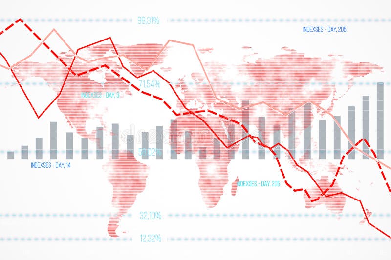
Free with trial Financial data chart featuring declining indexes and bar graphs overlaid on a world map background. Concept of global economic downturn. 3D Rendering. Data analysis decrease illustrations Financial data chart with declining indexes on a world map background. 3D Rendering. Financial data chart featuring declining indexes and bar graphs overlaid on a world map background. Concept of global economic downturn. 3D Rendering
Free with trial Stock market data with candlestick chart and declining arrow on a blurred light background. Concept of financial decline. 3D Rendering. Data analysis decrease illustrations Abstract image of financial stock market data with declining arrow on light background. 3D Rendering. Stock market data with candlestick chart and declining arrow on a blurred light background. Concept of financial decline. 3D Rendering
Free with trial This financial data illustration set features a stack of coins with a dollar sign alongside euro and pound currency stacks on the left, while the right side displays six analytical graphs including a blue downward trend graph, a green upward trend graph, a dual-color bar graph representing growth or decline, a bar graph with a green upward arrow indicating value increase, a pound coin illustration. Data analysis decrease illustrations Set of four financial data illustrations showing currency stacks and business graphs with trends for investment analysis and. This financial data illustration set features a stack of coins with a dollar sign alongside euro and pound currency stacks on the left, while the right side displays six analytical graphs including a blue downward trend graph, a green upward trend graph, a dual-color bar graph representing growth or decline, a bar graph with a green upward arrow indicating value increase, a pound coin illustration
Free with trial A red downward-pointing arrow sits atop a blue bar graph labeled GDP, with white financial data and numbers below on a dark background with a gradient light effect. red, down, arrow. Data analysis decrease illustrations Red down arrow on blue bar graph with g d p text and financial data. A red downward-pointing arrow sits atop a blue bar graph labeled GDP, with white financial data and numbers below on a dark background with a gradient light effect. red, down, arrow
Free with trial A vibrant blue percentage sign with a downward-pointing arrow visually represents a decrease or discount. This image is perfect for illustrating financial loss or reduction. Data analysis decrease vectors Vector art of blue percentage sign with arrow pointing down, indicating decrease, discount, or financial loss in a visually. A vibrant blue percentage sign with a downward-pointing arrow visually represents a decrease or discount. This image is perfect for illustrating financial loss or reduction
Free with trial Four 3D bar graphs with arrows indicating upward and downward trends on white. Clear details and vibrant colors enhance visual. Data analysis decrease illustrations Four 3D Bar Graphs Showing Upward and Downward Trends with Arrows on White Keywords: bar graph, chart, data, statistics, analysis. Four 3D bar graphs with arrows indicating upward and downward trends on white. Clear details and vibrant colors enhance visual
Free with trial A visually striking bar graph illustration depicting both upward and downward trends, set against a clean white background, representing market dynamics and data analysis. Data analysis decrease vectors Vector art of a dynamic bar graph illustration showcasing both upward and downward trends, , symbolizing market fluctuations and. A visually striking bar graph illustration depicting both upward and downward trends, set against a clean white background, representing market dynamics and data analysis
Free with trial Abstract data reduction concept showing declining metrics in a bar chart sequence, perfect for finance analysts and business presentations. This compelling AI-generated visual provides a clear metaphor for optimization, cost-cutting, or efficiency improvements in corporate reporting and digital design projects. Data analysis decrease illustrations Visual decrease in bar chart values indicated by a directional arrow. Abstract data reduction concept showing declining metrics in a bar chart sequence, perfect for finance analysts and business presentations. This compelling AI-generated visual provides a clear metaphor for optimization, cost-cutting, or efficiency improvements in corporate reporting and digital design projects.
Free with trial A shiny gold percentage symbol with a dramatic downward financial graph trend represented in red and blue, emphasizing a decrease in market performance and financial analysis. Perfect for discussions on stock market declines or investment strategies. Data analysis decrease illustrations Gold Percentage Symbol from Upward to Downward Financial Graph Trend. A shiny gold percentage symbol with a dramatic downward financial graph trend represented in red and blue, emphasizing a decrease in market performance and financial analysis. Perfect for discussions on stock market declines or investment strategies.
Free with trial The image displays a bar chart with eight vertical bars of varying heights. Each bar is colored in teal, and there are red arrows pointing downward on top of each bar, suggesting a decrease in the values they represent. The bars are arranged in a slightly irregular pattern, with the tallest bar positioned in the center of the chart. Data analysis decrease illustrations A bar chart with red arrows indicating a downward trend in data values. The image displays a bar chart with eight vertical bars of varying heights. Each bar is colored in teal, and there are red arrows pointing downward on top of each bar, suggesting a decrease in the values they represent. The bars are arranged in a slightly irregular pattern, with the tallest bar positioned in the center of the chart
Free with trial An open notebook displays two pages of business data visualization with a vertical bar graph on the left page featuring green, red, and blue bars alongside a central pie chart divided into red, blue, and green segments showing 70% in red with upward and downward arrows indicating percentage changes, all set against a clean white background ideal for concepts of analytics, financial reporting,. Data analysis decrease illustrations Business data analysis shown in an open notebook with colorful bar graph and pie chart illustrating statistics and percentages. An open notebook displays two pages of business data visualization with a vertical bar graph on the left page featuring green, red, and blue bars alongside a central pie chart divided into red, blue, and green segments showing 70% in red with upward and downward arrows indicating percentage changes, all set against a clean white background ideal for concepts of analytics, financial reporting,
Free with trial The image depicts a city map overlaid with stock market trend lines, illustrating various financial movements. Different colored lines represent upward and downward trends with percentage changes, indicating stock performance or indices across different regions. The visual juxtaposition of financial data against a geographical layout highlights how market movements correlate with specific. Data analysis decrease illustrations Stock market trends and performance analysis on a city map background. The image depicts a city map overlaid with stock market trend lines, illustrating various financial movements. Different colored lines represent upward and downward trends with percentage changes, indicating stock performance or indices across different regions. The visual juxtaposition of financial data against a geographical layout highlights how market movements correlate with specific
Free with trial The image depicts a wooden easel holding a white canvas. On the canvas, there is a red bar graph illustrating a downward trend. The bars decrease in height from left to right, and a red arrow at the top right corner of the graph further emphasizes the downward direction. The overall scene is set against a plain white background, drawing attention to the graph and its message of decline. Data analysis decrease illustrations Decline in data represented by a red downward trend graph on an easel. The image depicts a wooden easel holding a white canvas. On the canvas, there is a red bar graph illustrating a downward trend. The bars decrease in height from left to right, and a red arrow at the top right corner of the graph further emphasizes the downward direction. The overall scene is set against a plain white background, drawing attention to the graph and its message of decline
Free with trial Blue arrow pointing downward on a grid. Business graph with falling trend line. Digital stock market data visualization for investment analysis. Data analysis decrease illustrations Blue arrow pointing downward on a grid. Business graph with falling trend line
Free with trial A vertical bar graph displays monthly service reach statistics with six colored sections representing different months, showing service growth from approximately $20,000 to $30,000 in the first quarter, fluctuations between 1,500 and 2,500 in the second quarter, a decrease followed by slight recovery in service requests during the third quarter, and a significant increase from around 3,500 to 4,. Data analysis decrease illustrations Business growth bar chart showing monthly service reach statistics with colorful data visualization and performance metrics. A vertical bar graph displays monthly service reach statistics with six colored sections representing different months, showing service growth from approximately $20,000 to $30,000 in the first quarter, fluctuations between 1,500 and 2,500 in the second quarter, a decrease followed by slight recovery in service requests during the third quarter, and a significant increase from around 3,500 to 4,
Free with trial Computer screen displaying a simple statistical business graph, perfect for illustrating concepts like data analysis. Data analysis decrease illustrations Computer showing statistical business graph on screen. Computer screen displaying a simple statistical business graph, perfect for illustrating concepts like data analysis
Free with trial This is a 3D rendering of a bar chart depicting a decrease in data. The bars are colored red, blue, and yellow on a transparent backdrop. Data analysis decrease vectors Minimalist chart bars showing decrease trend on transparent background. This is a 3D rendering of a bar chart depicting a decrease in data. The bars are colored red, blue, and yellow on a transparent backdrop.
Free with trial A simple 3D render features four bars of decreasing height, in pink, blue and yellow, on a transparent backdrop. Depicts descending data. Data analysis decrease vectors Colorful 3D bar graph showing declining data on transparent background. A simple 3D render features four bars of decreasing height, in pink, blue and yellow, on a transparent backdrop. Depicts descending data.
Free with trial The image shows a whiteboard with a bar chart illustrating a series of bars that decrease in height. A red downward arrow is drawn over the bars, indicating a decline or negative trend. The whiteboard is set on a simple wooden easel with a small wooden figure on top, emphasizing the visual message of a downward trajectory in data or performance metrics. Data analysis decrease illustrations Declining growth represented by a bar chart with a downward trend arrow. The image shows a whiteboard with a bar chart illustrating a series of bars that decrease in height. A red downward arrow is drawn over the bars, indicating a decline or negative trend. The whiteboard is set on a simple wooden easel with a small wooden figure on top, emphasizing the visual message of a downward trajectory in data or performance metrics
Free with trial Analyzing Financial Data with Glowing Charts and Vibrant Color Bokeh Effect , colorful theme. Data analysis decrease illustrations Analyzing Financial Data with Glowing Charts and Vibrant Color Bokeh Effect
Free with trial Comprehensive vector silhouette icon set featuring essential financial concepts and business analytics. This professional collection includes 3D growth charts, economic downfall trends, global trade networks, magnifying glass market research, currency balance scales, and intersecting risk analysis arrows. Perfect for corporate presentations, fintech applications, stock market reports, banking graphics, and economic data visualization. Clean, high-contrast, and isolated on a pure white background for versatile commercial use. Data analysis decrease vectors Financial Analytics and Global Market Trends Vector Silhouette Icon Set. Comprehensive vector silhouette icon set featuring essential financial concepts and. Comprehensive vector silhouette icon set featuring essential financial concepts and business analytics. This professional collection includes 3D growth charts, economic downfall trends, global trade networks, magnifying glass market research, currency balance scales, and intersecting risk analysis arrows. Perfect for corporate presentations, fintech applications, stock market reports, banking graphics, and economic data visualization. Clean, high-contrast, and isolated on a pure white background for versatile commercial use.
Free with trial Modern business crisis collage witt business analyzing shocking falling stats graph symbolizing global decrease. Data analysis decrease illustrations Modern business crisis collage witt business analyzing shocking falling stats graph symbolizing global decrease
Free with trial Modern business crisis collage witt business analyzing shocking falling stats graph symbolizing global decrease. Data analysis decrease illustrations Modern business crisis collage witt business analyzing shocking falling stats graph symbolizing global decrease
Free with trial A 3D rendered representation of a bar chart displayed within a simplified interface window. The chart features ascending bars in shades of green and a single pink bar at the end, suggesting data and growth. The window has a purple top bar with three colored dots and the text "ISO 1600". The entire graphic floats against a light purple background. Data analysis decrease illustrations 3D Bar Chart with Green and Pink Bars Showing Growth and Data on a Purple Background with ISO 1600 Label. A 3D rendered representation of a bar chart displayed within a simplified interface window. The chart features ascending bars in shades of green and a single pink bar at the end, suggesting data and growth. The window has a purple top bar with three colored dots and the text "ISO 1600". The entire graphic floats against a light purple background
Free with trial Red pie chart with one slice separated showing data division and proportion. Data analysis decrease vectors Red pie chart with one slice separated showing data division and proportion
Free with trial Red pie chart with one slice separated showing data division and proportion. Data analysis decrease vectors Red pie chart with one slice separated showing data division and proportion
Free with trial A detailed financial analysis scene featuring a whiteboard calculator, a magnifying glass hovering over pie charts, and gold coins scattered on documents with bar graphs. This overhead shot on a wooden desk conveys concepts of auditing, investment, and financial planning. This image was generated with the assistance of artificial intelligence. Data analysis decrease illustrations Financial Analysis Calculator, Magnifying Glass, Charts, and Coins on Desk. A detailed financial analysis scene featuring a whiteboard calculator, a magnifying glass hovering over pie charts, and gold coins scattered on documents with bar graphs. This overhead shot on a wooden desk conveys concepts of auditing, investment, and financial planning.This image was generated with the assistance of artificial intelligence.
Free with trial A colorful 3D pie chart, segmented in blue, pink, and teal, is shown against a light purple background. A yellow coin with an upward arrow is positioned above the chart, and a pink coin with a downward arrow is placed beside it. This imagery represents financial data, growth, and decline. Data analysis decrease illustrations Pie Chart with Up and Down Arrows and Coins for Financial Growth graph data. A colorful 3D pie chart, segmented in blue, pink, and teal, is shown against a light purple background. A yellow coin with an upward arrow is positioned above the chart, and a pink coin with a downward arrow is placed beside it. This imagery represents financial data, growth, and decline
Free with trial Magnifying Glass Over Declining Financial Graph, Business Analysis Concept, illustration. Data analysis decrease illustrations Magnifying Glass Over Declining Financial Graph, Business Analysis Concept
Free with trial This image features a bar chart with five bars of varying heights, all in shades of blue. The bars decrease in height from left to right, indicating a downward trend. The first bar is the tallest, and the last bar is the shortest, suggesting a consistent decline in the data values represented. Data analysis decrease illustrations A bar chart showing a decreasing trend in data values over time. This image features a bar chart with five bars of varying heights, all in shades of blue. The bars decrease in height from left to right, indicating a downward trend. The first bar is the tallest, and the last bar is the shortest, suggesting a consistent decline in the data values represented
Free with trial A white line graph icon with three data points is displayed on a dark circular button against a white background. Data analysis decrease illustrations Line Graph Icon on Dark Circular Button with White Background chart data. A white line graph icon with three data points is displayed on a dark circular button against a white background
Free with trial A digital showing the word RISK in blue letters with a downward-pointing arrow, surrounded by stock market charts and data on. Data analysis decrease illustrations Financial risk concept with a glowing blue downward arrow and stock market data generated using ai. A digital showing the word RISK in blue letters with a downward-pointing arrow, surrounded by stock market charts and data on
Free with trial Declining bar chart and red arrow indicating percentage decrease. Represents budget loss, economic downturn, or financial reduction. Data analysis decrease vectors Bar chart declining graph financial percent decrease budget loss concept. Declining bar chart and red arrow indicating percentage decrease. Represents budget loss, economic downturn, or financial reduction
Free with trial The image shows a bar chart with five red bars of decreasing height. Each bar has a downward-pointing arrow above it, indicating a downward trend or decrease in the data represented by the bars. Data analysis decrease illustrations A bar chart with arrows pointing downwards indicating a decreasing trend. The image shows a bar chart with five red bars of decreasing height. Each bar has a downward-pointing arrow above it, indicating a downward trend or decrease in the data represented by the bars
Free with trial An illustration of Bitcoin, cryptocurrency market analysis, growth chart, and blockchain technology, representing digital finance and investment trends. Data analysis decrease vectors Vector art of bitcoin and cryptocurrency market analysis with growth chart and blockchain technology isolated on white background. An illustration of Bitcoin, cryptocurrency market analysis, growth chart, and blockchain technology, representing digital finance and investment trends
Free with trial A vibrant and detailed bar chart with a line graph overlay, showcasing financial data trends over time. The chart features a variety of colors, including shades of green, purple, and blue, with data points marked by small diamond shapes. The background is a dark blue grid, providing a stark contrast to the colorful data visualization. Data analysis decrease illustrations Colorful bar chart and line graph representing financial data trends. A vibrant and detailed bar chart with a line graph overlay, showcasing financial data trends over time. The chart features a variety of colors, including shades of green, purple, and blue, with data points marked by small diamond shapes. The background is a dark blue grid, providing a stark contrast to the colorful data visualization
Free with trial Marketing. A vibrant and modern bar graph with glowing neon colors represents data and business growth. Data analysis decrease illustrations Glowing Bar Graph Data Visualization, Business Growth, Statistics, marketing. marketing. A vibrant and modern bar graph with glowing neon colors represents data and business growth.
Free with trial A line graph displaying a downward trend with a red arrow indicating a significant drop, multiple blue lines represent different data sets. Data analysis decrease illustrations Graph showing a sharp decline in value over time with multiple data lines. A line graph displaying a downward trend with a red arrow indicating a significant drop, multiple blue lines represent different data sets