Free with trial A circular icon with a thick gold border contains a golden DNA helix symbol on a black background. To the right of the DNA helix, two jagged arrows point downwards, indicating a downward trend or decline. The overall design is sleek and symbolic, suggesting concepts related to genetic research, health trends, or scientific data analysis. Data analysis decrease illustrations Golden DNA Helix Icon with Downward Trend Arrows on Black Circle with Gold Border genetics. A circular icon with a thick gold border contains a golden DNA helix symbol on a black background. To the right of the DNA helix, two jagged arrows point downwards, indicating a downward trend or decline. The overall design is sleek and symbolic, suggesting concepts related to genetic research, health trends, or scientific data analysis
Free with trial Colorful data visualization with various charts and graphs. Visual representation of growth and performance metrics, breathtaking wallpaper background Generative AI. Data analysis decrease illustrations Colorful data visualization with various charts and graphs. Visual representation of growth and performance metrics
Free with trial Analyzing the Decline: Understanding the Downward Trend in Graph Data and Its Implications. Data analysis decrease illustrations Analyzing the Decline: Understanding the Downward Trend in Graph Data and Its Implications
Free with trial Red bar chart displays performance metrics on a table ,Generative ai. Data analysis decrease illustrations Red bar chart illustrating performance metrics on a table, data analysis and visualization. Red bar chart displays performance metrics on a table ,Generative ai
Free with trial A 3D illustration of a blue line graph on a light blue background. The graph features a wavy blue line connecting several data points represented by small pink and green spheres. The overall shape suggests fluctuating data or trends, with some points indicating upward movement. Data analysis decrease illustrations 3D Blue Line Graph with Pink and Green Data Points on Light Blue Background chart statistics. A 3D illustration of a blue line graph on a light blue background. The graph features a wavy blue line connecting several data points represented by small pink and green spheres. The overall shape suggests fluctuating data or trends, with some points indicating upward movement
Free with trial A stylized 3D business growth chart depicted against a light blue background. The chart features a blue mountain-like shape representing a peak, with two intersecting lines. One line, marked with pink nodes, shows fluctuations, while another line with green nodes indicates a general upward trend. This visual metaphor conveys concepts of business performance, market trends, and financial analysis. Data analysis decrease illustrations 3D Stylized Business Growth Chart with Red and Green Nodes on Blue Background graph data. A stylized 3D business growth chart depicted against a light blue background. The chart features a blue mountain-like shape representing a peak, with two intersecting lines. One line, marked with pink nodes, shows fluctuations, while another line with green nodes indicates a general upward trend. This visual metaphor conveys concepts of business performance, market trends, and financial analysis
Free with trial Stock market data with various ticker symbols and percentages displayed in red and green. Numbers and letters are overlaid on dark background with a grid pattern. Data analysis decrease illustrations Stock market data with various ticker symbols and percentages displayed in red and green
Free with trial Financial Data Graph With Falling And Rising Lines. Stock Market Volatility. Digital Business. , Generated by AI. Data analysis decrease illustrations Financial Data Graph With Falling And Rising Lines. Stock Market Volatility. Digital Business.
Free with trial Abstract digital illustration featuring blue and red bar charts and line graphs on a dark blue background. Orange and light blue points highlight data trends. The style is clean and modern. Data analysis decrease illustrations Abstract Financial Data Visualization Blue Red Charts Graphs Lines Points finance business. Abstract digital illustration featuring blue and red bar charts and line graphs on a dark blue background. Orange and light blue points highlight data trends. The style is clean and modern
Free with trial This vibrant pyramid stack of 3D cubes, meticulously crafted and isolated against a pristine white background, offers a striking and engaging visual element for business presentations and data storytelling. The gradual decrease in cube size from base to apex creates a compelling visual representation of hierarchical data, making complex information easily digestible for audiences of all. Data analysis decrease illustrations Dynamic 3D Cube Pyramid A Colorful Visual for Data Visualization and Business Presentations. This vibrant pyramid stack of 3D cubes, meticulously crafted and isolated against a pristine white background, offers a striking and engaging visual element for business presentations and data storytelling. The gradual decrease in cube size from base to apex creates a compelling visual representation of hierarchical data, making complex information easily digestible for audiences of all
Free with trial Futuristic financial data visualization with graphs and charts showing growth and market trends. Data analysis decrease illustrations Futuristic financial data visualization with graphs and charts showing growth and market trends
Free with trial Orange Pencil on Paper with Fluctuating Line Graph Representing Business Trends and Analysis, Generated by AI. Data analysis decrease illustrations Orange Pencil on Paper with Fluctuating Line Graph Representing Business Trends and Analysis
Free with trial A colorful bar graph depicting an upward trend with a minor dip, presented as a document icon. The design uses bold colors and clean lines for a modern, data-driven aesthetic. Ideal for presentations or reports. Data analysis decrease illustrations Vibrant Bar Graph on Document Icon: Upward Trend with Slight Dip, Colorful Data Visualization. A colorful bar graph depicting an upward trend with a minor dip, presented as a document icon. The design uses bold colors and clean lines for a modern, data-driven aesthetic. Ideal for presentations or reports
Free with trial Downward arrows set. Financial decline percent. Economic crisis concept. Vector business analysis. EPS 10. Data analysis decrease vectors Downward arrows set. Financial decline percent. Economic crisis concept. Vector business analysis.
Free with trial Decreasing line graphic. Square point Vector. Minimalist progress chart. Data sequence illustration. EPS 10. Data analysis decrease vectors Decreasing line graphic. Square point Vector. Minimalist progress chart. Data sequence illustration.
Free with trial This compelling red zigzag line graph vividly illustrates a downward market trend, offering a concise yet insightful representation of declining stock prices. The dynamic zigzag pattern clearly highlights fluctuations and sharp drops in the data, making it an ideal tool for visualizing market analysis and economic indicators. The falling red line graph effectively communicates the negative. Data analysis decrease illustrations Analyzing a Declining Market Trend Visualizing Falling Stock Prices with a Red Zigzag Line Graph. This compelling red zigzag line graph vividly illustrates a downward market trend, offering a concise yet insightful representation of declining stock prices. The dynamic zigzag pattern clearly highlights fluctuations and sharp drops in the data, making it an ideal tool for visualizing market analysis and economic indicators. The falling red line graph effectively communicates the negative
Free with trial A character is grasping a big red arrow that points downward, symbolizing decline or decrease against a plain white backdrop. Data analysis decrease illustrations Character Holding a Large Red Downward Arrow on a White Background Indicating Decline or Decrease. A character is grasping a big red arrow that points downward, symbolizing decline or decrease against a plain white backdrop
Free with trial A close-up, angled view of a digital stock market ticker board. The screen displays rows of numbers in vibrant red and green LED lights against a dark background. Red numbers typically indicate a price decrease or negative performance, while green signifies an increase or positive performance. The display shows various financial data, including stock prices, trading volumes, and potentially chart lines, creating a dynamic and abstract representation of financial markets and trading. Data analysis decrease illustrations Stock Market Ticker Display with Red and Green Numbers. A close-up, angled view of a digital stock market ticker board. The screen displays rows of numbers in vibrant red and green LED lights against a dark background. Red numbers typically indicate a price decrease or negative performance, while green signifies an increase or positive performance. The display shows various financial data, including stock prices, trading volumes, and potentially chart lines, creating a dynamic and abstract representation of financial markets and trading.
Free with trial Inflation rate graph on digital display vivid data visualization highlighting economic concerns, Generated by AI. Data analysis decrease illustrations Inflation rate graph on digital display vivid data visualization highlighting economic concerns
Free with trial Decreasing line graphic. Circle point Vector. Minimalist growth chart. Data progression illustration. EPS 10. Data analysis decrease vectors Decreasing line graphic. Circle point Vector. Minimalist growth chart. Data progression illustration.
Free with trial A laptop computer showing various graphs and charts representing trend analysis for website traffic, Incorporate trend analysis for website traffic fluctuations. Data analysis decrease illustrations A laptop computer showing various graphs and charts representing trend analysis for website traffic, Incorporate trend analysis
Free with trial Colorful bar graph showing data and trends, perfect for business, finance, or analytics presentations. EPS 10. Data analysis decrease vectors Colorful bar graph showing data and trends, perfect for business, finance, or analytics presentations.
Free with trial This image shows a falling graph behind a diamond, representing the decrease in the value of precious stones. It's suitable for illustrating financial losses. Data analysis decrease vectors Illustration of a falling graph behind a diamond, symbolizing a decrease in the value of precious stones. This image shows a falling graph behind a diamond, representing the decrease in the value of precious stones. It's suitable for illustrating financial losses
Free with trial This vibrant 3D bar chart illustrates upward trending data, perfect for presentations or reports on financial growth, market analysis, or business success. The colorful blocks represent different data points. Data analysis decrease illustrations Colorful 3D Bar Chart Showing Business Growth and Success. This vibrant 3D bar chart illustrates upward trending data, perfect for presentations or reports on financial growth, market analysis, or business success. The colorful blocks represent different data points.
Free with trial Three black, rounded, vertical bars of progressively increasing height are displayed against a clean white background. The bars are smooth and have a matte finish. This visual representation suggests concepts of growth, progress, data analysis, or a simple bar graph. Data analysis decrease illustrations Three black rounded bars of increasing height on a white background bar chart graph. Three black, rounded, vertical bars of progressively increasing height are displayed against a clean white background. The bars are smooth and have a matte finish. This visual representation suggests concepts of growth, progress, data analysis, or a simple bar graph
Free with trial Stock market trading technical analysis bar chart fall. Business candlestick graph exchange down trend. Crisis economy and investment loss graph. Trader financial index crash concept. Eps banner. Data analysis decrease vectors Stock market trading technical analysis bar chart fall. Business candlestick graph exchange down trend. Crisis economy
Free with trial Global tobacco consumption trends illustrated with a world map and data overlays on usage patterns, Generated by AI. Data analysis decrease illustrations Global tobacco consumption trends illustrated with a world map and data overlays on usage patterns
Free with trial Set Financial growth, decrease, Binary code, Cloud download and upload, Folder lock, Server and icon. Vector. Data analysis decrease illustrations Set Financial growth, decrease, Binary code, Cloud download and upload, Folder lock, Server and icon. Vector
Free with trial Stock market chart analysis displayed on computer screen showing growth and performance ,Generative ai. Data analysis decrease illustrations Stock market analysis chart displayed on computer screen showing growth and investment performance. Stock market chart analysis displayed on computer screen showing growth and performance ,Generative ai
Free with trial Stock market chart displaying a transition from a downturn to a bullish trend. Red candlesticks indicate a declining phase, followed by green candlesticks showing upward movement. The grid and digital interface feature blue and orange function buttons surrounding the chart. The setup appears designed for financial analysis, illustrating market behavior for reports or presentations. Data analysis decrease illustrations Dynamic stock market chart showing bullish trend after downturn for financial analysis reports and presentations. Stock market chart displaying a transition from a downturn to a bullish trend. Red candlesticks indicate a declining phase, followed by green candlesticks showing upward movement. The grid and digital interface feature blue and orange function buttons surrounding the chart. The setup appears designed for financial analysis, illustrating market behavior for reports or presentations.
Free with trial Bar chart with arrow pointing down, illustrating economic decline, business loss, or negative trend data. Data analysis decrease vectors Bar chart with arrow pointing down, illustrating economic decline, business loss, or negative trend data
Free with trial Set line Financial growth decrease, Binary code and icon. Vector. Data analysis decrease illustrations Set line Financial growth decrease, Binary code and icon. Vector
Free with trial This sales graph clearly illustrates a concerning downward trend. The visualization displays a significant decline in sales figures over a specified period, potentially indicating a market downturn or other factors impacting business performance. Careful analysis of this data is crucial for understanding the underlying causes. Are sales decreasing across all product lines or specific segments. Data analysis decrease illustrations Analyzing Declining Sales Trends A Deep Dive into Market Performance and Potential Recovery Strategies. This sales graph clearly illustrates a concerning downward trend. The visualization displays a significant decline in sales figures over a specified period, potentially indicating a market downturn or other factors impacting business performance. Careful analysis of this data is crucial for understanding the underlying causes. Are sales decreasing across all product lines or specific segments
Free with trial Illustration of a graph showing the growth of the indian rupee in the stock market. the image represents investment, financial analysis and currency exchange rates in the indian economy. the graph shows an upward trend. Data analysis decrease illustrations Indian rupee stock market investment graph chart financial growth and currency exchange rate analysis. illustration of a graph showing the growth of the indian rupee in the stock market. the image represents investment, financial analysis and currency exchange rates in the indian economy. the graph shows an upward trend.
Free with trial A digital representation of quality and cost metrics in the business world, emphasizing strategy and analysis through upward and downward arrows in a modern setting. Qubit. Data analysis decrease illustrations Digital hand showcasing quality and cost metrics with upward and downward arrows, representing analysis, strategy, and. A digital representation of quality and cost metrics in the business world, emphasizing strategy and analysis through upward and downward arrows in a modern setting. Qubit
Free with trial A red stock market crash chart showing a significant financial downturn. This image represents a recession, bear market, and investment losses, highlighting a negative trend analysis. Data analysis decrease illustrations Stock market crash chart red background financial crisis recession bear market investment loss trend analysis. A red stock market crash chart showing a significant financial downturn. This image represents a recession, bear market, and investment losses, highlighting a negative trend analysis.
Free with trial Two sets of three dimensional bar charts. One set shows ascending bars in light colors, shows bars in yellow, beige with decreasing trend. Visual representation aids in data analysis. Data analysis decrease illustrations Two sets of three dimensional bar charts. One set shows ascending bars in light colors, shows bars in yellow, beige with
Free with trial This image features six black bar chart icons with red and green arrows showing increase, decrease, and uncertainty trends. It is a clear, simple vector for business or data visuals, informative and clean. Generative AI. Data analysis decrease vectors Set of six vector bar chart icons with arrows indicating trends and question mark in black and colored design elements. This image features six black bar chart icons with red and green arrows showing increase, decrease, and uncertainty trends. It is a clear, simple vector for business or data visuals, informative and clean. Generative AI
Free with trial A bear in a business suit sitting at a desk surrounded by stock market monitors displaying financial data, symbolizing bearish market trends and investment risks. Generative AI. Data analysis decrease illustrations A bear in a business suit sitting at a desk surrounded by stock market monitors displaying financial data, symbolizing bearish
Free with trial Person analyses stock market trends on mobile phone. Investor views financial data on smartphone display. Stock charts display, market fluctuations. Businessman tracks investment. Data analysis decrease illustrations Person analyses stock market trends on mobile phone. Investor views financial data on smartphone display. Stock charts display
Free with trial Colorful Bar Graph Showing Decrease with a Yellow Arrow Signifying a Downward Trend in Financial Performance. Data analysis decrease vectors Colorful Bar Graph Showing Decrease with a Yellow Arrow Signifying a Downward Trend in Financial Performance
Free with trial Market crash analysis, businessman analyst using magnifying glass to look at red arrow on crash chart. Data analysis decrease vectors Market crash analysis, businessman analyst using magnifying glass to look at red arrow on crash chart
Free with trial Abstract bar graph chart background representing stock market trade growth and financial investment success ideal for business analysis economic data visualization and corporate finance concept designs. Data analysis decrease illustrations Abstract bar graph chart stock market trade background showing upward growth financial investment concept. Abstract bar graph chart background representing stock market trade growth and financial investment success ideal for business analysis economic data visualization and corporate finance concept designs
Free with trial Bar Chart With Downward Trend Line Icon. Financial Decline, Economic Recession, And Market Analysis Outline Symbol. Business Performance Tracking. Editable Stroke. Isolated Vector Illustration. Data analysis decrease vectors Bar Chart With Downward Trend Line Icon. Financial Decline, Economic Recession, And Market Analysis Outline Symbol
Free with trial Hand interacting with a projected bar chart on a wall, exploring data visualization ,Generative ai. Data analysis decrease illustrations Data visualization, hand engages with interactive bar chart projected on wall, exploring trends and insights. Hand interacting with a projected bar chart on a wall, exploring data visualization ,Generative ai
Free with trial Bar Chart With Downward Trend Line Solid Icon. Financial Decline, Economic Downturn, And Market Analysis Silhouette Symbol. Business Performance Tracking. Isolated Vector Illustration. Data analysis decrease vectors Bar Chart With Downward Trend Line Solid Icon. Financial Decline, Economic Downturn, And Market Analysis Silhouette
Free with trial Descending Graph Depicts a Clear Downward Trend in Business Financial Analysis and Loss Indicating Recession. Data analysis decrease vectors Descending Graph Depicts a Clear Downward Trend in Business Financial Analysis and Loss Indicating Recession
Free with trial A hand with a pen analyzes financial charts on a digital screen, highlighting investment trends, market analysis, and economic growth using visual representation of performance. Data analysis decrease illustrations Analyzing financial data with pen on digital screen, showing investment trends and growth. Chart displays performance. A hand with a pen analyzes financial charts on a digital screen, highlighting investment trends, market analysis, and economic growth using visual representation of performance
Free with trial 3D render of red and white candlestick chart with percentage symbols, symbolizing financial market analysis, stock trading, cryptocurrency, and investment trends in a modern style. Data analysis decrease illustrations 3D render of red and white candlestick chart with percentage symbols, symbolizing financial market analysis, stock trading
Free with trial This compelling data visualization showcases a remarkable success story in optimizing website performance. Through insightful charts and graphs, the image reveals a significant decrease in bounce rates, a key indicator of user engagement. The visual narrative effectively communicates the positive impact of strategic website improvements, such as user-friendly navigation, compelling content, and. Data analysis decrease illustrations Boosting Website Engagement A Data Visualization Success Story Unveiling Low Bounce Rates and Increased User. This compelling data visualization showcases a remarkable success story in optimizing website performance. Through insightful charts and graphs, the image reveals a significant decrease in bounce rates, a key indicator of user engagement. The visual narrative effectively communicates the positive impact of strategic website improvements, such as user-friendly navigation, compelling content, and
Free with trial A green flag waving above pink descending bar chart symbolizing decline or loss in data visualization. Generative AI. Data analysis decrease illustrations Green flag waving above pink descending bar chart symbolizing decline or loss in data visualization
Free with trial A bar graph showing a downward trend, with red and blue bars against a dark background. it represents a financial downturn, economic recession, or stock market crash. data analysis is key to understanding the trends. Data analysis decrease illustrations Stock market crash graph downtrend chart financial crisis economic recession business failure investment loss. a bar graph showing a downward trend, with red and blue bars against a dark background. it represents a financial downturn, economic recession, or stock market crash. data analysis is key to understanding the trends
Free with trial Market trend icon in comic style. Decline arrow with magnifier cartoon vector illustration on isolated background. Decrease splash effect business concept. Data analysis decrease vectors Market trend icon in comic style. Decline arrow with magnifier cartoon vector illustration on isolated background. Decrease splash
Free with trial Decreasing bar graph illustration simple hand drawn financial decline, negative trend analysis chart with arrow axes, AI. Data analysis decrease vectors Decreasing bar graph illustration simple hand drawn financial decline, negative trend analysis chart with arrow axes, AI
Free with trial Hand interacting with a declining chart, symbolizing market trends and financial analysis ,Generative ai. Data analysis decrease illustrations Declining chart and hand interaction, visualizing market trends financial analysis for strategic decisionmaking. Hand interacting with a declining chart, symbolizing market trends and financial analysis ,Generative ai
Free with trial Analyzing the Decline: Understanding the Downward Trend in Graph Data and Its Implications. Data analysis decrease illustrations Analyzing the Decline Understanding the Downward Trend in Graph Data and Its Implications
Free with trial This vector illustration depicts a descending bar graph, representing decline and negative trends. It is suitable for financial reports, business analysis, and presentations. Data analysis decrease vectors Illustration of a descending bar graph, , representing decline, decrease, and negative trends in business or finance. This vector illustration depicts a descending bar graph, representing decline and negative trends. It is suitable for financial reports, business analysis, and presentations
Free with trial Set line Browser window, Online shopping on screen, Financial growth decrease, with shield, setting and icon. Vector. Data analysis decrease vectors Set line Browser window, Online shopping on screen, Financial growth decrease, with shield, setting and icon. Vector
Free with trial Analyzing the Decline: Understanding the Downward Trend in Graph Data and Its Implications. Data analysis decrease illustrations Analyzing the Decline Understanding the Downward Trend in Graph Data and Its Implications
Free with trial This vibrant bar chart infographic is a powerful tool for communicating complex data in a clear and engaging way. Ideal for business presentations, reports, and marketing materials, this visually appealing design highlights key performance indicators and trends. The clean, modern aesthetic ensures your message stands out, while the colorful bars and clear labels make understanding the statistics. Data analysis decrease illustrations Colorful Bar Chart Infographic Diagram A Modern Effective Data Visualization Template for Business Presentations. This vibrant bar chart infographic is a powerful tool for communicating complex data in a clear and engaging way. Ideal for business presentations, reports, and marketing materials, this visually appealing design highlights key performance indicators and trends. The clean, modern aesthetic ensures your message stands out, while the colorful bars and clear labels make understanding the statistics
Free with trial A simple yet effective hand-drawn red arrow pointing downwards. This vector graphic is ideal for various applications, from presentations and websites to marketing materials. Its clean design makes it easily adaptable to different projects, conveying decline, decrease, or negative trends clearly and concisely. Perfect for illustrating data, showcasing negative growth, or simply adding a visual cue to your design. The minimalist aesthetic ensures versatility across diverse design styles. Data analysis decrease illustrations Hand Drawn Red Down Arrow: Simple, Clean Vector Graphic for Presentations, Websites, and Marketing Materials. Perfect. A simple yet effective hand-drawn red arrow pointing downwards. This vector graphic is ideal for various applications, from presentations and websites to marketing materials. Its clean design makes it easily adaptable to different projects, conveying decline, decrease, or negative trends clearly and concisely. Perfect for illustrating data, showcasing negative growth, or simply adding a visual cue to your design. The minimalist aesthetic ensures versatility across diverse design styles.
Free with trial Abstract red line chart graphic shows market decline. Digital data screen displays, finance failure. Economy drops down. Background bokeh lights. Data analysis decrease illustrations Abstract red line chart graphic shows market decline. Digital data screen displays finance failure. Economy drops down. Abstract red line chart graphic shows market decline. Digital data screen displays, finance failure. Economy drops down. Background bokeh lights.
Free with trial Digital financial chart displays rising falling stock market data. Dynamic investment data visualization shows fluctuating market trends. Abstract financial interface with glowing. Data analysis decrease illustrations Digital financial chart displays rising, falling stock market data. Dynamic investment data visualization shows fluctuating. Digital financial chart displays rising falling stock market data. Dynamic investment data visualization shows fluctuating market trends. Abstract financial interface with glowing.
Free with trial Businessman Choosing Cost Reduction Strategies through Digital Technologies and Visual Data Representation for Enhanced Profitability and Efficiency Quark. Data analysis decrease illustrations Businessman Choosing Cost Reduction Strategies through Digital Technologies and Visual Data Representation for Enhanced. Profitability and Efficiency Quark
Free with trial Russian flag overlaid with a stock market chart featuring a candlestick graph. The chart indicates a fluctuating, predominantly downward trend, with multicolored candlesticks suggesting market volatility. The flag's colors�white, blue, and red�are visible, merging with the financial data. Horizontal lines denote different price levels, providing context for the market analysis. This visual combination suggests an economic analysis of the Russian market, with an emphasis on its performance trends. Data analysis decrease illustrations Russia Stock Market Chart. Russia Flag With Stock Market Data Chart, Trading Graph. Candlestick Chart With Falling Trend. Russian flag overlaid with a stock market chart featuring a candlestick graph. The chart indicates a fluctuating, predominantly downward trend, with multicolored candlesticks suggesting market volatility. The flag's colors�white, blue, and red�are visible, merging with the financial data. Horizontal lines denote different price levels, providing context for the market analysis. This visual combination suggests an economic analysis of the Russian market, with an emphasis on its performance trends.
Free with trial Sugar cubes pile sits before financial chart screen with market data. Concept of commodity trading, investment in sugar prices. Stock exchange graph shows futures rise, fall. Data analysis decrease illustrations Sugar cubes pile sits before financial chart screen with market data. Concept of commodity trading, investment in sugar prices.
Free with trial BSC Balanced Scorecard infographic template with round vertical box container gradually decrease on right column dark background style with 4 point for slide presentation vector. Data analysis decrease illustrations BSC Balanced Scorecard infographic template with round vertical box container gradually decrease on right column dark background
Free with trial Infographic world map with charts, graphs, and data visualizations for business reports, presentations, and website content, vibrant background Generative AI. Data analysis decrease illustrations Infographic world map with charts, graphs, and data visualizations for business reports, presentations, and website content
Free with trial A set of hand-drawn financial graph and chart icons. These icons are suitable for business analysis, investment strategies, and economic growth presentations. Data analysis decrease vectors Vector art of hand drawn financial graph and chart icons for business analysis, investment, and economic growth in vector format. A set of hand-drawn financial graph and chart icons. These icons are suitable for business analysis, investment strategies, and economic growth presentations
Free with trial Set Financial growth decrease Magnifying glass with check mark Graph chart infographic Search engine Website stocks market Browser shield window and Mobile phone icon. Vector. Data analysis decrease illustrations Set Financial growth decrease, Magnifying glass with check mark, Graph chart infographic, Search engine, Website stocks. Set Financial growth decrease Magnifying glass with check mark Graph chart infographic Search engine Website stocks market Browser shield window and Mobile phone icon. Vector.
Free with trial Stock market chart shows fluctuating data with traders in the background. Growing intensity in the economic environment. no focus. Data analysis decrease illustrations Stock market chart shows fluctuating data with traders in the background. Growing intensity in the economic environment. no focus
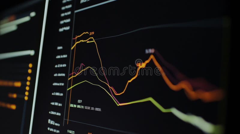
Free with trial This compelling data visualization showcases a clear downward trend, perfect for illustrating declining performance, market share, or other metrics. The dark background provides a striking contrast to the graph's lines, emphasizing the trend's trajectory. The visual clarity makes it an excellent tool for conveying complex information effectively, whether for internal reports, presentations to. Data analysis decrease illustrations Visualizing Declining Trends A Dark Night Graph Depicts a Downward Trajectory in Data Ideal for Reports Presentations. This compelling data visualization showcases a clear downward trend, perfect for illustrating declining performance, market share, or other metrics. The dark background provides a striking contrast to the graph's lines, emphasizing the trend's trajectory. The visual clarity makes it an excellent tool for conveying complex information effectively, whether for internal reports, presentations to
Free with trial Set line Financial growth decrease Cloud computing lock and Pie chart infographic with long shadow. Red square button. Vector. Data analysis decrease vectors Set line Financial growth, decrease, Cloud computing lock and Pie chart infographic with long shadow. Red square button
Free with trial Data funnel filtering process showing percentage drop in prices or conversion rate on isolated black and white design. Data analysis decrease vectors Data funnel filtering process showing percentage drop in prices or conversion rate on isolated black and white design
Free with trial The image captures a close-up view of someone examining financial charts on a screen, possibly for making trading or investment decisions, emphasizing the data-driven nature of finance. Data analysis decrease illustrations A person analyzing financial market charts on a screen, possibly for investment or trading decisions. Data-driven finance concept. The image captures a close-up view of someone examining financial charts on a screen, possibly for making trading or investment decisions, emphasizing the data-driven nature of finance
Free with trial Abstract 3D blue graph representing market data fluctuations over time, showing peaks and valleys on a financial report, detailed background Generative AI. Data analysis decrease illustrations Abstract 3D blue graph representing market data fluctuations over time, showing peaks and valleys on a financial report
Free with trial A 3D representation of a document displaying a bar chart and a dotted line graph, indicating data trends and analysis. A small, rounded icon featuring a landscape with mountains and a sun is placed ab. Data analysis decrease illustrations 3d infographic showing a document with a bar chart and line graph, alongside a small image icon, isolated on white background. A 3D representation of a document displaying a bar chart and a dotted line graph, indicating data trends and analysis. A small, rounded icon featuring a landscape with mountains and a sun is placed ab
Free with trial Person using smartphone for stock trading. Mobile phone displays financial data charts. Hands actively interact with screen. Market trends shown in background. Businessman investor. Data analysis decrease illustrations Person using smartphone for stock trading. Mobile phone displays financial data, charts. Hands actively interact with screen. Person using smartphone for stock trading. Mobile phone displays financial data charts. Hands actively interact with screen. Market trends shown in background. Businessman investor.
Free with trial Person holding tablet displaying globe with eco data charts. Sustainable tech used for global investment strategy corporate responsibility in environmental governance. Data visualization. Data analysis decrease illustrations Person holding tablet displaying globe with eco data charts. Sustainable tech used for global investment strategy, corporate. Person holding tablet displaying globe with eco data charts. Sustainable tech used for global investment strategy corporate responsibility in environmental governance. Data visualization.
Free with trial Person viewing digital globe on tablet eco-friendly investment strategy data. Sustainable development information displayed on digital screen. Green plants eco-conscious workplace. Data analysis decrease illustrations Person viewing digital globe on tablet eco-friendly investment strategy data. Sustainable development information displayed on