Free with trial Collage with person observing rising arrow symbolizing startup growth business income statistics trading decrease increase. Data analysis decrease illustrations Collage with person observing rising arrow symbolizing startup growth business income statistics trading decrease
Free with trial This bar graph on a computer screen illustrates progress or growth, providing a visual representation of data for analysis and decision-making processes. Data analysis decrease vectors Vector art of a bar graph is displayed on a computer screen, showing the progress of a project or the growth of a company. This bar graph on a computer screen illustrates progress or growth, providing a visual representation of data for analysis and decision-making processes
Free with trial A professional set of icons depicting various data chart types, including exponential growth, volatility, and linear trends for business analytics and reporting. Data analysis decrease illustrations Collection of professional data graph icons illustrating different growth patterns and financial statistics trends. a professional set of icons depicting various data chart types, including exponential growth, volatility, and linear trends for business analytics and reporting
Free with trial The image displays two sets of vertical bars, one in green and one in red, each accompanied by arrows indicating trends. The green bars show an initial decrease followed by an increase, while the red bars show an initial increase followed by a decrease. The visual is labeled 'Word 100' at the bottom right, potentially indicating a specific data point or category. Data analysis decrease illustrations Comparison of increasing and decreasing bar trends in a visual chart labeled word 100. The image displays two sets of vertical bars, one in green and one in red, each accompanied by arrows indicating trends. The green bars show an initial decrease followed by an increase, while the red bars show an initial increase followed by a decrease. The visual is labeled 'Word 100' at the bottom right, potentially indicating a specific data point or category
Free with trial The image shows a person holding a tablet displaying a bar chart with two distinct data sets, one in red and one in blue, indicating a comparison of metrics or trends. The person appears to be in an office environment, possibly analyzing financial or business data, suggesting a focus on performance metrics or market analysis. Data analysis decrease illustrations Professional analyzing financial growth trends on a digital tablet in an office setting. The image shows a person holding a tablet displaying a bar chart with two distinct data sets, one in red and one in blue, indicating a comparison of metrics or trends. The person appears to be in an office environment, possibly analyzing financial or business data, suggesting a focus on performance metrics or market analysis
Free with trial Decrease bar chart icon set. Market crash illustration concept. Data analysis decrease vectors Decrease bar chart icon set. Market crash concept. Decrease bar chart icon set. Market crash illustration concept
Free with trial A businessman in a suit is intently working on a laptop, analyzing financial data displayed with charts and graphs, including a prominent red percentage symbol and a downward-pointing arrow, indicating a decline in performance or value. Data analysis decrease illustrations Businessman Analyzing Financial Data with Decreasing Percentage and Bar Graphs on Laptop. A businessman in a suit is intently working on a laptop, analyzing financial data displayed with charts and graphs, including a prominent red percentage symbol and a downward-pointing arrow, indicating a decline in performance or value
Free with trial Colorful bar chart graph with long shadow in circular background represents data analytics. Data analysis decrease vectors Colorful bar chart graph with long shadow in circular background represents data analytics
Free with trial Decrease bar chart icon on black circle. Statistic sign symbol illustration. Data analysis decrease vectors Decrease bar chart icon on black circle. Statistic sign symbol
Free with trial This is an detailed assembly of essential outline icons for business strategy, data visualization, and planning. Data analysis decrease vectors Essential business strategy and data visualization tools in professional outline style. This is an detailed assembly of essential outline icons for business strategy, data visualization, and planning
Free with trial A person's hand is reaching out towards a holographic display that shows various financial data charts and an infinity symbol, representing continuous growth and success in the financial market. Data analysis decrease illustrations Hand interacting with a holographic display showing financial data and an infinity symbol. A person's hand is reaching out towards a holographic display that shows various financial data charts and an infinity symbol, representing continuous growth and success in the financial market
Free with trial Decrease bar chart icon in generic style. Statistic sign symbol illustration. Data analysis decrease vectors Decrease bar chart icon in generic style. Statistic sign symbol
Free with trial Modern graphic business charts set featuring financial growth and decline for data visualization. Data analysis decrease vectors Modern graphic business charts set featuring financial growth and decline for data visualization
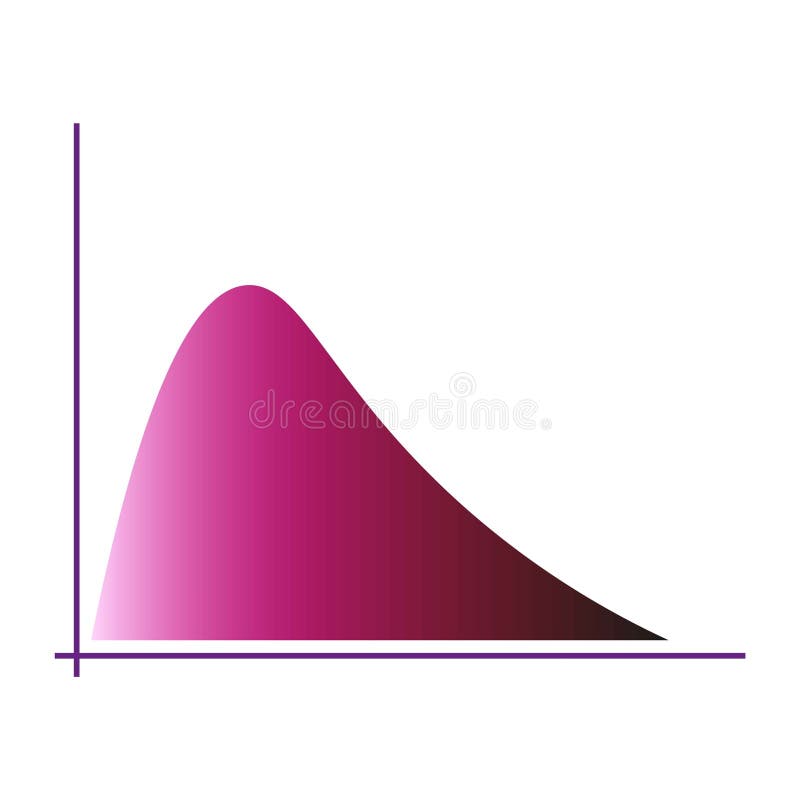
Free with trial Gradient curve chart. Pink color distribution. Graphical data visualization. Modern vector graphic. EPS 10. Data analysis decrease vectors Gradient curve chart. Pink color distribution. Graphical data visualization. Modern vector graphic.
Free with trial The image displays a grid of twelve different statistical graphs and charts, each representing various data trends and distributions. The graphs include line charts, bar charts, and area charts, each showcasing unique data patterns. Some graphs show fluctuating data points, while others illustrate steady increases or decreases. The bar charts present different frequencies and distributions. Data analysis decrease illustrations Collection of various statistical graphs and charts illustrating data trends and distributions. The image displays a grid of twelve different statistical graphs and charts, each representing various data trends and distributions. The graphs include line charts, bar charts, and area charts, each showcasing unique data patterns. Some graphs show fluctuating data points, while others illustrate steady increases or decreases. The bar charts present different frequencies and distributions.
Free with trial Minimalist 3D bar chart with colorful pastel blocks representing data on a clean white background. Data analysis decrease illustrations Minimalist 3D bar chart with colorful pastel blocks representing data on a clean white background
Free with trial A man is presenting business data on a whiteboard, using a laptop. The chart shows growth and success. He is explaining the strategy and planning to his colleagues. Data analysis decrease illustrations Man presenting business data on a whiteboard isolated on white background. A man is presenting business data on a whiteboard, using a laptop. The chart shows growth and success. He is explaining the strategy and planning to his colleagues
Free with trial A businessman analyzes a declining business showing financial loss. He uses a laptop to study financial data charts illustrating a downward trend and falling figures. This image effectively conveys concepts of failure, risk, and economic decline, suitable for business and finance publications. Data analysis decrease illustrations Businessman analyzing declining business performance using laptop and financial data charts. A businessman analyzes a declining business showing financial loss. He uses a laptop to study financial data charts illustrating a downward trend and falling figures. This image effectively conveys concepts of failure, risk, and economic decline, suitable for business and finance publications
Free with trial San Francisco skyline with a financial chart overlay showing red downward trends, glowing data, and buildings in the background, symbolizing market crisis. Data analysis decrease illustrations Double exposure of San Francisco skyline and financial stock market chart with red downward trend, glowing data points, and. San Francisco skyline with a financial chart overlay showing red downward trends, glowing data, and buildings in the background, symbolizing market crisis
Free with trial The image shows two arrows, one red with a downward direction and a percentage symbol indicating a decrease, and another green with an upward direction and a percentage symbol indicating an increase. These visuals are commonly used to represent opposing trends, such as declines and rises in data like stock prices, economic indicators, or performance metrics. Data analysis decrease illustrations Opposing trends represented by percentage change indicators with upward and downward arrows. The image shows two arrows, one red with a downward direction and a. The image shows two arrows, one red with a downward direction and a percentage symbol indicating a decrease, and another green with an upward direction and a percentage symbol indicating an increase. These visuals are commonly used to represent opposing trends, such as declines and rises in data like stock prices, economic indicators, or performance metrics
Free with trial Set line Financial growth decrease, Graph, chart, diagram and Clock icon. Vector. Data analysis decrease illustrations Set line Financial growth decrease, Graph, chart, diagram and Clock icon. Vector
Free with trial Decrease bar chart icon set on black circle. Market crash illustration concept. Data analysis decrease vectors Decrease bar chart icon set on black circle. Market crash concept. Decrease bar chart icon set on black circle. Market crash illustration concept
Free with trial Computer Screen Showing Downward Trend Graph in Red. Stock Market Decrease and Economic Problems. Data analysis decrease vectors Computer Screen Showing Downward Trend Graph in Red. Stock Market Decrease and Economic Problems
Free with trial Clean vector icon illustrating a declining line graph with push pins, symbolizing data analysis. Data analysis decrease illustrations Line graph decline chart icon. Clean vector icon illustrating a declining line graph with push pins, symbolizing data analysis
Free with trial The image displays a three-dimensional, purple percentage symbol against a plain white background. The symbol appears glossy and modern, likely intended for use in presentations, financial reports, or data visualizations. Data analysis decrease illustrations A sleek purple percentage symbol floating in a white space for financial or data representation. The image displays a three-dimensional, purple percentage symbol against a plain white background. The symbol appears glossy and modern, likely intended for use in presentations, financial reports, or data visualizations
Free with trial The image shows a three-dimensional bar chart with alternating red and green bars, each varying in height. The bars are arranged on a green circular base, suggesting a comparison of data points, possibly financial metrics like stock prices, market performance, or growth analysis. The red bars indicate a decline or negative value, while the green bars suggest an increase or positive value. Data analysis decrease illustrations Colorful 3d bar chart illustration depicting financial market trends or growth metrics. The image shows a three-dimensional bar chart with alternating red and green bars, each varying in height. The bars are arranged on a green circular base, suggesting a comparison of data points, possibly financial metrics like stock prices, market performance, or growth analysis. The red bars indicate a decline or negative value, while the green bars suggest an increase or positive value
Free with trial Close Up of L. E. D. Stock Ticker Showing Market Data Prices and Numbers at Night With Blurred Crowd, Generated by AI. Data analysis decrease illustrations Close Up of L.E.D. Stock Ticker Showing Market Data Prices and Numbers at Night With Blurred Crowd
Free with trial Downward glowing arrow over planet earth. Concept showing global economic crisis or financial downturn. Digital data visualization for business analysis. Data analysis decrease illustrations Downward glowing arrow over planet earth. Concept showing global economic crisis or financial downturn
Free with trial Performance showing colorful graph with magnifying glass and pie chart on white background keywords: graph, chart, data, analytics, statistics. Data analysis decrease illustrations Colorful graph with magnifying glass and pie chart on white background Keywords: graph, chart, data, analytics
Free with trial The image shows a 3D bar graph with blue bars of varying heights. Two large red arrows cross over the graph: one pointing upward to the right, symbolizing growth or increase, and the other pointing downward to the right, symbolizing decline or decrease. This visual metaphor emphasizes conflicting trends or mixed signals in data. Data analysis decrease illustrations Contradictory growth and decline indicators represented by a bar graph with crossed arrows. The image shows a 3D bar graph with blue bars of varying heights. Two large red arrows cross over the graph: one pointing upward to the right, symbolizing growth or increase, and the other pointing downward to the right, symbolizing decline or decrease. This visual metaphor emphasizes conflicting trends or mixed signals in data
Free with trial A striking red downward arrow is prominently placed on a chart highlighting a notable decrease in financial metrics over time suggesting a troubling trend in market analysis. Data analysis decrease illustrations A striking red downward arrow is prominently placed on a chart highlighting a notable decrease in financial metrics over time
Free with trial Iconographic display of economic downturn and business challenges. A black bar graph accompanied by a descending arrow, representing loss, decrease, and negative market trends. Useful for financial reports and risk analysis. Data analysis decrease illustrations Black bar chart with downward arrow signifying financial decline and negative market performance. Iconographic display of economic downturn and business challenges. A black bar graph accompanied by a descending arrow, representing loss, decrease, and negative market trends. Useful for financial reports and risk analysis
Free with trial A hand in a suit holds a magnifying glass over a financial graph showing a downward trend. The graph blue and white bars and a black line indicating a decline in values. The magnifying glass highlights the graph's data points, emphasizing analysis and cost reduction. The background is a dark blue gradient, and the overall style is a clean, flat. Data analysis decrease illustrations Hand holding magnifying glass over downward trending financial graph with cost reduction concept. A hand in a suit holds a magnifying glass over a financial graph showing a downward trend. The graph blue and white bars and a black line indicating a decline in values. The magnifying glass highlights the graph's data points, emphasizing analysis and cost reduction. The background is a dark blue gradient, and the overall style is a clean, flat
Free with trial Financial Market Data, Red Stock Chart Lines over a Cityscape at Night, Business and Finance Concept, Generated by AI. Data analysis decrease illustrations Financial Market Data, Red Stock Chart Lines over a Cityscape at Night, Business and Finance Concept
Free with trial Vibrant abstract visualization of a trendline against a gradient background, ideal for business reports, financial analysis, and creative projects. Data analysis decrease illustrations Abstract Data Visualization of a Trendline with Blue and Pink Background for Business Use. Vibrant abstract visualization of a trendline against a gradient background, ideal for business reports, financial analysis, and creative projects
Free with trial Colorful data charts, graphs, and infographics on white background, illustrating business analytics, breathtaking wallpaper background Generative AI. Data analysis decrease illustrations Colorful data charts, graphs, and infographics on white background, illustrating business analytics
Free with trial Four distinct graphs and charts illustrating various data trends and patterns, each with unique colors and styles. Data analysis decrease illustrations Collection of colorful graphs and charts displaying data trends isolated on transparent background. Four distinct graphs and charts illustrating various data trends and patterns, each with unique colors and styles
Free with trial Illustration of dynamic stock market chart with red fluctuations in dark trading environment. Economic financial volatility, digital data analysis, business concept. Charts reflect. Data analysis decrease illustrations Illustration of dynamic stock market chart with red fluctuations in dark trading environment. Economic financial volatility
Free with trial PNG 3D Bar Chart Data Visualization Business Analytics Performance Metrics Colorful Graph against transparent Background. Data analysis decrease illustrations PNG 3D Bar Chart Data Visualization Business Analytics Performance Metrics Colorful Graph against transparent Background
Free with trial A 3D bar graph with a jagged trend line shows rising data followed by a sudden drop, set against a bright blue background. Data analysis decrease illustrations A 3D bar graph with a jagged trend line shows rising data followed by a sudden drop, set against a bright blue background
Free with trial Futuristic data visualization dashboards with various charts and graphs in purple hues. Data analysis decrease illustrations Futuristic data visualization dashboards
Free with trial A financial chart stock market downtrend red line trading graph investment loss crisis volatility data financial chart stock market downtrend. Data analysis decrease illustrations Financial chart stock market downtrend red line trading graph investment loss crisis volatility data financial chart stock market
Free with trial Line art business trend icons set featuring growth and decline bar charts for financial data visualization. Data analysis decrease vectors Line art business trend icons set featuring growth and decline bar charts for financial data visualization
Free with trial A minimalist illustration showing a decreasing bar graph with an arrow, and a magnifying glass over a dollar sign. Flat style with grey and orange. Data analysis decrease vectors Economic Downturn and Financial Analysis: Decrease Graph with Magnifying Glass Over Dollar Sign. A minimalist illustration showing a decreasing bar graph with an arrow, and a magnifying glass over a dollar sign. Flat style with grey and orange.
Free with trial A magnifying glass hovers over a grid paper background displaying two line graphs, one red and one blue. The red graph a general upward trend with several peaks and valleys, while the blue graph a downward trend. The magnifying glass focuses on a prominent red upward arrow within the red graph, highlighting an increase. Data analysis decrease illustrations Magnifying glass over red and blue upward and downward trending graphs on grid paper chart data analysis. A magnifying glass hovers over a grid paper background displaying two line graphs, one red and one blue. The red graph a general upward trend with several peaks and valleys, while the blue graph a downward trend. The magnifying glass focuses on a prominent red upward arrow within the red graph, highlighting an increase
Free with trial Yellow business trend line graph shows financial decline, revenue decrease with white arrow pointing downward, market fall concept. Data analysis decrease illustrations Yellow business trend line graph shows financial decline, revenue decrease with white arrow pointing downward
Free with trial Business Concept of Quality and Cost Management with Graphs Showing Increase and Decrease Percentages in Professional Setting. Qubit. Data analysis decrease illustrations Business Concept of Quality and Cost Management with Graphs Showing Increase and Decrease Percentages in Professional
Free with trial Neobrutalism infographic design for presenting marketing and business data percentages. Minimalistic graphics with decorative elements creates an engaging and informative layout. Data analysis decrease vectors Neobrutalism infographic design for presenting marketing and business data percentages. Minimalistic graphics with
Free with trial A man is presenting business data on a whiteboard, using a laptop. He is explaining the chart and graph to his colleagues. The scene is set in an office. Data analysis decrease illustrations Man presenting business data on a whiteboard with laptop isolated on white background. A man is presenting business data on a whiteboard, using a laptop. He is explaining the chart and graph to his colleagues. The scene is set in an office
Free with trial This abstract image represents detailed data visualization of financial market trends featuring line graphs and bar charts on a dark backdrop. Data analysis decrease illustrations Abstract Data Visualization of Financial Market Trends with Line Graph and Bar Chart on Dark Background. This abstract image represents detailed data visualization of financial market trends featuring line graphs and bar charts on a dark backdrop
Free with trial A visual representation of a stock market crash, showcasing a downward trend with a red line and bar graph, indicating financial loss and economic downturn. it is a risk analysis chart. Data analysis decrease illustrations Stock market crash graph, financial analysis, investment risk, economic downturn, recession chart, loss trend. a visual representation of a stock market crash, showcasing a downward trend with a red line and bar graph, indicating financial loss and economic downturn. it is a risk analysis chart.
Free with trial Four distinct 3D graphs illustrating different data trends and representations, featuring upward and downward movements. Data analysis decrease illustrations Collection of 3d graphs showing various trends and data representations isolated on transparent background. Four distinct 3D graphs illustrating different data trends and representations, featuring upward and downward movements
Free with trial A hopeful medical technology science displays weight loss and glucose level data charts showing healthcare progress with syringe. Data analysis decrease illustrations Hopeful medical technology science displays weight loss and glucose level data charts showing healthcare progress with syringe
Free with trial Vibrant data visualization featuring bar and line graphs, sun icon, and descending trend lines against a stark black background in a flat style. Data analysis decrease vectors Colorful data visualization with bar graphs, line graph, sun icon, and descending trends on a black background. Vibrant data visualization featuring bar and line graphs, sun icon, and descending trend lines against a stark black background in a flat style.
Free with trial Dynamic grid of fluctuating stock prices and financial data with columns and rows showing the volatile market changes in green and red creating a high-tech abstract visualization. Data analysis decrease illustrations Abstract data visualization of stock market prices and financial data in rows and columns with price changes in green and red. Dynamic grid of fluctuating stock prices and financial data with columns and rows showing the volatile market changes in green and red creating a high-tech abstract visualization
Free with trial Document is being analyzed with a bar graph and pie chart representing market data. Data analysis decrease vectors Document with charts showing market analysis and financial report. Document is being analyzed with a bar graph and pie chart representing market data
Free with trial Laptop screen with two graphs showing opposite trends. Perfect for illustrating financial data, market analysis, business statistics in presentations. Data analysis decrease illustrations Laptop screen with two graphs showing opposite trends.
Free with trial Hand Drawn Pink Bar Chart Illustration Showing Rise and Fall of Data Trends with Arrows Symbolizing Up and Down Fluctuations. Data analysis decrease vectors Hand Drawn Pink Bar Chart Illustration Showing Rise and Fall of Data Trends with Arrows Symbolizing Up and Down Fluctuations
Free with trial Simplified icon-style illustration of a business professional with financial reports and data on a black backdrop in a modern flat vector style. Data analysis decrease vectors Business professional and financial data presented with a simplified stylized illustration on a black background. Simplified icon-style illustration of a business professional with financial reports and data on a black backdrop in a modern flat vector style.
Free with trial A close-up shot shows a businessman in a suit using a marker to draw a sharp downward trend line over a bar graph, symbolizing significant cost reduction and a decrease in percentage. Data analysis decrease illustrations Businessman drawing a downward trend graph indicating cost reduction and percentage decrease with a marker background image. A close-up shot shows a businessman in a suit using a marker to draw a sharp downward trend line over a bar graph, symbolizing significant cost reduction and a decrease in percentage
Free with trial Golden coin stacks decrease in height. Red arrow shows downward trend. Financial loss and economic downturn illustration. Minimalist design depicts, budget cut. Data analysis decrease illustrations Golden coin stacks decrease in height. Red arrow shows downward trend. Financial loss and economic downturn illustration.
Free with trial The image displays an abstract graph illustrating fluctuating growth trends with associated data points and bar charts representing additional metrics. Data analysis decrease illustrations Abstract Graph Showing Growth and Data Trends. The image displays an abstract graph illustrating fluctuating growth trends with associated data points and bar charts representing additional metrics
Free with trial Smartphone displaying a downward trending line graph, depicting recession and economic downturn, business analysis, digital information. Data analysis decrease vectors Smartphone displaying a downward trending line graph, depicting recession and economic downturn, business analysis, digital
Free with trial This image features multiple percentage decrease icons, symbolizing rate reduction, financial loss, and economic downturn, presented in a minimalist design on white. Data analysis decrease vectors Vector art of multiple percentage decrease icons, , representing rate reduction, financial loss, and economic downturn in a. This image features multiple percentage decrease icons, symbolizing rate reduction, financial loss, and economic downturn, presented in a minimalist design on white
Free with trial Decrease and increase arrows. Red down arrow and green up arrow side by side. Business growth and decline concept. Financial trends represented. Market fluctuation. Data analysis decrease illustrations Red down arrow and green up arrow symbolizing decrease and increase on white background. Decrease and increase arrows. Red down arrow and green up arrow side by side. Business growth and decline concept. Financial trends represented. Market fluctuation
Free with trial This image features financial analysis and cryptocurrency icons, including money, calculator, bear market, graphs, bitcoin, and a digital display, all in one place. Data analysis decrease vectors Vector art of financial analysis and cryptocurrency icons, featuring money, calculator, bear market, graphs, bitcoin, and digital. This image features financial analysis and cryptocurrency icons, including money, calculator, bear market, graphs, bitcoin, and a digital display, all in one place
Free with trial A vibrant illustration of a bar graph with arrows, representing financial trends and market analysis. The image conveys economic performance and business insights. Data analysis decrease vectors Vector art of colorful bar graph with arrows indicating growth and decline, symbolizing financial trends, market analysis, and. A vibrant illustration of a bar graph with arrows, representing financial trends and market analysis. The image conveys economic performance and business insights
Free with trial This image showcases a businessman illustrating the concept of cost reduction and profit growth holding graphic elements that represent financial data analysis market performance and strategic planning The composition suggests a focus on improving business outcomes through careful financial management and investment decisions leading to increased profitability and overall success in competitive. Data analysis decrease illustrations Cost reduction and profit growth strategy depicted by businessman with graphic elements indicating financial performance and. This image showcases a businessman illustrating the concept of cost reduction and profit growth holding graphic elements that represent financial data analysis market performance and strategic planning The composition suggests a focus on improving business outcomes through careful financial management and investment decisions leading to increased profitability and overall success in competitive
Free with trial A close-up view of a financial candlestick chart displaying an overall upward trend. The chart features numerous blue and white candlesticks, which represent price movements over specific periods. Blue candlesticks typically indicate a price increase, while white ones suggest a decrease. Overlaying the candlesticks are two smooth lines, one green and one light blue, which are likely moving. Data analysis decrease illustrations Uptrending candlestick chart illustrating financial market growth and stock trading analysis isolated on white background. A close-up view of a financial candlestick chart displaying an overall upward trend. The chart features numerous blue and white candlesticks, which represent price movements over specific periods. Blue candlesticks typically indicate a price increase, while white ones suggest a decrease. Overlaying the candlesticks are two smooth lines, one green and one light blue, which are likely moving
Free with trial Business analytics, data visualization, market research, financial reports, and growth strategies are symbolized in this image. Elegant empty space crafted for branding, ads, and product presentations. Suitable for marketing campaigns and creative displays. . Generative AI. Data analysis decrease illustrations Colorful Data Charts and Graphs on White Background Business analytics data visualization market research financial reports. Business analytics, data visualization, market research, financial reports, and growth strategies are symbolized in this image. Elegant empty space crafted for branding, ads, and product presentations. Suitable for marketing campaigns and creative displays. . Generative AI
Free with trial Exponential Decay Curve Graph, icon in line design. Exponential, decay, curve, graph, decrease, decline, reduction on white background vector. Exponential Decay Curve Graph editable stroke icon. Data analysis decrease vectors Exponential Decay Curve Graph, icon in line design. Exponential, decay, curve, graph, decrease, decline, reduction on
Free with trial Professional vector illustration of downward sloping bar graph and connected dots line represents decreasing profits market loss economic recession data analysis results reduction in growth levels and monthly revenue falling. Data analysis decrease illustrations Descending bar chart icon with line graph showing negative business trends and financial decline on transparent background. Professional vector illustration of downward sloping bar graph and connected dots line represents decreasing profits market loss economic recession data analysis results reduction in growth levels and monthly revenue falling
Free with trial This vibrant image features a collection of colorful 3D bar graphs representing data trends, perfect for visualizing statistics in business presentations and analyses. Data analysis decrease illustrations Colorful Bar Graph with 3D Shapes Representing Data Trends and Visualizing Statistics in Business and Finance Environments. This vibrant image features a collection of colorful 3D bar graphs representing data trends, perfect for visualizing statistics in business presentations and analyses
Free with trial Sine waves analysis outline icon in white and black colors. sine waves analysis flat vector icon from business and analytics collection for web, mobile apps and ui. Data analysis decrease vectors Sine waves analysis outline icon in white and black colors. sine waves analysis flat vector icon from business and analytics
Free with trial This image features an intricate bar graph displaying colorful statistical data trends, perfect for business reports and presentations. Analyze metrics effectively. Data analysis decrease illustrations Colorful Data Visualization with Bar Graphs and Trends Displaying Statistical Information on a White Background. This image features an intricate bar graph displaying colorful statistical data trends, perfect for business reports and presentations. Analyze metrics effectively
Free with trial Illustration of business downfall with a declining bar chart, downward arrow indicating decrease, and silhouette icons of people representing workforce or customer loss, signifying reduction. Data analysis decrease illustrations Bar chart with downward arrow and people icons showing decline in workforce or sales decrease business downfall illustration. Illustration of business downfall with a declining bar chart, downward arrow indicating decrease, and silhouette icons of people representing workforce or customer loss, signifying reduction
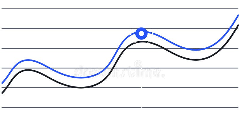
Free with trial Two lines are representing data progression over time, one blue and one black, creating a visual representation of trends and a key intersection point is marked with a blue circle. Data analysis decrease illustrations Two lines are representing data progression over time, one blue and one black, creating a visual representation of