Free with trial Analyze Data with Colorful Graph and Notes for Business Planning Strategy , layered depth. Data analysis decrease illustrations Analyze Data with Colorful Graph and Notes for Business Planning Strategy
Free with trial This vibrant image features a white cube with a prominent black percentage symbol, seemingly floating above a row of five identical white cubes, each displaying a clear black downward arrow. Set against a bright yellow background, the composition powerfully symbolizes a concept of reduction, decline, or decrease. It's ideal for illustrating topics such as falling interest rates, economic downturns, sales reductions, discounts, negative trends, or any financial or business concept involving a downward movement in percentages. The clean, minimalist design offers versatility for various editorial and commercial uses. Data analysis decrease illustrations Percentage Decrease Concept with Downward Arrows. This vibrant image features a white cube with a prominent black percentage symbol, seemingly floating above a row of five identical white cubes, each displaying a clear black downward arrow. Set against a bright yellow background, the composition powerfully symbolizes a concept of reduction, decline, or decrease. It's ideal for illustrating topics such as falling interest rates, economic downturns, sales reductions, discounts, negative trends, or any financial or business concept involving a downward movement in percentages. The clean, minimalist design offers versatility for various editorial and commercial uses.
Free with trial An image showing two arrows, one red pointing up with a percentage symbol and a white upward arrow inside, and one green pointing down with a percentage symbol and a white downward arrow inside, likely used to represent increase and decrease in percentages. Data analysis decrease illustrations Up and down percentage arrows for increase and decrease. An image showing two arrows, one red pointing up with a percentage symbol and a white upward arrow inside, and one green pointing down with a percentage symbol and a white downward arrow inside, likely used to represent increase and decrease in percentages
Free with trial The image shows a bar graph placed on top of an open financial report book. The bar graph displays data with blue bars of varying heights, and two lines are plotted across the bars, one red and one blue. The graph appears to be indicating trends or comparisons over time. The financial report book underneath has detailed tables and charts, suggesting a thorough analysis of financial data. Data analysis decrease illustrations Bar graph on financial report. The image shows a bar graph placed on top of an open financial report book. The bar graph displays data with blue bars of varying heights, and two lines are plotted across the bars, one red and one blue. The graph appears to be indicating trends or comparisons over time. The financial report book underneath has detailed tables and charts, suggesting a thorough analysis of financial data
Free with trial A clean, minimalist illustration featuring a combined line graph and bar chart on a white background. The line graph, with circular data points, shows an upward trend with fluctuations. It is overlaid on a series of vertical bars, alternating in black and white, representing discrete data values. The grid lines behind the charts suggest a data analysis or financial context. This graphic is ideal for presentations, reports, and websites related to statistics, business growth, market trends, and data visualization. Data analysis decrease vectors Line and Bar Chart Combination. A clean, minimalist illustration featuring a combined line graph and bar chart on a white background. The line graph, with circular data points, shows an upward trend with fluctuations. It is overlaid on a series of vertical bars, alternating in black and white, representing discrete data values. The grid lines behind the charts suggest a data analysis or financial context. This graphic is ideal for presentations, reports, and websites related to statistics, business growth, market trends, and data visualization.
Free with trial Business decline bar chart icon vector. Decrease, loss, and financial collapse sign symbol on black circle. Data analysis decrease vectors Business decline bar chart icon. Decrease, loss, and financial collapse sign symbol on black circle
Free with trial A set of icons representing various aspects of capacity planning systems, including demand and capacity management, data analysis, cloud computing, and resource allocation. The icons are colorful and simple, making them suitable for use in presentations, reports, and other visual materials. Data analysis decrease illustrations Capacity planning systems icons. A set of icons representing various aspects of capacity planning systems, including demand and capacity management, data analysis, cloud computing, and resource allocation. The icons are colorful and simple, making them suitable for use in presentations, reports, and other visual materials.
Free with trial This image depicts a bar and line chart illustrating a significant decline in values. The bars represent discrete data points that decrease progressively, while the line chart overlays the bars, emphasizing the downward trend. The chart uses a blue color scheme for both the bars and the line, with a clear visual representation of a negative progression. The overall design is minimalistic and. Data analysis decrease vectors Downward trend chart showing a decline in values over time. This image depicts a bar and line chart illustrating a significant decline in values. The bars represent discrete data points that decrease progressively, while the line chart overlays the bars, emphasizing the downward trend. The chart uses a blue color scheme for both the bars and the line, with a clear visual representation of a negative progression. The overall design is minimalistic and
Free with trial A simple yet effective graphic representing a negative trend or declining business chart, perfect for illustrating downward data or economic downturn. Data analysis decrease vectors Negative Trend Graph, Decreasing Business Chart, Downward Data Illustration. A simple yet effective graphic representing a negative trend or declining business chart, perfect for illustrating downward data or economic downturn.
Free with trial A clean and modern abstract logo featuring three overlapping blue chevrons pointing downwards. The chevrons are layered with subtle shadows, creating a sense of depth and dimension. The design is minimalist and geometric, rendered on a white background. This versatile graphic is ideal for technology companies, financial services, data analysis, or any business emphasizing progress, direction, or efficiency. Data analysis decrease illustrations Abstract Blue Chevron Layers Logo. A clean and modern abstract logo featuring three overlapping blue chevrons pointing downwards. The chevrons are layered with subtle shadows, creating a sense of depth and dimension. The design is minimalist and geometric, rendered on a white background. This versatile graphic is ideal for technology companies, financial services, data analysis, or any business emphasizing progress, direction, or efficiency.
Free with trial Illustration of global stock market data. The graphic includes a world map background bar charts and a line graph. Represents finance investment and trading, trends across international. Data analysis decrease illustrations Illustration of global stock market data. The graphic includes a world map background bar charts and a line graph. Represents
Free with trial Green up arrow and orange down arrow icon symbolizing direction change data flow transfer growth decline. Data analysis decrease vectors Green up arrow and orange down arrow icon symbolizing direction change data flow transfer growth decline
Free with trial A grid of black and white icons depicting financial charts with rising and falling trends, magnifying glasses with download arrows, and dollar signs. Data analysis decrease vectors Collection of black and white icons representing financial charts and data analysis graph bar chart. A grid of black and white icons depicting financial charts with rising and falling trends, magnifying glasses with download arrows, and dollar signs
Free with trial A visual representation of business growth and financial data with 3D charts. This image effectively conveys concepts of analytics, progress, and reporting in a modern and engaging way. Data analysis decrease illustrations 3d bar chart and pie chart representing financial data and growth on a blueprint isolated on white background. A visual representation of business growth and financial data with 3D charts. This image effectively conveys concepts of analytics, progress, and reporting in a modern and engaging way
Free with trial Broker trader analyzing economic crisis. Trade exchange, financial decrease, bed business strategy, digital asset, loss investment fund, online broker, stock collapse and crisis concept. Data analysis decrease illustrations Broker trader analyzing economic crisis. Trade exchange, financial decrease
Free with trial Simple line art business icons set featuring a magnifying glass, minus symbol, pie chart, and rising bar graph for financial data analysis. Data analysis decrease vectors Simple line art business icons set featuring a magnifying glass, minus symbol, pie chart, and rising bar graph for
Free with trial A clean, minimalist vector illustration of a bar chart featuring three distinct columns. The columns are colored in vibrant orange, teal, and yellow, representing different data points or categories. The chart is set against a white background with a dark blue axis line, making it ideal for presentations, reports, and infographics focused on data visualization, business growth, or financial analysis. Data analysis decrease vectors Simple Bar Chart with Three Columns. A clean, minimalist vector illustration of a bar chart featuring three distinct columns. The columns are colored in vibrant orange, teal, and yellow, representing different data points or categories. The chart is set against a white background with a dark blue axis line, making it ideal for presentations, reports, and infographics focused on data visualization, business growth, or financial analysis.
Free with trial A 3D rendered bar chart encased in clear glass, displaying year-end business performance. The chart features three vertical bars in blue, pink, and yellow, representing 61%, 24%, and 35% respectively. The clean, modern design and transparent material create a sophisticated visual suitable for presentations, reports, and data visualization concepts related to business growth, financial analysis, and success metrics. Data analysis decrease illustrations Year End Business Performance Chart. A 3D rendered bar chart encased in clear glass, displaying year-end business performance. The chart features three vertical bars in blue, pink, and yellow, representing 61%, 24%, and 35% respectively. The clean, modern design and transparent material create a sophisticated visual suitable for presentations, reports, and data visualization concepts related to business growth, financial analysis, and success metrics.
Free with trial A businessman is using wooden blocks to represent financial growth and decline. the image represents business strategy, investment planning and market analysis for online business success now. Data analysis decrease illustrations Business growth strategy and financial planning for investment and market analysis success online now. a businessman is using wooden blocks to represent financial growth and decline. the image represents business strategy, investment planning and market analysis for online business success now.
Free with trial A minimalist black line graph icon on a clean white background, clearly illustrating a downward trend. The zigzagging line culminates in a sharp arrow pointing downwards, symbolizing decline, decrease, or negative performance. This versatile vector illustration is ideal for representing financial losses, economic downturns, sales drops, market crashes, or any data indicating a negative trajectory. Perfect for business reports, presentations, websites, apps, and infographics requiring a clear visual indicator of reduction or poor results. Data analysis decrease vectors Downward Trend Graph with Arrow Icon. A minimalist black line graph icon on a clean white background, clearly illustrating a downward trend. The zigzagging line culminates in a sharp arrow pointing downwards, symbolizing decline, decrease, or negative performance. This versatile vector illustration is ideal for representing financial losses, economic downturns, sales drops, market crashes, or any data indicating a negative trajectory. Perfect for business reports, presentations, websites, apps, and infographics requiring a clear visual indicator of reduction or poor results.
Free with trial Colorful Charts and Graphs Data Visualization Infographic. Data analysis decrease illustrations Colorful Charts and Graphs Data Visualization Infographic
Free with trial A vibrant red arrow curves and points downwards against a clean white background. This 3D rendered illustration conveys the concept of decline, decrease, or downward trend. Its clean design makes it suitable for a variety of applications, including business presentations, financial reports, and data visualizations. The image is versatile and can be used to represent negative growth, falling prices, or other downward movements. Data analysis decrease illustrations Red Arrow Pointing Down - Decline Concept. A vibrant red arrow curves and points downwards against a clean white background. This 3D rendered illustration conveys the concept of decline, decrease, or downward trend. Its clean design makes it suitable for a variety of applications, including business presentations, financial reports, and data visualizations. The image is versatile and can be used to represent negative growth, falling prices, or other downward movements.
Free with trial Red bar chart depicting a downward trend on a white background. The bars progressively decrease in height from left to right. An upward-pointing arrow emerges from the first bar, indicating initial growth. A curved, downward-pointing arrow overlays the bars, emphasizing the overall decline. The clear design conveys concepts of financial loss, decreasing statistics, or declining data points. Data analysis decrease vectors Red bar chart showing a downward trend with an upward arrow and a falling arrow isolated on white background. Red bar chart depicting a downward trend on a white background. The bars progressively decrease in height from left to right. An upward-pointing arrow emerges from the first bar, indicating initial growth. A curved, downward-pointing arrow overlays the bars, emphasizing the overall decline. The clear design conveys concepts of financial loss, decreasing statistics, or declining data points.
Free with trial A photorealistic 3D render depicts a smartphone displaying a stock market trading analysis app. The screen shows a prominent red downward trending line graph overlaid on blue bar graphs. Surrounding the phone are 3D rendered dollar signs and bills, suggesting a financial context. The overall color scheme is dark with vibrant accents of red and blue in the graphs. The style is clean and modern,. Data analysis decrease illustrations 3 D Stock Trading Analysis App Smartphone Displaying Red Downward Trend Graph. A photorealistic 3D render depicts a smartphone displaying a stock market trading analysis app. The screen shows a prominent red downward trending line graph overlaid on blue bar graphs. Surrounding the phone are 3D rendered dollar signs and bills, suggesting a financial context. The overall color scheme is dark with vibrant accents of red and blue in the graphs. The style is clean and modern,
Free with trial The image features four bar graphs displaying data trends over time, with varying scales and patterns on each graph. Data analysis decrease illustrations Four graphs showing data trends over time. The image features four bar graphs displaying data trends over time, with varying scales and patterns on each graph
Free with trial Decline bar chart with downward trend arrow icon vector. Decrease, loss, and financial drop symbol. Editable stroke. Data analysis decrease vectors Decline bar chart with downward trend arrow icon. Decrease, loss, and financial drop symbol. Editable stroke
Free with trial Colorful financial data displayed on laptop, urban background, detailed background Generative AI, visually striking background Generative AI. Data analysis decrease illustrations Colorful financial data displayed on laptop, urban background
Free with trial A bar chart displayed on an easel, illustrating a negative trend. The bars, a mix of blue and grey, show a progressive decrease in value. A prominent red arrow curves downwards across the chart, signifying a decline or loss. The presentation suggests a financial report or business analysis with unfavorable results. Data analysis decrease illustrations Bar chart showing a downward trend with a red arrow indicating decline. A bar chart displayed on an easel, illustrating a negative trend. The bars, a mix of blue and grey, show a progressive decrease in value. A prominent red arrow curves downwards across the chart, signifying a decline or loss. The presentation suggests a financial report or business analysis with unfavorable results
Free with trial This image presents a clean, minimalist graphic illustrating economic trends. It features two distinct charts: a line graph on the left showing fluctuating data points over time, and a bar chart on the right comparing values across categories. The charts use a simple black and white color scheme with grayscale elements, making them versatile for various business and financial contexts. Labels like 'ECONOMIC', 'PARCTIRUM', and 'PLACTIRUM' suggest analysis of economic performance and market data. The overall design emphasizes clarity and data visualization. Data analysis decrease vectors Economic Growth Trends: Line and Bar Charts. This image presents a clean, minimalist graphic illustrating economic trends. It features two distinct charts: a line graph on the left showing fluctuating data points over time, and a bar chart on the right comparing values across categories. The charts use a simple black and white color scheme with grayscale elements, making them versatile for various business and financial contexts. Labels like 'ECONOMIC', 'PARCTIRUM', and 'PLACTIRUM' suggest analysis of economic performance and market data. The overall design emphasizes clarity and data visualization.
Free with trial Various colored cylinder objects of different heights arranged against striped background resembling falling chart Ideal for presenting business data or financial analysis. Data analysis decrease illustrations Analyzing Colorful Cylinders Arranged Like a Falling Bar Chart on Blue Background. Various colored cylinder objects of different heights arranged against striped background resembling falling chart Ideal for presenting business data or financial analysis
Free with trial Declining Graph With Cursor Line And Solid Icon Set. Economic Downturn, Market Analysis, And Financial Decline Symbol Collection. Business Performance Tracking. Isolated Vector Illustration. Data analysis decrease vectors Declining Graph With Cursor Line And Solid Icon Set. Economic Downturn, Market Analysis, And Financial Decline Symbol
Free with trial Business decline bar chart icon. Decrease, loss, and financial collapse sign symbol vector. Data analysis decrease vectors Business decline bar chart icon. Decrease, loss, and financial collapse sign symbol
Free with trial This detailed graph presents the relationship between unemployment rates and gold demand, illustrating economic trends through visual data. Data analysis decrease illustrations Unemployment and Gold Demand Contrast Illustrated in Graph Format with Data Representation. This detailed graph presents the relationship between unemployment rates and gold demand, illustrating economic trends through visual data
Free with trial A detailed close-up of a digital trading screen displaying a bearish stock market trend. The focus is on a white candlestick chart showing a significant price decline, representing financial crisis, recession, or investment loss. The background features other graphs and fluctuating data on a modern blue interface. This image is ideal for concepts related to finance, economics, stock exchange, forex trading, data analysis, risk management, and the global economy, visualizing market volatility and downturns. Data analysis decrease illustrations Bearish Stock Market Chart on Digital Display. A detailed close-up of a digital trading screen displaying a bearish stock market trend. The focus is on a white candlestick chart showing a significant price decline, representing financial crisis, recession, or investment loss. The background features other graphs and fluctuating data on a modern blue interface. This image is ideal for concepts related to finance, economics, stock exchange, forex trading, data analysis, risk management, and the global economy, visualizing market volatility and downturns.
Free with trial A set of three distinct candlestick chart icons, rendered in a clean, flat vector style against a white background. The green candle typically represents a bullish trend or price increase, the red candle signifies a bearish trend or price decrease, and the gray candle can denote neutrality or indecision in the market. These versatile symbols are ideal for illustrating financial concepts, stock market analysis, trading platforms, investment apps, economic reports, and educational materials related to forex, cryptocurrency, and general business trends. Data analysis decrease vectors Candlestick Chart Icons for Financial Analysis. A set of three distinct candlestick chart icons, rendered in a clean, flat vector style against a white background. The green candle typically represents a bullish trend or price increase, the red candle signifies a bearish trend or price decrease, and the gray candle can denote neutrality or indecision in the market. These versatile symbols are ideal for illustrating financial concepts, stock market analysis, trading platforms, investment apps, economic reports, and educational materials related to forex, cryptocurrency, and general business trends.
Free with trial A hand interacts with luminous digital charts and graphs representing financial data. The scene conveys trends and growth in a modern business context. Scalp. Data analysis decrease illustrations Hand Interacting with Digital Charts and Graphs Displaying Financial Data in a Dark Background with Global Map for. A hand interacts with luminous digital charts and graphs representing financial data. The scene conveys trends and growth in a modern business context. Scalp
Free with trial 3D pie chart illustrating data segments with percentage values, alongside a bar graph in the background, showcasing financial or business data. Data analysis decrease illustrations 3D pie chart illustrating data segments with percentage values, alongside a bar graph in the background, showcasing financial or
Free with trial This image depicts a graph with fluctuating data trends over time, represented by both a line chart and bar chart. Data analysis decrease illustrations Graph showing fluctuating data trends over time. This image depicts a graph with fluctuating data trends over time, represented by both a line chart and bar chart
Free with trial Collection of eight minimalist line icons representing various types of data visualization, including bar charts, line graphs, pie charts, and progress indicators. Ideal for websites, apps, or presentations needing a clean and modern aesthetic. Data analysis decrease illustrations Data Visualization Icons. Collection of eight minimalist line icons representing various types of data visualization, including bar charts, line graphs, pie charts, and progress indicators. Ideal for websites, apps, or presentations needing a clean and modern aesthetic.
Free with trial A clean and modern vector icon design of a percentage calculator. Perfect for websites, apps, and presentations related to finance, business, and data analysis. This simple yet effective icon uses a flat design style with 3D elements. Data analysis decrease illustrations Percentage Calculator Icon Simple & Modern Design. A clean and modern vector icon design of a percentage calculator. Perfect for websites, apps, and presentations related to finance, business, and data analysis. This simple yet effective icon uses a flat design style with 3D elements.
Free with trial The image shows a red downward-pointing arrow with a percentage symbol, indicating a decrease. Next to it, there is a green upward-pointing arrow shaped like a house with a percentage symbol, indicating an increase. Data analysis decrease illustrations Illustration of percentage increase and decrease with arrows and house shapes. The image shows a red downward-pointing arrow with a percentage symbol, indicating a decrease. Next to it, there is a green upward-pointing arrow shaped like a house with a percentage symbol, indicating an increase
Free with trial That the image is generated using AI. Dynamic financial market data display with rising stock trends. Data analysis decrease illustrations Dynamic financial market data display with rising stock trends
Free with trial A versatile collection of flat vector icons illustrating concepts of decline, decrease, and loss. This set features various graphics, including downward-pointing arrows, negative trend line graphs, and falling bar charts in multiple colors. These symbols are perfect for representing financial crisis, economic recession, stock market crash, business failure, or any form of reduction. Ideal for use in infographics, presentations, financial reports, websites, and data visualization projects, these modern icons effectively communicate negative trends and downturns. Isolated on a white background for easy integration into any design. Data analysis decrease illustrations Financial Decline and Recession Vector Icon Set. A versatile collection of flat vector icons illustrating concepts of decline, decrease, and loss. This set features various graphics, including downward-pointing arrows, negative trend line graphs, and falling bar charts in multiple colors. These symbols are perfect for representing financial crisis, economic recession, stock market crash, business failure, or any form of reduction. Ideal for use in infographics, presentations, financial reports, websites, and data visualization projects, these modern icons effectively communicate negative trends and downturns. Isolated on a white background for easy integration into any design.
Free with trial A minimalist black vector icon illustrating a significant decline or negative trend. The image features three bar chart elements, progressively decreasing in height from left to right, symbolizing a fall in data or performance. A prominent, thick downward-pointing arrow diagonally overlays the bars, reinforcing the concept of reduction, loss, or economic downturn. Isolated on a clean white background, this graphic is ideal for financial reports, business presentations, economic analysis, or any visual communication requiring a clear representation of falling statistics or poor results. Data analysis decrease vectors Business Decline Bar Chart with Down Arrow Icon. A minimalist black vector icon illustrating a significant decline or negative trend. The image features three bar chart elements, progressively decreasing in height from left to right, symbolizing a fall in data or performance. A prominent, thick downward-pointing arrow diagonally overlays the bars, reinforcing the concept of reduction, loss, or economic downturn. Isolated on a clean white background, this graphic is ideal for financial reports, business presentations, economic analysis, or any visual communication requiring a clear representation of falling statistics or poor results.
Free with trial A 3D visualization of financial data, featuring a colorful pie chart and a series of bar graphs placed on top of a financial report document. The document also includes line graphs, illustrating various data trends and analyses. The composition is set against a white background. Data analysis decrease illustrations 3D Bar Chart and Pie Chart on Financial Report with Line Graphs data statistics. A 3D visualization of financial data, featuring a colorful pie chart and a series of bar graphs placed on top of a financial report document. The document also includes line graphs, illustrating various data trends and analyses. The composition is set against a white background
Free with trial This image showcases twelve diverse data visualization icons, including bar charts, pie charts, line graphs, and other visual representations of data. These icons are ideal for presentations, reports, or digital interfaces needing a modern and aesthetically pleasing design. The color palette is co. Data analysis decrease illustrations Data Visualization Icons
Free with trial Data charts and tables illustration sales bar, colorful categories, figures trends data charts and tables. Data analysis decrease illustrations Data charts and tables
Free with trial Set of 16 line icons representing various types of charts, graphs, clocks, and data-related symbols. Perfect for business presentations, reports, or website design. Clean and modern style. Data analysis decrease illustrations Data Visualization Icons. Set of 16 line icons representing various types of charts, graphs, clocks, and data-related symbols. Perfect for business presentations, reports, or website design. Clean and modern style.
Free with trial Decline bar chart with downward trend arrow icon. Decrease, loss, and financial crisis sign symbol vector. Data analysis decrease vectors Decline bar chart with downward trend arrow icon. Decrease, loss, and financial crisis sign symbol
Free with trial A three-dimensional bar graph is depicted against a white background, illustrating a clear downward trend. The bars, transitioning from blue at the highest point to red at the lowest, decrease in height from left to right, visually representing a decline or loss. Data analysis decrease illustrations 3D bar graph showing a downward trend with red and blue bars chart data. A three-dimensional bar graph is depicted against a white background, illustrating a clear downward trend. The bars, transitioning from blue at the highest point to red at the lowest, decrease in height from left to right, visually representing a decline or loss
Free with trial An abstract graphic featuring a series of vertical bars with rounded tops, arranged in varying heights along a horizontal base. The bars display a smooth gradient color transition, starting with blue on the left and shifting to purple and pink on the right. Set against a clean white background, this modern and minimalist design evokes concepts of data visualization, statistical analysis, or an audio equalizer. It's ideal for illustrating growth, progress, or comparative data in presentations, infographics, web design, or technology-related content. Data analysis decrease vectors Abstract Gradient Bar Chart or Equalizer Graphic. An abstract graphic featuring a series of vertical bars with rounded tops, arranged in varying heights along a horizontal base. The bars display a smooth gradient color transition, starting with blue on the left and shifting to purple and pink on the right. Set against a clean white background, this modern and minimalist design evokes concepts of data visualization, statistical analysis, or an audio equalizer. It's ideal for illustrating growth, progress, or comparative data in presentations, infographics, web design, or technology-related content.
Free with trial A simple yet effective visualization showing data via a pie chart and bar graph Ideal for presentations and reports. Data analysis decrease illustrations Colorful Pie Chart and Bar Graph Data Visualization. A simple yet effective visualization showing data via a pie chart and bar graph Ideal for presentations and reports
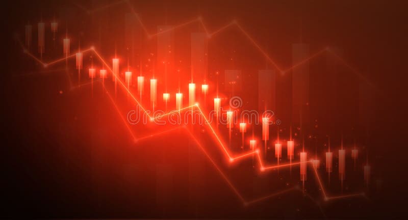
Free with trial A red graph with a downward trend, displaying various data points and percentages along the line. Data analysis decrease illustrations Graph showing downward trend with key data points. A red graph with a downward trend, displaying various data points and percentages along the line
Free with trial A conceptual 3D illustration of cybersecurity and digital safety. Three blocks represent key components of a security strategy: a glowing shield for protection, a padlock for defense, and a chart showing risk reduction. This image symbolizes the implementation of robust defense mechanisms to mitigate online threats and protect sensitive data. The technological background with network lines and graphs highlights the context of information technology, data analysis, and modern security challenges. Ideal for illustrating topics on internet security, data privacy, and risk management. Data analysis decrease illustrations Cybersecurity Defense and Risk Management Concept. A conceptual 3D illustration of cybersecurity and digital safety. Three blocks represent key components of a security strategy: a glowing shield for protection, a padlock for defense, and a chart showing risk reduction. This image symbolizes the implementation of robust defense mechanisms to mitigate online threats and protect sensitive data. The technological background with network lines and graphs highlights the context of information technology, data analysis, and modern security challenges. Ideal for illustrating topics on internet security, data privacy, and risk management.
Free with trial Abstract 3D render of a colorful descending bar chart with cubes. Perfect for data visualization, business presentations, or illustrating trends. Representing financial, statistical or marketing information. Data analysis decrease illustrations Colorful 3D Bar Chart, Data Visualization Concept. Abstract 3D render of a colorful descending bar chart with cubes. Perfect for data visualization, business presentations, or illustrating trends. Representing financial, statistical or marketing information.
Free with trial This image showcases a variety of modern, flat-design charts and graphs commonly used in business, finance, and data analysis. It includes bar charts, pie charts, and line graphs, presented in a clean, minimalist style with teal and gray color accents. These visual representations are ideal for illustrating trends, statistics, performance, and financial data in presentations, reports, and web content. Data analysis decrease illustrations Collection of Business and Financial Charts and Graphs. This image showcases a variety of modern, flat-design charts and graphs commonly used in business, finance, and data analysis. It includes bar charts, pie charts, and line graphs, presented in a clean, minimalist style with teal and gray color accents. These visual representations are ideal for illustrating trends, statistics, performance, and financial data in presentations, reports, and web content.
Free with trial A grid of various icons related to business technology and data analysis. Generative AI. Data analysis decrease illustrations Collection of Business and Technology Icons Set. A grid of various icons related to business technology and data analysis. Generative AI
Free with trial Financial data chart, glowing lines, digital display. Stock image showing trends. Data analysis decrease illustrations Digital financial graph with candlestick chart, data analytics, stock market trend, technology concept. Financial data chart, glowing lines, digital display. Stock image showing trends
Free with trial The image depicts three blue bar charts of varying heights, symbolizing different levels of data or growth. Two large orange arrows are shown pointing in opposite directions, one upward and one downward, indicating trends of increase and decrease respectively. The upward arrow is positioned behind the tallest bar, while the downward arrow is behind the shortest bar. Data analysis decrease illustrations Growth and decline represented by arrows and bar charts. The image depicts three blue bar charts of varying heights, symbolizing different levels of data or growth. Two large orange arrows are shown pointing in opposite directions, one upward and one downward, indicating trends of increase and decrease respectively. The upward arrow is positioned behind the tallest bar, while the downward arrow is behind the shortest bar
Free with trial A grid of diverse icons representing different types of charts and graphs, including bar, line, and pie charts, symbolizing data analysis and business performance metrics. Data analysis decrease vectors Collection of various business and financial chart icons. A grid of diverse icons representing different types of charts and graphs, including bar, line, and pie charts, symbolizing data analysis and business performance metrics
Free with trial A minimalist line icon depicting strategic analysis. Data analysis decrease illustrations Strategic Analysis Knight, Graph, Magnifying Glass Icon. A minimalist line icon depicting strategic analysis.
Free with trial A comprehensive set of monochromatic icons representing various financial and statistical growth metrics. The icons include bar graphs, line charts, pie charts, and other graphical representations of data. Some icons depict upward trends, stability, percentages, and financial symbols such as dollar signs and coins. The overall theme is focused on financial analysis, economic growth, and data. Data analysis decrease illustrations Collection of financial and statistical growth icons. A comprehensive set of monochromatic icons representing various financial and statistical growth metrics. A comprehensive set of monochromatic icons representing various financial and statistical growth metrics. The icons include bar graphs, line charts, pie charts, and other graphical representations of data. Some icons depict upward trends, stability, percentages, and financial symbols such as dollar signs and coins. The overall theme is focused on financial analysis, economic growth, and data
Free with trial Three blue apple icons are depicted. The top apple stands alone, and the two below have arrows beside them. The left apple has a downward arrow, indicating a decrease, while the right apple is paired with an upward arrow, suggesting an increase. Each apple is solid blue with a small leaf, symbolizing fruit-related data or trends. The arrangement is simple and symmetrical on a white background, with the icons representing changes in quantity or direction. Data analysis decrease vectors Apples with up and down arrows with fruit icon with directional arrows. Three blue apple icons are depicted. The top apple stands alone, and the two below have arrows beside them. The left apple has a downward arrow, indicating a decrease, while the right apple is paired with an upward arrow, suggesting an increase. Each apple is solid blue with a small leaf, symbolizing fruit-related data or trends. The arrangement is simple and symmetrical on a white background, with the icons representing changes in quantity or direction.
Free with trial A simple blue line graph with circular data points is displayed against a clean white background with subtle horizontal grid lines. The graph shows fluctuations and trends, making it suitable for representing data, analytics, or financial performance. Generated by AI. Data analysis decrease vectors Blue Line Graph with Data Points on White Background. A simple blue line graph with circular data points is displayed against a clean white background with subtle horizontal grid lines. The graph shows fluctuations and trends, making it suitable for representing data, analytics, or financial performance. Generated by AI
Free with trial A flat style pie chart displays market shares in teal, green, and yellow, with a dollar coin icon representing financial data. Data analysis decrease vectors Flat design pie chart illustration representing business finance and market share analysis. A flat style pie chart displays market shares in teal, green, and yellow, with a dollar coin icon representing financial data.
Free with trial A clean and informative energy report summary displaying winter usage data. The graphic shows a 15% decrease in energy consumption compared to the previous year, indicated by a green checkmark. Ideal for illustrating energy efficiency, sustainability, or cost savings. Data analysis decrease illustrations Energy Report Summary with Winter Usage Statistics. A clean and informative energy report summary displaying winter usage data. The graphic shows a 15% decrease in energy consumption compared to the previous year, indicated by a green checkmark. Ideal for illustrating energy efficiency, sustainability, or cost savings
Free with trial A chart showing a decrease with an arrow pointing down, isolated on a white background, representing a decline in data or performance. Data analysis decrease illustrations Decreasing chart with arrow isolated on white background. A chart showing a decrease with an arrow pointing down, isolated on a white background, representing a decline in data or performance
Free with trial A two-toned zigzag line graph against a white background. The line starts in red, descending from the top left, and transitions to green around the midway point, continuing downward. This design symbolizes a decline, often used in financial or performance metrics to indicate a decrease. The red section suggests loss or negative performance, while the green section might imply a potential recovery or different segment in charting data analysis. The photo is generated using Ai. Data analysis decrease illustrations Two-toned zigzag line graph against a white background.
Free with trial Stock and economic crisis graph background. Trade exchange, financial decrease, bed business strategy, digital asset, loss investment fund, online broker, stock collapse and crisis concept. Data analysis decrease illustrations Stock and economic crisis graph background. Trade exchange, financial decrease
Free with trial Simple Bar Chart Showing Business Growth and Data Trends. Data analysis decrease vectors Simple Bar Chart Showing Business Growth and Data Trends
Free with trial Simple line art business icons set featuring a magnifying glass, minus symbol, pie chart, and rising bar graph for financial data analysis. Data analysis decrease illustrations Simple line art business icons set featuring a magnifying glass, minus symbol, pie chart, and rising bar graph for
Free with trial Laptop displaying a bar chart indicating growth and analysis ,Generative ai. Data analysis decrease illustrations Laptop with bar chart, visualizing growth, analysis, and business trends. Laptop displaying a bar chart indicating growth and analysis ,Generative ai
Free with trial A minimalist black and white icon representing a bar graph. The graph features several vertical bars of varying heights, arranged in a sequence that initially ascends to a peak and then descends. This versatile graphic symbolizes data, statistics, growth, decline, trends, and analysis. Its clean design makes it suitable for presentations, reports, websites, and applications related to finance, business, technology, and research. Data analysis decrease vectors Black Bar Graph Icon with Ascending and Descending Bars. A minimalist black and white icon representing a bar graph. The graph features several vertical bars of varying heights, arranged in a sequence that initially ascends to a peak and then descends. This versatile graphic symbolizes data, statistics, growth, decline, trends, and analysis. Its clean design makes it suitable for presentations, reports, websites, and applications related to finance, business, technology, and research.
Free with trial Bar chart and line graph showing financial data and trends. Generative AI. Data analysis decrease illustrations Bar chart and line graph showing financial data and trends
Free with trial A dynamic 3D visualization of financial data, featuring an upward trending blue arrow graph, a series of white and blue bar graphs, and two pie charts. The composition is set against a dark blue, grid-like background, symbolizing data analysis, business growth, and financial success. This image is ideal for presentations, reports, and websites related to finance, economics, and market trends. Data analysis decrease illustrations 3D Financial Growth Chart with Pie Charts and Bar Graph. A dynamic 3D visualization of financial data, featuring an upward trending blue arrow graph, a series of white and blue bar graphs, and two pie charts. The composition is set against a dark blue, grid-like background, symbolizing data analysis, business growth, and financial success. This image is ideal for presentations, reports, and websites related to finance, economics, and market trends.
Free with trial This is an isometric 3D illustration depicting a dynamic data visualization. It features a combination of bar charts and a line graph, showcasing rising trends and fluctuating data points. The color palette includes shades of blue, teal, and coral, creating a modern and professional aesthetic. This graphic is ideal for representing financial reports, business analytics, market trends, growth, and performance metrics in a visually engaging and easy-to-understand format. Data analysis decrease illustrations Isometric 3D Bar and Line Graph with Data Visualization. This is an isometric 3D illustration depicting a dynamic data visualization. It features a combination of bar charts and a line graph, showcasing rising trends and fluctuating data points. The color palette includes shades of blue, teal, and coral, creating a modern and professional aesthetic. This graphic is ideal for representing financial reports, business analytics, market trends, growth, and performance metrics in a visually engaging and easy-to-understand format.
Free with trial Conceptual image depicting declining sales and the need for analysis. Data analysis decrease illustrations Declining Sales Analysis Magnifying Glass, Chart, Calendar. Conceptual image depicting declining sales and the need for analysis.