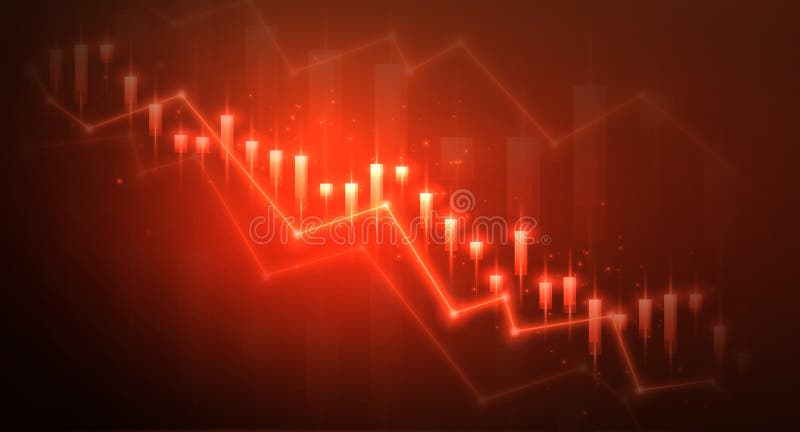
Free with trial Stock and economic crisis graph background. Trade exchange, financial decrease, bed business strategy, digital asset, loss investment fund, online broker, stock collapse and crisis concept. Data analysis decrease illustrations Stock and economic crisis graph background. Trade exchange, financial decrease
Free with trial A versatile collection of flat vector icons representing key concepts in finance, economics, and security. This comprehensive set includes symbols for market growth, decline, and trends, various currency representations like the Euro and Korean Won, and essential security elements such as open and closed padlocks. Designed with a clean, modern aesthetic, these icons are perfect for enhancing business presentations, financial reports, websites, mobile applications, and infographics, effectively illustrating concepts like investment, market analysis, currency exchange, and data protection. Data analysis decrease vectors Financial and Security Vector Icon Set. A versatile collection of flat vector icons representing key concepts in finance, economics, and security. This comprehensive set includes symbols for market growth, decline, and trends, various currency representations like the Euro and Korean Won, and essential security elements such as open and closed padlocks. Designed with a clean, modern aesthetic, these icons are perfect for enhancing business presentations, financial reports, websites, mobile applications, and infographics, effectively illustrating concepts like investment, market analysis, currency exchange, and data protection.
Free with trial Circular chart icon presenting a bar graph visualizing statistical data, analytics, and business reports, symbolizing financial decline, data analysis, and market trends. Data analysis decrease vectors Circular chart icon showing declining bar graph. Circular chart icon presenting a bar graph visualizing statistical data, analytics, and business reports, symbolizing financial decline, data analysis, and market trends
Free with trial Business person examines financial data on a laptop, focusing on a declining graph and calculation symbols. The vector illustration highlights financial challenges and downturns faced by investments. Data analysis decrease vectors Business Crisis Analysis with Falling. Business person examines financial data on a laptop, focusing on a declining graph and calculation symbols. The vector illustration highlights financial challenges and downturns faced by investments.
Free with trial Broker trader analyzing economic crisis. Trade exchange, financial decrease, bed business strategy, digital asset, loss investment fund, online broker, stock collapse and crisis concept. Data analysis decrease vectors Broker trader analyzing economic crisis. Trade exchange, financial decrease
Free with trial Declining graph icon in line design. decline, graph, chart, analytics, business, decrease, statistics on white background vector. Declining graph editable stroke icon. Data analysis decrease vectors Declining graph icon in line design. decline, graph, chart, analytics, business, decrease, statistics on white background vector
Free with trial Decrease : Decrease represents a reduction in value, profit, or financial performance over a specific period. Data analysis decrease vectors Illustration of Decrease. Decrease : Decrease represents a reduction in value, profit, or financial performance over a specific period.
Free with trial The image displays an abstract logo combining a stylized green leaf with four horizontal bars that decrease in length and shade from dark to light green. This design effectively symbolizes concepts of sustainability progress and ecological data visualization. Rendered by Ai, the clean vector graphic is ideal for environmental consulting growth tracking or organic brand identity. It conveys both. Data analysis decrease illustrations Abstract green leaf data progress bar symbol. The image displays an abstract logo combining a stylized green leaf with four horizontal bars that decrease in length and shade from dark to light green. This design effectively symbolizes concepts of sustainability progress and ecological data visualization. Rendered by Ai, the clean vector graphic is ideal for environmental consulting growth tracking or organic brand identity. It conveys both
Free with trial A striking 3D visualization features a formation of polished black cubes descending like a minimalist bar chart indicating decline. Rendered by Ai this abstract geometric composition stands dramatically against a deep matte black background. The stark contrast and high gloss finish emphasize concepts of data analysis business loss or mathematical patterns. Data analysis decrease illustrations Abstract dark graph of descending glossy cubes. A striking 3D visualization features a formation of polished black cubes descending like a minimalist bar chart indicating decline. Rendered by Ai this abstract geometric composition stands dramatically against a deep matte black background. The stark contrast and high gloss finish emphasize concepts of data analysis business loss or mathematical patterns
Free with trial A person meticulously studies complex financial or historical data displayed on a paper chart. The brass-rimmed magnifying glass highlights crucial upticks and downward trends in the graph line. Rendered by Ai. This scene captures the essence of deep research, analysis, and discovery in a vintage setting. Data analysis decrease illustrations Magnifying glass focused on a detailed stock chart. A person meticulously studies complex financial or historical data displayed on a paper chart. The brass-rimmed magnifying glass highlights crucial upticks and downward trends in the graph line. Rendered by Ai. This scene captures the essence of deep research, analysis, and discovery in a vintage setting
Free with trial 3D bar chart with descending green bars and blue downward arrow on white background. Ideal for finance, business decline, loss and market analysis. Data analysis decrease illustrations 3D Declining Bar Chart with Blue Arrow Down Icon on Transparent Background for Finance Analysis. 3D bar chart with descending green bars and blue downward arrow. 3D bar chart with descending green bars and blue downward arrow on white background. Ideal for finance, business decline, loss and market analysis
Free with trial Decrease: Decrease represents a reduction in value, amount, or performance over time. Data analysis decrease illustrations Illustration of Decrease. Decrease: Decrease represents a reduction in value, amount, or performance over time.
Free with trial Funny pizza slice cartoon character presenting a sales report bar graph. This vector illustration is perfect for business analysis, food industry, and creative presentations about market trends. Data analysis decrease illustrations Pizza Sales Report Cartoon Icon, Business Analysis Concept. Funny pizza slice cartoon character presenting a sales report bar graph. This vector illustration is perfect for business analysis, food industry, and creative presentations about market trends.
Free with trial Vibrant vector illustration featuring business data charts and graphs, including bar graphs, line graphs, pie charts, and a roller coaster metaphor for market trends. This eye-catching design is perfect for presentations, infographics, and financial reports. Data analysis decrease illustrations Business Data Charts Graphs Vector Illustration, Statistics. Vibrant vector illustration featuring business data charts and graphs, including bar graphs, line graphs, pie charts, and a roller coaster metaphor for market trends. This eye-catching design is perfect for presentations, infographics, and financial reports.
Free with trial Bar graph with varying heights beside a line chart with rising and falling pattern on a grid. Ideal for business analysis, statistics, metrics, trends, presentation, infographics, simple flat. Data analysis decrease illustrations Data Visualization with Bar Graph and Line Chart in Minimalist Design. Bar graph with varying heights beside a line chart with rising and falling pattern on a grid. Ideal for business analysis, statistics, metrics, trends, presentation, infographics, simple flat
Free with trial Downward arrows representing decline, calculator symbolizing calculations, and percentage sign for financial analysis. Ideal for business, finance, data analysis, interest rate, savings, growth. Data analysis decrease vectors Decreasing Trends with Financial Calculation and Percentage Concept. Downward arrows representing decline, calculator symbolizing calculations, and percentage sign for financial analysis. Ideal for business, finance, data analysis, interest rate, savings, growth
Free with trial A black bar chart graph with a falling arrow on a white background, indicating decline and decrease in data or business performance. Scalable format print and digital media. and projects. Data analysis decrease vectors Black bar chart graph with falling arrow decline. A black bar chart graph with a falling arrow on a white background, indicating decline and decrease in data or business performance. Scalable format print and digital media. and projects
Free with trial Downward Trend Line Graph Icons for Financial Data vol 34820. Data analysis decrease vectors Downward Trend Line Graph Icons for Financial Data
Free with trial A modern flat design graphic set featuring two icons: opposing arrows indicating increase decrease and a bar chart showing financial growth or decline, perfect for business concepts. Data analysis decrease vectors Increase and decrease arrows with bar chart icon. A modern flat design graphic set featuring two icons: opposing arrows indicating increase decrease and a bar chart showing financial growth or decline, perfect for business concepts
Free with trial Financial analysis, performance monitoring, economic crisis, stock market trends, investment risk, data alerts. Sad face and bell symbol near a declining graph. Financial analysis and performance. Data analysis decrease illustrations Financial Decline and Alert Notification with a Chart and Sad Face Icon. Financial analysis, performance monitoring, economic crisis, stock market trends, investment risk, data alerts. Sad face and bell symbol near a declining graph. Financial analysis and performance
Free with trial Circular percentage icon indicating a decrease or reduction, useful for financial concepts like interest rate changes, sales, discounts, and data analysis in business and economics. Data analysis decrease vectors Decreasing percentage rate circular icon illustration. Circular percentage icon indicating a decrease or reduction, useful for financial concepts like interest rate changes, sales, discounts, and data analysis in business and economics
Free with trial Downward arrow, message bubble with dots, and chart with decreasing points. Ideal for data analysis, trends, communication, decline, business, marketing simple flat metaphor. Data analysis decrease illustrations Declining Trend Indicated by Arrow with Chart and Communication Bubble. Downward arrow, message bubble with dots, and chart with decreasing points. Ideal for data analysis, trends, communication, decline, business, marketing simple flat metaphor
Free with trial A versatile set of black and white vector icons depicting financial growth, decline, and market trends. Perfect for business, analytics, and finance presentations. Data analysis decrease vectors Set of increase and decrease financial data icons. A versatile set of black and white vector icons depicting financial growth, decline, and market trends. Perfect for business, analytics, and finance presentations
Free with trial Bar chart showing stock market increase and decrease. Data analysis decrease vectors Bar chart showing stock market increase and decrease.
Free with trial Decrease bar chart icon on circle line. Statistic sign symbol illustration. Data analysis decrease vectors Decrease bar chart icon on circle line. Statistic sign symbol
Free with trial A line art icon depicting business performance analysis. Data analysis decrease illustrations Gear, Chart, Envelope Business Performance Analysis Icon. A line art icon depicting business performance analysis.
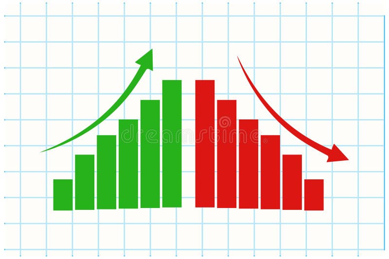
Free with trial A flat design vector illustration showing a graph with rising and falling bars, marked by green and red arrows indicating increase and decrease. Ideal for financial concepts. Data analysis decrease vectors Bar chart showing positive and negative data trends. A flat design vector illustration showing a graph with rising and falling bars, marked by green and red arrows indicating increase and decrease. Ideal for financial concepts
Free with trial A striking red line graph dramatically descends across a dark, futuristic digital grid background, illuminated by subtle blue light. This powerful visual represents a significant financial downturn, economic crisis, market crash, or business loss. The jagged, downward-sloping line symbolizes negative trends, risk, bankruptcy, and declining profits. It's an ideal image for conveying concepts of recession, failure, warning, or critical data analysis in business, finance, and technology contexts, emphasizing a period of decline or crisis. Data analysis decrease illustrations Red Declining Graph - Financial Crisis Concept. A striking red line graph dramatically descends across a dark, futuristic digital grid background, illuminated by subtle blue light. This powerful visual represents a significant financial downturn, economic crisis, market crash, or business loss. The jagged, downward-sloping line symbolizes negative trends, risk, bankruptcy, and declining profits. It's an ideal image for conveying concepts of recession, failure, warning, or critical data analysis in business, finance, and technology contexts, emphasizing a period of decline or crisis.
Free with trial Line graph with downward trend, sad face for dissatisfaction, alert bell for warning, and magnifier symbolizing evaluation. Ideal for data analysis, performance tracking, decline, warning, failure. Data analysis decrease vectors Declining Graph with Sad Face, Alert Bell, and Magnifier Indicating Negative Trends. Line graph with downward trend, sad face for dissatisfaction, alert bell for warning, and magnifier symbolizing evaluation. Ideal for data analysis, performance tracking, decline, warning, failure
Free with trial Person seated on bar chart with laptop, upward and downward arrows, cloud element. Ideal for data trends, analytics, cloud computing, statistics, progress tracking, career growth simple flat. Data analysis decrease vectors Woman Analyzing Data on Laptop, Representing Cloud-Based Growth and Decline Trends. Person seated on bar chart with laptop, upward and downward arrows, cloud element. Ideal for data trends, analytics, cloud computing, statistics, progress tracking, career growth simple flat
Free with trial Abstract financial data visualization graphic. Data analysis decrease illustrations Blue Digital Data Visualization Abstract Background with Bars and Lines. Abstract financial data visualization graphic
Free with trial Downward arrow, bar chart in browser window, abstract leaf shape. Ideal for business, analytics, environment, economy, growth planning strategy concepts. Simple flat metaphor. Data analysis decrease vectors Data Chart with Downward Arrow and Leaf Element for Trend Analysis and Growth Concept. Downward arrow, bar chart in browser window, abstract leaf shape. Ideal for business, analytics, environment, economy, growth planning strategy concepts. Simple flat metaphor
Free with trial Sad face next to a declining line graph indicating falling satisfaction levels. Green, orange, and red happy faces for feedback. Ideal for data trends, surveys, reports, performance, analysis. Data analysis decrease illustrations Declining satisfaction levels represented with happy faces and a downward trend graph. Sad face next to a declining line graph indicating falling satisfaction levels. Green, orange, and red happy faces for feedback. Ideal for data trends, surveys, reports, performance, analysis
Free with trial Euro Currency Decrease Icons with Downward Arrow vol 30127. Data analysis decrease vectors Euro Currency Decrease Icons with Downward Arrow
Free with trial Business decline chart or bar graph icon. Decrease, loss, and financial crisis sign symbol vector. Data analysis decrease vectors Business decline chart or bar graph icon. Decrease, loss, and financial crisis sign symbol
Free with trial A line graph showing a downward trend with two colored lines on a grid background. The graph represents data analysis and statistics. Data analysis decrease illustrations Downward Trend Line Graph. A line graph showing a downward trend with two colored lines on a grid background. The graph represents data analysis and statistics.
Free with trial Set of icons representing data decline and financial loss business charts graphs arrows isolated. Data analysis decrease vectors Modern data decline visualization icons with colorful gradient. Set of icons representing data decline and financial loss business charts graphs arrows isolated
Free with trial Decrease and increase chart icon with arrow. Negative and positive trend symbol illustration. Data analysis decrease vectors Decrease and increase chart icon with arrow. Negative and positive trend symbol
Free with trial Chart illustrating performance trends with emotive faces, team photos, analytic symbols thumbs up an atom and checkmark. Ideal for teamwork, strategy, data, feedback, process, analysis charts. Data analysis decrease vectors Business Performance Trends Featuring Emotional Reactions Across Team Members and Analytics. Chart illustrating performance trends with emotive faces, team photos, analytic symbols thumbs up an atom and checkmark. Ideal for teamwork, strategy, data, feedback, process, analysis charts
Free with trial Vertical arrow pointing downward next to bar graph with decreasing metrics. Ideal for business analysis, data visualization, financial downturn, market decline, trend report, economics, simple flat. Data analysis decrease illustrations Declining Bar Graph with Arrow Indicating Downward Trend in Performance or Statistics. Vertical arrow pointing downward next to bar graph with decreasing metrics. Ideal for business analysis, data visualization, financial downturn, market decline, trend report, economics, simple flat
Free with trial A clear, minimalist illustration featuring two distinct arrows on a clean white background. On the left, a blue arrow points downwards, symbolizing concepts like decrease, decline, or negative trends. On the right, a vibrant green arrow points upwards, representing increase, growth, improvement, or positive movement. Rendered in a modern flat design style, this versatile graphic is ideal for conveying directional changes, comparisons, data trends, or navigation in user interfaces, presentations, infographics, and educational content. Data analysis decrease illustrations Green Up and Blue Down Arrows. A clear, minimalist illustration featuring two distinct arrows on a clean white background. On the left, a blue arrow points downwards, symbolizing concepts like decrease, decline, or negative trends. On the right, a vibrant green arrow points upwards, representing increase, growth, improvement, or positive movement. Rendered in a modern flat design style, this versatile graphic is ideal for conveying directional changes, comparisons, data trends, or navigation in user interfaces, presentations, infographics, and educational content.
Free with trial Downward graph with data points, sad face symbolizing dissatisfaction, and a delivery truck. Ideal for business decline, logistics challenges, sales drop, market analysis, e-commerce, customer. Data analysis decrease illustrations Declining Sales Trend with Sad Face and Delivery Truck Highlighting Business Challenges. Downward graph with data points, sad face symbolizing dissatisfaction, and a delivery truck. Ideal for business decline, logistics challenges, sales drop, market analysis, e-commerce, customer
Free with trial A simple and clean line art icon of a graph, isolated on a white background. This vector illustration features a line chart with axes, showing a fluctuating trend with distinct data points. The minimalist design makes it perfect for various applications related to business, finance, and data analysis. Ideal for use in presentations, infographics, websites, mobile apps, and user interfaces to represent concepts like statistics, growth, market trends, performance reports, and financial analytics. A versatile symbol for progress and data visualization. Data analysis decrease illustrations Analytics Line Graph Vector Icon. A simple and clean line art icon of a graph, isolated on a white background. This vector illustration features a line chart with axes, showing a fluctuating trend with distinct data points. The minimalist design makes it perfect for various applications related to business, finance, and data analysis. Ideal for use in presentations, infographics, websites, mobile apps, and user interfaces to represent concepts like statistics, growth, market trends, performance reports, and financial analytics. A versatile symbol for progress and data visualization.
Free with trial Yellow sad emoticon and green pants next to stylized line graph with nodes. Ideal for fashion industry, sales decrease, trends, dissatisfaction, analysis, loss, economics. Simple flat metaphor. Data analysis decrease illustrations Sad face with pants and graph chart symbolizing loss or decline in trends or fashion demand. Yellow sad emoticon and green pants next to stylized line graph with nodes. Ideal for fashion industry, sales decrease, trends, dissatisfaction, analysis, loss, economics. Simple flat metaphor
Free with trial Four colorful bar charts are displayed on a graph, representing trends, statistics, and timeline data, with a potential focus on business infographics elements. Data analysis decrease vectors Four colorful bar charts are displayed on a graph, representing trends, statistics, and timeline data, with a potential
Free with trial Colorful bar charts are presenting statistical trends and business performance data across different time periods. Possibly days of the week. Using a vibrant color scheme of blue. Purple. And orange. Data analysis decrease vectors Colorful bar charts are presenting statistical trends and business performance data across different time periods
Free with trial Loss Report Document Icons for Financial Decline and Business Analysis vol 11482. Data analysis decrease vectors Loss Report Document Icons for Financial Decline and Business Analysis
Free with trial Abstract illustration of a financial graph with glowing lines on a dark background. The graph shows two distinct curves, one starting in cool blue tones and transitioning to warm orange hues, suggesting a shift in market trends or performance. The image conveys concepts of data analysis, growth, decline, and financial forecasting. Suitable for illustrating business reports, presentations, or articles related to finance, investment, and economics. Data analysis decrease illustrations Abstract Financial Graph Illustration. Abstract illustration of a financial graph with glowing lines on a dark background. The graph shows two distinct curves, one starting in cool blue tones and transitioning to warm orange hues, suggesting a shift in market trends or performance. The image conveys concepts of data analysis, growth, decline, and financial forecasting. Suitable for illustrating business reports, presentations, or articles related to finance, investment, and economics.
Free with trial Twelve small line graphs showcase diverse data trends, illustrating increases, decreases, peaks, and valleys. Visual representation of business analytics. Data analysis decrease illustrations Various Line Graph Charts Data Visualization Business Analytics. Twelve small line graphs showcase diverse data trends, illustrating increases, decreases, peaks, and valleys. Visual representation of business analytics
Free with trial This image displays a set of stylized bar chart icons representing financial and business trends. The leftmost icon features green bars increasing in height, accompanied by a green upward-pointing arrow, symbolizing growth and success. The middle icon shows red bars decreasing in height, with a black downward-pointing arrow indicating decline and loss. The right side presents two smaller black and white bar charts, also depicting downward trends. These icons are ideal for illustrating concepts like profit, loss, market trends, economic performance, and data analysis. Data analysis decrease illustrations Growth and Decline Bar Chart Icons. This image displays a set of stylized bar chart icons representing financial and business trends. The leftmost icon features green bars increasing in height, accompanied by a green upward-pointing arrow, symbolizing growth and success. The middle icon shows red bars decreasing in height, with a black downward-pointing arrow indicating decline and loss. The right side presents two smaller black and white bar charts, also depicting downward trends. These icons are ideal for illustrating concepts like profit, loss, market trends, economic performance, and data analysis.
Free with trial Percentage Decrease Bar Chart Icons for Financial Reports and Analytics vol 34492. Data analysis decrease vectors Percentage Decrease Bar Chart Icons for Financial Reports and Analytics
Free with trial A vibrant pink 3D bar chart illustrates financial data with a prominent downward-trending arrow superimposed. The bars decrease in height from left to right, signifying a decline. An upward-pointing arrow is positioned at the top left, indicating a contrasting upward trend. The graphic is isolated on a white background, making it suitable for presentations on financial performance, market trends,. Data analysis decrease illustrations 3D Pink Bar Chart with Downward Trend Arrow and Upward Trend Arrow graph statistics. A vibrant pink 3D bar chart illustrates financial data with a prominent downward-trending arrow superimposed. The bars decrease in height from left to right, signifying a decline. An upward-pointing arrow is positioned at the top left, indicating a contrasting upward trend. The graphic is isolated on a white background, making it suitable for presentations on financial performance, market trends,
Free with trial Computer monitor next to red error mark and downward graph. Ideal for themes of error, data analysis, poor performance, system failure, troubleshooting, warnings, technology issues. Simple flat. Data analysis decrease vectors Computer screen with error mark and declining graph symbolizing technical issues or performance drop. Computer monitor next to red error mark and downward graph. Ideal for themes of error, data analysis, poor performance, system failure, troubleshooting, warnings, technology issues. Simple flat
Free with trial A 3D rendered bar chart illustrating a significant downward trend. Three blue, rounded bars are displayed on a clean white background with subtle grid lines. A prominent, bold red arrow sharply descends across the bars, clearly indicating a decline, decrease, or negative progression. This graphic is ideal for representing financial losses, market downturns, business challenges, economic recession, or any statistical data showing a negative trend. It conveys concepts of risk, failure, and reduction in a clear, impactful visual manner for presentations, reports, and analytical content. Data analysis decrease vectors Downward Trend Bar Chart with Red Arrow. A 3D rendered bar chart illustrating a significant downward trend. Three blue, rounded bars are displayed on a clean white background with subtle grid lines. A prominent, bold red arrow sharply descends across the bars, clearly indicating a decline, decrease, or negative progression. This graphic is ideal for representing financial losses, market downturns, business challenges, economic recession, or any statistical data showing a negative trend. It conveys concepts of risk, failure, and reduction in a clear, impactful visual manner for presentations, reports, and analytical content.
Free with trial A collection of five distinct black and white graphic representations of data. From left to right, the first is a line graph with dots, showing fluctuations. The second is a zig-zag line graph with dots and an upward arrow. The third is a series of ascending vertical bars. The fourth is a bar chart with a single dot above one of the bars. The fifth is a pie chart divided into four sections, with. Data analysis decrease vectors Collection of black and white business and data charts and graphs statistics analytics. A collection of five distinct black and white graphic representations of data. From left to right, the first is a line graph with dots, showing fluctuations. The second is a zig-zag line graph with dots and an upward arrow. The third is a series of ascending vertical bars. The fourth is a bar chart with a single dot above one of the bars. The fifth is a pie chart divided into four sections, with
Free with trial A chart displays financial data with yellow bars. Data analysis decrease illustrations Chart displays financial data trends with yellow bars and purple waves in a grid layout. A chart displays financial data with yellow bars
Free with trial Business charts, data visualization, financial analysis, progress tracking, statistics, graphs, analysis, charts bar in line, orange. Data analysis decrease vectors Collection of diverse orange bar charts and line graph against a white background. Business charts, data visualization, financial analysis, progress tracking, statistics, graphs, analysis, charts bar in line, orange
Free with trial A clean and simple illustration of a bar chart icon. The chart features three bars of varying heights, colored in shades of yellow and green, outlined in dark blue. The design is minimalist and suitable for a wide range of applications, including presentations, infographics, and web design. It conveys concepts of data analysis, growth, and statistics. Data analysis decrease illustrations Simple Bar Chart Icon. A clean and simple illustration of a bar chart icon. The chart features three bars of varying heights, colored in shades of yellow and green, outlined in dark blue. The design is minimalist and suitable for a wide range of applications, including presentations, infographics, and web design. It conveys concepts of data analysis, growth, and statistics.
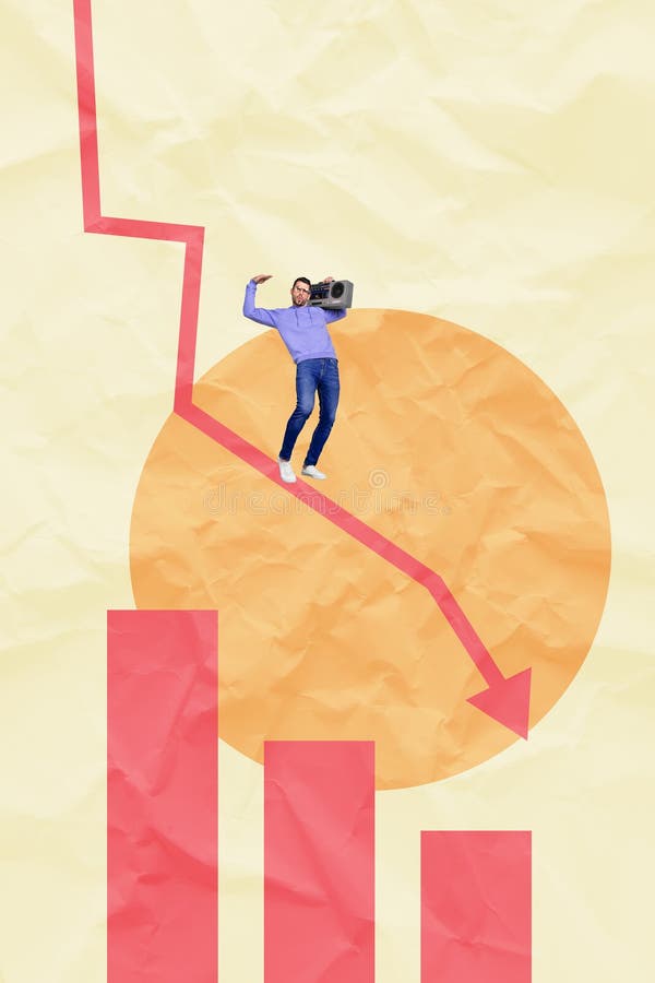
Free with trial Modern business crisis collage witt business analyzing shocking falling stats graph symbolizing global decrease. Data analysis decrease illustrations Modern business crisis collage witt business analyzing shocking falling stats graph symbolizing global decrease
Free with trial Modern business crisis collage witt business analyzing shocking falling stats graph symbolizing global decrease. Data analysis decrease illustrations Modern business crisis collage witt business analyzing shocking falling stats graph symbolizing global decrease
Free with trial Decline bar chart with downward trend arrow outline icon vector. Decrease, loss, and financial drop symbol in black circle. Data analysis decrease vectors Decline bar chart with downward trend arrow outline icon. Decrease, loss, and financial drop symbol in black circle
Free with trial A line graph displaying fluctuating data points over time with a distinct pattern of peaks and troughs. Data analysis decrease illustrations Graph showing fluctuating data points over time. A line graph displaying fluctuating data points over time with a distinct pattern of peaks and troughs
Free with trial A comprehensive collection of flat line design icons representing key concepts in business, finance, and data analytics. The set includes various charts (bar, line, pie), a speedometer, a magnifying glass with a graph, financial documents with checkmarks, a target with an arrow, a dollar sign, a percentage symbol, and directional arrows for growth and decline. These versatile vector elements are ideal for presentations, reports, websites, and applications focused on statistics, performance, strategy, and financial insights. Data analysis decrease illustrations Business and Data Analytics Flat Line Icons Set. A comprehensive collection of flat line design icons representing key concepts in business, finance, and data analytics. The set includes various charts (bar, line, pie), a speedometer, a magnifying glass with a graph, financial documents with checkmarks, a target with an arrow, a dollar sign, a percentage symbol, and directional arrows for growth and decline. These versatile vector elements are ideal for presentations, reports, websites, and applications focused on statistics, performance, strategy, and financial insights.
Free with trial A minimalist vector icon illustrating market volatility and financial trends. The graphic features two distinct line graphs on a coordinate system: a jagged, highly fluctuating upper line representing high volatility, and a smoother lower line with marked points indicating a general trend. Up-down arrows and separate up down indicators further emphasize market movement and unpredictable changes. Ideal for financial reports, business presentations, data visualization, and economic analysis. Data analysis decrease vectors Market Volatility and Financial Trend Graph Icon. A minimalist vector icon illustrating market volatility and financial trends. The graphic features two distinct line graphs on a coordinate system: a jagged, highly fluctuating upper line representing high volatility, and a smoother lower line with marked points indicating a general trend. Up-down arrows and separate up down indicators further emphasize market movement and unpredictable changes. Ideal for financial reports, business presentations, data visualization, and economic analysis.
Free with trial Glass Data Columns Melting Into Droplet, Surreal AI Analytics and Insight Concept. Data analysis decrease illustrations Glass Data Columns Melting Into Droplet, Surreal AI Analytics and Insight Concept
Free with trial Connected cube network in blockchain style, sales decrease arrow, and analytics report. Ideal for blockchain, cryptocurrency, sales, technology, analytics, business data-driven decision-making. Data analysis decrease illustrations Blockchain Network with Sales Decline and Analytics Representation. Connected cube network in blockchain style, sales decrease arrow, and analytics report. Ideal for blockchain, cryptocurrency, sales, technology, analytics, business data-driven decision-making
Free with trial A comprehensive vector icon set featuring essential symbols for business, finance, and data analysis. This collection includes various arrows for indicating growth and decline, wavy lines representing market trends, checkmarks for success or approval, X marks for errors or rejection, stopwatches for time management and efficiency, and stacks of coins with dollar signs for financial concepts. Ideal for presentations, infographics, web design, and reports to visually communicate progress, status, and economic indicators. Data analysis decrease vectors Business, Finance, and Data Analytics Vector Icon Set. A comprehensive vector icon set featuring essential symbols for business, finance, and data analysis. This collection includes various arrows for indicating growth and decline, wavy lines representing market trends, checkmarks for success or approval, X marks for errors or rejection, stopwatches for time management and efficiency, and stacks of coins with dollar signs for financial concepts. Ideal for presentations, infographics, web design, and reports to visually communicate progress, status, and economic indicators.
Free with trial The image depicts a series of green bars representing data points, with a prominent red downward arrow indicating a decline in performance or values over time. The bars decrease in height from left to right, emphasizing a downward trend. Data analysis decrease illustrations Decline in performance indicated by downward trend. The image depicts a series of green bars representing data points, with a prominent red downward arrow indicating a decline in performance or values over time. The bars decrease in height from left to right, emphasizing a downward trend
Free with trial Climate change, sustainability, eco-friendly practices, carbon footprint, energy efficiency, environmental awareness. Man pointing at charts and graphs. Environmental awareness and sustainability. Data analysis decrease vectors Environmental Data Analysis with Focus on Carbon Footprint, Emission Reduction, and Home Energy Efficiency. Climate change, sustainability, eco-friendly practices, carbon footprint, energy efficiency, environmental awareness. Man pointing at charts and graphs. Environmental awareness and sustainability
Free with trial A vibrant digital explosion of glowing stock market data, featuring percentage gains and losses, trading volumes, and financial charts on a dark background. Data analysis decrease illustrations Digital Stock Market Data Explosion with Glowing Graphs Percentages and Financial Numbers. A vibrant digital explosion of glowing stock market data, featuring percentage gains and losses, trading volumes, and financial charts on a dark background
Free with trial Graphic bar chart illustrating business data analysis, financial statistics, and market trends with both positive growth and negative decline on a clean white background. Data analysis decrease vectors Business financial graph showing increase and decrease. Graphic bar chart illustrating business data analysis, financial statistics, and market trends with both positive growth and negative decline on a clean white background
Free with trial A 3D rendering of a bar chart featuring three colorful columns: blue, orange, and green, increasing in height from left to right. Two prominent red downward arrows are positioned above the tallest green bar, clearly indicating a decline, decrease, or negative trend. The minimalist design on a clean white background makes it ideal for illustrating business performance, financial reports, economic downturns, sales drops, or any data visualization requiring a clear representation of a negative change or warning. Perfect for presentations, infographics, and analytical content. Data analysis decrease vectors 3D Bar Chart with Red Downward Arrows Showing Decline. A 3D rendering of a bar chart featuring three colorful columns: blue, orange, and green, increasing in height from left to right. Two prominent red downward arrows are positioned above the tallest green bar, clearly indicating a decline, decrease, or negative trend. The minimalist design on a clean white background makes it ideal for illustrating business performance, financial reports, economic downturns, sales drops, or any data visualization requiring a clear representation of a negative change or warning. Perfect for presentations, infographics, and analytical content.
Free with trial Trend disintegrating line graph illustration dec decrease, fall analysis, visualization statistics trend disintegrating line graph. Data analysis decrease illustrations Trend disintegrating line graph
Free with trial A 3D bar chart rendered in a vibrant pink color illustrates a downward trend. The bars decrease in height from left to right, representing a decline in data or performance. A thick pink arrow with a sharp point follows the descending path of the bars, reinforcing the concept of a decrease. The chart is presented in isolation against a clean white background, making the visual elements stand out. Data analysis decrease illustrations Pink Bar Chart with a Downward Trending Arrow Symbolizing Decline graph magenta. A 3D bar chart rendered in a vibrant pink color illustrates a downward trend. The bars decrease in height from left to right, representing a decline in data or performance. A thick pink arrow with a sharp point follows the descending path of the bars, reinforcing the concept of a decrease. The chart is presented in isolation against a clean white background, making the visual elements stand out
Free with trial This dynamic digital artwork displays a vibrant abstract representation of a financial stock market trading chart. Featuring prominent candlestick bars in shades of orange and green, alongside a delicate line graph, it conveys concepts of market volatility, data analytics, and economic trends. Data analysis decrease illustrations Abstract financial stock market graph with trading candlesticks and line chart, digital data visualization. This dynamic digital artwork displays a vibrant abstract representation of a financial stock market trading chart. Featuring prominent candlestick bars in shades of orange and green, alongside a delicate line graph, it conveys concepts of market volatility, data analytics, and economic trends.
Free with trial Isometric colorful cylinder bar graph showing a financial decline. 3D chart representing loss, decrease, and business drop symbol. Data analysis decrease vectors Isometric colorful cylinder bar graph showing a financial decline. 3D chart representing loss, decrease, and business drop
Free with trial Colorful vector icons showing graphs charts arrows lightbulb target briefcase for analytics strategy and success. Data analysis decrease illustrations Illustrated Business Data Analysis and Growth Concepts. Colorful vector icons showing graphs charts arrows lightbulb target briefcase for analytics strategy and success
Free with trial Corn price going down decrease cheaper in commodity market international trading market vector. Data analysis decrease vectors Corn price going down decrease cheaper in commodity market international trading market
Free with trial A simple hand-drawn illustration of a bar chart or graph. The chart is rendered in black lines on a white background, with the lower portions of the bars filled with diagonal hatching. This image can be used to represent data, statistics, growth, progress, or analysis in a visually appealing and informal way. Suitable for presentations, reports, or website graphics. Data analysis decrease illustrations Hand-Drawn Bar Chart Illustration. A simple hand-drawn illustration of a bar chart or graph. The chart is rendered in black lines on a white background, with the lower portions of the bars filled with diagonal hatching. This image can be used to represent data, statistics, growth, progress, or analysis in a visually appealing and informal way. Suitable for presentations, reports, or website graphics.