Free with trial Sales performance, data analysis, business strategy, financial downturn, decision making, marketing insights. Arrow pointing down with sale text, charts check mark. Sales performance and data. Data analysis decrease vectors Sales Analytics and Performance Metrics with Downward Trends and Checkmark. Sales performance, data analysis, business strategy, financial downturn, decision making, marketing insights. Arrow pointing down with sale text, charts check mark. Sales performance and data
Free with trial Downward arrow, magnifying glass, dollar sign indicate declining trends, financial analysis, revenue downturn. Ideal for business, finance, investment, market trends loss economic study simple. Data analysis decrease vectors Declining Trends in Business Revenue with Analysis and Financial Focus. Downward arrow, magnifying glass, dollar sign indicate declining trends, financial analysis, revenue downturn. Ideal for business, finance, investment, market trends loss economic study simple
Free with trial Abstract illustration of business growth, featuring bar graphs and line graphs in shades of blue and grey. The image conveys concepts of data analysis, progress, and financial performance. Suitable for presentations, reports, and marketing materials related to business, finance, and technology. Data analysis decrease illustrations Abstract Business Growth Chart. Abstract illustration of business growth, featuring bar graphs and line graphs in shades of blue and grey. The image conveys concepts of data analysis, progress, and financial performance. Suitable for presentations, reports, and marketing materials related to business, finance, and technology.
Free with trial A 3D illustration of a financial chart showing a dramatic downward trend. A large red arrow points sharply down over a series of declining blue bar graphs, symbolizing a stock market crash, economic recession, or business failure. The background features complex data and grids, representing financial analysis and market data. This image is perfect for concepts related to economic crisis, investment loss, financial risk, bankruptcy, and negative business reports. Data analysis decrease illustrations Stock Market Crash Financial Graph. A 3D illustration of a financial chart showing a dramatic downward trend. A large red arrow points sharply down over a series of declining blue bar graphs, symbolizing a stock market crash, economic recession, or business failure. The background features complex data and grids, representing financial analysis and market data. This image is perfect for concepts related to economic crisis, investment loss, financial risk, bankruptcy, and negative business reports.
Free with trial A 3D icon depicts a financial graph. The icon features a rounded purple square with a lighter purple top edge. Inside, a yellow line chart with circular data points shows an upward trend, overlaid on a series of yellow vertical bars representing a bar chart. The overall design is clean and modern, symbolizing data analysis, business growth, and financial performance. Data analysis decrease illustrations 3D icon representing a financial graph with bars and a line chart on a purple background. A 3D icon depicts a financial graph. The icon features a rounded purple square with a lighter purple top edge. Inside, a yellow line chart with circular data points shows an upward trend, overlaid on a series of yellow vertical bars representing a bar chart. The overall design is clean and modern, symbolizing data analysis, business growth, and financial performance
Free with trial A simple and bold icon illustration of a bar graph. This can be used to represent data, statistics, growth, or trends. The icon is designed in a clean and minimalist style, making it versatile for various applications. Data analysis decrease vectors Simple Bold Bar Graph Sign Shape Icon for Data Presentation. A simple and bold icon illustration of a bar graph. This can be used to represent data, statistics, growth, or trends. The icon is designed in a clean and minimalist style, making it versatile for various applications.
Free with trial A simple line graph icon showing a downward trend with two arrows and the words "DECREASE DECLINE. Data analysis decrease illustrations Downward Trend Graph Icon with Decrease Decline Text chart. A simple line graph icon showing a downward trend with two arrows and the words "DECREASE DECLINE
Free with trial Trend melting line graph illustration analysis visualization, ice decrease, plot statistics trend melting line graph. Data analysis decrease illustrations Trend melting line graph
Free with trial Orange bar chart showing progressive data decline paired with a sad face icon suggesting disappointment. Ideal for business loss, failure, negative feedback, underperformance, worry, challenges. Data analysis decrease vectors Bar Chart with Declining Data and Sad Face Icon Representing Negative Trends. Orange bar chart showing progressive data decline paired with a sad face icon suggesting disappointment. Ideal for business loss, failure, negative feedback, underperformance, worry, challenges
Free with trial Conceptual line art depicting business analysis and market trends. Data analysis decrease illustrations Business Analysis Magnifying Glass, Thumbs Up, Declining Graph. Conceptual line art depicting business analysis and market trends.
Free with trial Close-up of neatly stacked coins, arranged in an ascending and descending pattern, symbolizing financial growth, savings, and investment progress. The blurred background features a dynamic financial market chart with glowing lines, representing stock market trends, economic data, or cryptocurrency fluctuations. This image effectively illustrates concepts of wealth management, business success, risk, and the fluctuating nature of the global economy. It's ideal for financial articles, presentations, and advertisements related to banking, investment, budgeting, and economic analysis. Data analysis decrease illustrations Financial Growth Concept with Stacks of Coins and Stock Market Chart. Close-up of neatly stacked coins, arranged in an ascending and descending pattern, symbolizing financial growth, savings, and investment progress. The blurred background features a dynamic financial market chart with glowing lines, representing stock market trends, economic data, or cryptocurrency fluctuations. This image effectively illustrates concepts of wealth management, business success, risk, and the fluctuating nature of the global economy. It's ideal for financial articles, presentations, and advertisements related to banking, investment, budgeting, and economic analysis.
Free with trial A simple black and red bar chart displays data with varying heights on a white background. Data analysis decrease illustrations Simple Bar Chart with One Red Bar on White Background graph data. A simple black and red bar chart displays data with varying heights on a white background
Free with trial A magnifying glass focuses on a downward trend graph and briefcase, symbolizing economic downturn analysis and market. Data analysis decrease illustrations Economic Downturn Analysis Magnifying Glass on Market Decline. A magnifying glass focuses on a downward trend graph and briefcase, symbolizing economic downturn analysis and market.
Free with trial A businessman wearing a suit analyzes cost reduction versus quality improvement He uses both a laptop and a tablet computer to look at the data and see how these two factors interact to produce the best result for his company and business dealings shown with a graph of numbers going up and down. Data analysis decrease illustrations Cost reduction and quality improvement shown with businessman analyzing data on devices. A businessman wearing a suit analyzes cost reduction versus quality improvement He uses both a laptop and a tablet computer to look at the data and see how these two factors interact to produce the best result for his company and business dealings shown with a graph of numbers going up and down
Free with trial Orange bar chart with downward arrow vector illustration. Financial loss, economic recession, market crash, business failure, negative growth, data analysis. Declining graph with falling trend. Data analysis decrease vectors Decreasing bar chart with downward arrow showing financial loss and economic recession vector illustration. Orange bar chart with downward arrow vector. Orange bar chart with downward arrow vector illustration. Financial loss, economic recession, market crash, business failure, negative growth, data analysis. Declining graph with falling trend
Free with trial A circular icon containing a stylized representation of financial data. The icon features a series of black vertical bars of varying heights, suggesting a bar chart. Overlaid on the bars are two thin lines, one black and one grey, depicting line graphs with peaks and troughs, indicating fluctuating trends. The overall design is minimalist and symbolic, suitable for representing business analytics. Data analysis decrease illustrations Circular Graph Icon with Bar and Line Charts Representing Financial Data and Trends business. A circular icon containing a stylized representation of financial data. The icon features a series of black vertical bars of varying heights, suggesting a bar chart. Overlaid on the bars are two thin lines, one black and one grey, depicting line graphs with peaks and troughs, indicating fluctuating trends. The overall design is minimalist and symbolic, suitable for representing business analytics
Free with trial A flat design vector illustration depicting a financial market data board or stock ticker. The black-bordered display features various stock symbols, numerical values like '$ ,80K', '$ ,22,50', and indicators of market performance. Prominently highlighted in red is the word 'LOSING', accompanied by a red downward arrow signifying a price drop, and a red downward triangle. Conversely, a green upward arrow indicates a price increase. This icon effectively visualizes concepts of financial loss, gain, market volatility, and investment trends, suitable for business, finance, and economic content. Data analysis decrease illustrations Financial Market Data Board Icon with Loss and Gain Indicators. A flat design vector illustration depicting a financial market data board or stock ticker. The black-bordered display features various stock symbols, numerical values like '$ ,80K', '$ ,22,50', and indicators of market performance. Prominently highlighted in red is the word 'LOSING', accompanied by a red downward arrow signifying a price drop, and a red downward triangle. Conversely, a green upward arrow indicates a price increase. This icon effectively visualizes concepts of financial loss, gain, market volatility, and investment trends, suitable for business, finance, and economic content.
Free with trial Circular maze with a descending bar chart icon, symbolizing the challenge of navigating business data and analytics amid declines, obstacles, and the search for strategic solutions and recovery. Data analysis decrease illustrations Navigating complex data decline challenges and finding solutions. Circular maze with a descending bar chart icon, symbolizing the challenge of navigating business data and analytics amid declines, obstacles, and the search for strategic solutions and recovery
Free with trial Flat illustration of technical analysis with a magnifying glass on a yellow background. Stock market correction concept. Bankrupt financial information. Descending trading graph. Data analysis decrease vectors Flat illustration of technical analysis with a magnifying glass on a yellow background. Stock market correction concept. Bankrupt
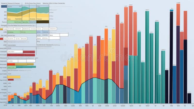
Free with trial This image presents a detailed analysis of business performance metrics, including market share, quarterly sales, and key performance indicators (KPIs. Data analysis decrease illustrations Comprehensive business performance metrics and growth analysis. This image presents a detailed analysis of business performance metrics, including market share, quarterly sales, and key performance indicators (KPIs
Free with trial Data metallic style declining sales graph illustration report forecast, revenue market, performance downturn data metallic style declining sales graph. Data analysis decrease illustrations Data metallic style declining sales graph
Free with trial A thick, red, zigzagging line, potentially a stock chart, is superimposed over a dark background with glowing green and red data points and lines. Image. Data analysis decrease illustrations Red Zigzag Line Overlaying Financial Data. A thick, red, zigzagging line, potentially a stock chart, is superimposed over a dark background with glowing green and red data points and lines. Image
Free with trial A striking 3D rendering illustrates a significant decline in consumer spending or retail sales. The image features a large green shopping bag followed by three progressively smaller white shopping bags, visually representing a reduction. A prominent red arrow, shaped like a downward trend graph, effectively symbolizes a market downturn, economic recession, or decrease in purchasing power. Set against a clean white background, this conceptual image is ideal for financial reports, business presentations, and articles discussing economic challenges, retail struggles, or market analysis. Data analysis decrease illustrations Retail Sales Decline and Economic Downturn. A striking 3D rendering illustrates a significant decline in consumer spending or retail sales. The image features a large green shopping bag followed by three progressively smaller white shopping bags, visually representing a reduction. A prominent red arrow, shaped like a downward trend graph, effectively symbolizes a market downturn, economic recession, or decrease in purchasing power. Set against a clean white background, this conceptual image is ideal for financial reports, business presentations, and articles discussing economic challenges, retail struggles, or market analysis.
Free with trial A dynamic image of a digital stock market ticker screen displaying financial data. The background is filled with red, downward-pointing arrows and negative numbers, symbolizing a bearish market, recession, or economic downturn. In stark contrast, a single, large, bright green arrow points upwards, representing growth, success, profit, and recovery. This powerful visual metaphor illustrates a single stock's success or a broader economic turnaround amidst widespread losses. It's perfect for concepts related to investment strategy, financial analysis, market volatility, and economic hope. Data analysis decrease illustrations Stock Market Recovery and Growth Concept. A dynamic image of a digital stock market ticker screen displaying financial data. The background is filled with red, downward-pointing arrows and negative numbers, symbolizing a bearish market, recession, or economic downturn. In stark contrast, a single, large, bright green arrow points upwards, representing growth, success, profit, and recovery. This powerful visual metaphor illustrates a single stock's success or a broader economic turnaround amidst widespread losses. It's perfect for concepts related to investment strategy, financial analysis, market volatility, and economic hope.
Free with trial Futuristic Robotic Hand Pointing Towards Computer Display with Cost Analysis Concept and Digital Connections Representing Innovation and Technology Quark. Data analysis decrease illustrations Futuristic Robotic Hand Pointing Towards Computer Display with Cost Analysis Concept and Digital Connections
Free with trial This infographic features a collection of colorful charts and graphs on a white background, surrounded by arrows pointing in different directions. The image represents business and finance concepts, such as data analysis, statistics, and trends. The vibrant colors and dynamic design make it visually appealing and engaging. Data analysis decrease vectors A colorful infographic with arrows and charts on a white background. This infographic features a collection of colorful charts and graphs on a white background, surrounded by arrows pointing in different directions. The image represents business and finance concepts, such as data analysis, statistics, and trends. The vibrant colors and dynamic design make it visually appealing and engaging.
Free with trial Conceptual Illustration of Cost Analysis and Research Strategy with a Computer Screen and Hand Gestures in a Modern Digital Environment Quark. Data analysis decrease illustrations Conceptual Illustration of Cost Analysis and Research Strategy with a Computer Screen and Hand Gestures in a Modern
Free with trial An isolated vector illustration featuring two prominent, stylized arrows on a clean white background. One arrow, colored in shades of red and pink, points diagonally upwards and to the right, symbolizing growth, increase, or positive trends. The other arrow, rendered in blue and cyan tones, points diagonally downwards and to the left, representing decline, decrease, or negative movement. Both arrows have a modern, slightly textured or sketchy appearance, making them ideal for infographics, business presentations, financial reports, or conceptual designs illustrating contrasting directions, market changes, or comparative data. Data analysis decrease illustrations Growth and Decline Arrows with Sketchy Style. An isolated vector illustration featuring two prominent, stylized arrows on a clean white background. One arrow, colored in shades of red and pink, points diagonally upwards and to the right, symbolizing growth, increase, or positive trends. The other arrow, rendered in blue and cyan tones, points diagonally downwards and to the left, representing decline, decrease, or negative movement. Both arrows have a modern, slightly textured or sketchy appearance, making them ideal for infographics, business presentations, financial reports, or conceptual designs illustrating contrasting directions, market changes, or comparative data.
Free with trial 3d blue magnifying glass with downward-trending chart inside Financial analysis, economic decline, risk assessment, market monitoring, investment evaluation concept Low poly digital futuristic Vector. Data analysis decrease vectors 3d blue magnifying glass with downward-trending chart inside Financial analysis, economic decline, risk assessment
Free with trial A magnifying glass focuses on a declining bar graph and a file folder, symbolizing a decrease in sales and the need for. Data analysis decrease illustrations Declining Sales Analysis Magnifying Glass, Downward Graph. A magnifying glass focuses on a declining bar graph and a file folder, symbolizing a decrease in sales and the need for.
Free with trial A collection of nine simple black icons on a white background depicting concepts of decrease loss and downward trends using graphs charts and arrows. Data analysis decrease vectors Set of black decline icons showing business failure and data reduction. A collection of nine simple black icons on a white background depicting concepts of decrease loss and downward trends using graphs charts and arrows
Free with trial A professional office setting showcasing teamwork in data analysis, emphasizing a digital graph reflecting cost reduction trends over time. Perfect for business concepts. Raster. Data analysis decrease illustrations Business Analysis with Transparent Graph Showing Cost Decrease Over Time with Team Collaborating on Digital Devices in. A professional office setting showcasing teamwork in data analysis, emphasizing a digital graph reflecting cost reduction trends over time. Perfect for business concepts. Raster
Free with trial Futuristic Robotic Hand Interacting with Digital Interface for Cost Analysis and Reduction Strategies in Business Environment Quark. Data analysis decrease illustrations Futuristic Robotic Hand Interacting with Digital Interface for Cost Analysis and Reduction Strategies in Business
Free with trial Cost Analysis in Business Strategy: Hands on Laptop with Graphs and Icons Representing Marketing, Planning, and Research in Contemporary Workspace Quark. Data analysis decrease illustrations Cost Analysis in Business Strategy: Hands on Laptop with Graphs and Icons Representing Marketing, Planning, and Research
Free with trial Robotic Hand Interacting with Digital Cost Reduction Interface in a Futuristic Cityscape with Data Graphs and Business Icons Quark. Data analysis decrease illustrations Robotic Hand Interacting with Digital Cost Reduction Interface in a Futuristic Cityscape with Data Graphs and Business
Free with trial A magnifying glass rests on gold coins atop a financial chart, generated by AI. This image symbolizes the detailed examination and analysis needed for successful investment strategies in the volatile world of finance. The visual representation highlights the intricate process of studying market tre. Data analysis decrease illustrations Financial Market Analysis. A magnifying glass rests on gold coins atop a financial chart, generated by AI. This image symbolizes the detailed examination and analysis needed for successful investment strategies in the volatile world of finance. The visual representation highlights the intricate process of studying market tre
Free with trial Ethanol price goes down drop decrease cheap in global commodity market trade export transaction vector. Data analysis decrease vectors Ethanol price goes down drop decrease cheap in global commodity market trade export transaction
Free with trial Dynamic teal graph visually represents financial data. Professional design elements provide an ideal visual for business reports and presentations , dreamy concept. Data analysis decrease illustrations Abstract Digital Financial Graph with Teal Data. Dynamic teal graph visually represents financial data. Professional design elements provide an ideal visual for business reports and presentations , dreamy concept
Free with trial Year data charts illustration color coded, categories month, total representation year data charts. Data analysis decrease illustrations Year data charts
Free with trial Aerial View of Business Professionals Collaborating on Cost Analysis with Laptop and Digital Graphs on Table in Modern Office Setting Quark. Data analysis decrease illustrations Aerial View of Business Professionals Collaborating on Cost Analysis with Laptop and Digital Graphs on Table in Modern
Free with trial Collection of business growth and financial analysis icons featuring bar charts and arrows with editable line art and flat shape style. Editable vector icon set. Data analysis decrease vectors Collection of business growth and financial analysis icons featuring bar charts and arrows with editable line art and flat shape
Free with trial Stylized data illustrates financial increase using dollar signs, bar graphs, and arrows. Some data trends down while other data trends up, showing potential profits and losses. Data analysis decrease illustrations Stock Market Data Shows Economic Growth and Potential Loss in the Future. Stylized data illustrates financial increase using dollar signs, bar graphs, and arrows. Some data trends down while other data trends up, showing potential profits and losses.
Free with trial Conceptual Image of Cost Analysis with Hands Reaching Out to Digital Graphs and Icons Representing Business Strategy and Financial Planning Quark. Data analysis decrease illustrations Conceptual Image of Cost Analysis with Hands Reaching Out to Digital Graphs and Icons Representing Business Strategy and
Free with trial A collage of nine distinct charts and graphs, primarily displaying financial data, growth trends, and economic indicators. The visuals feature line graphs, area charts, and bar charts with various colored lines and shaded areas representing different metrics over time. Accompanying text and labels suggest analysis of business performance, economic growth, and financial markets. This collection is ideal for presentations, reports, and articles related to finance, economics, and business analytics. Data analysis decrease illustrations Collection of Financial and Business Growth Charts. A collage of nine distinct charts and graphs, primarily displaying financial data, growth trends, and economic indicators. The visuals feature line graphs, area charts, and bar charts with various colored lines and shaded areas representing different metrics over time. Accompanying text and labels suggest analysis of business performance, economic growth, and financial markets. This collection is ideal for presentations, reports, and articles related to finance, economics, and business analytics.
Free with trial Futuristic Robot Hand Interacting with Cost Analysis Concepts on Digital Screen in Modern Business Environment Quark. Data analysis decrease illustrations Futuristic Robot Hand Interacting with Cost Analysis Concepts on Digital Screen in Modern Business Environment Quark
Free with trial Up and down directional arrows in vector format for versatile use. Perfect for business infographics and data visualization. EPS 10. Data analysis decrease vectors Up and down directional arrows in vector format for versatile use. Perfect for business infographics and data visualization.
Free with trial A robotic hand extends toward dynamic financial graphs and data in a cosmic setting. This image symbolizes the intersection of technology and finance, showcasing innovation. Scalp. Data analysis decrease illustrations Futuristic robotic hand reaching towards digital financial graphs and data visualizations in a cosmic background with. A robotic hand extends toward dynamic financial graphs and data in a cosmic setting. This image symbolizes the intersection of technology and finance, showcasing innovation. Scalp
Free with trial A vibrant and modern illustration of a bar graph, featuring four bars of varying heights and colors: blue, green, orange, and red. The bars are positioned on a gray horizontal line, creating a sense of data comparison and visual hierarchy. This image is ideal for representing data, statistics, business reports, financial analysis, or any concept requiring visual data representation. The clean design and bright colors make it suitable for presentations, websites, and marketing materials. Data analysis decrease illustrations Colorful Bar Graph Illustration. A vibrant and modern illustration of a bar graph, featuring four bars of varying heights and colors: blue, green, orange, and red. The bars are positioned on a gray horizontal line, creating a sense of data comparison and visual hierarchy. This image is ideal for representing data, statistics, business reports, financial analysis, or any concept requiring visual data representation. The clean design and bright colors make it suitable for presentations, websites, and marketing materials.
Free with trial Robotic Hand Holding Computer Display with Cost Reduction Concept, Analyzing Data and Strategies for Business Growth in Digital World Quark. Data analysis decrease illustrations Robotic Hand Holding Computer Display with Cost Reduction Concept, Analyzing Data and Strategies for Business Growth in
Free with trial Futuristic Robot Hand Interacting with Cost Analysis Concept on a Digital Screen for Business Strategies and Financial Planning Insights Quark. Data analysis decrease illustrations Futuristic Robot Hand Interacting with Cost Analysis Concept on a Digital Screen for Business Strategies and Financial
Free with trial Business Meeting on Real Estate Market Analysis with Charts, Graphs, and Digital House Icon Showing Trends in Property Value Changes Sigmoid. Data analysis decrease illustrations Professionals discuss real estate market trends using data and analytics. A digital house icon symbolizes value changes. Business Meeting on Real Estate Market Analysis with Charts, Graphs, and Digital House Icon Showing Trends in Property Value Changes Sigmoid
Free with trial This vector illustration features a set of two minimalist graphs depicting a significant decline. Each graph includes a downward-sloping line chart with an accompanying filled area, clearly indicating a negative trend. One version is presented in black on a white background, while the other is white on a black background, offering versatile usage. This icon is ideal for illustrating concepts of business loss, economic recession, market downturns, financial crisis, poor performance, or any data showing a decrease. Perfect for presentations, reports, infographics, and web design. Data analysis decrease vectors Declining Business Graph Icon Set - Negative Trend Chart. This vector illustration features a set of two minimalist graphs depicting a significant decline. Each graph includes a downward-sloping line chart with an accompanying filled area, clearly indicating a negative trend. One version is presented in black on a white background, while the other is white on a black background, offering versatile usage. This icon is ideal for illustrating concepts of business loss, economic recession, market downturns, financial crisis, poor performance, or any data showing a decrease. Perfect for presentations, reports, infographics, and web design.
Free with trial Stock market display with a red line graph indicating a downward trend on a digital screen. The graph is composed of jagged peaks and troughs, suggesting instability. Surrounding the graph are numeric data and grid lines, highlighting market performance details. The screen is located in a financial setting with a blurred, busy background, possibly an office or trading floor, enhancing the context of economic activity. The color red typically signifies a decrease or negative trend in market terms. Data analysis decrease illustrations Red Stock Market Crash On Screen. Stock market display with a red line graph indicating a downward trend on a digital screen. The graph is composed of jagged peaks and troughs, suggesting instability. Surrounding the graph are numeric data and grid lines, highlighting market performance details. The screen is located in a financial setting with a blurred, busy background, possibly an office or trading floor, enhancing the context of economic activity. The color red typically signifies a decrease or negative trend in market terms.
Free with trial Price increase. Inflation icon group. Purchasing power decrease and savings. Services and goods cost rise. Vector illustration. Data analysis decrease vectors Price increase. Inflation icon group. Purchasing power decrease and savings. Services and goods cost rise. Vector illustration.
Free with trial Abstract 3D render of a financial growth chart. The image features a series of vertical bars, some in teal and others in orange, representing data points on a graph. The bars increase in height towards the right, suggesting positive growth or progress. The chart is set against a dark background with a subtle grid pattern and a reflective surface, adding depth and visual interest. Suitable for illustrating financial reports, market analysis, or business trends. Data analysis decrease illustrations Abstract Financial Growth Chart. Abstract 3D render of a financial growth chart. The image features a series of vertical bars, some in teal and others in orange, representing data points on a graph. The bars increase in height towards the right, suggesting positive growth or progress. The chart is set against a dark background with a subtle grid pattern and a reflective surface, adding depth and visual interest. Suitable for illustrating financial reports, market analysis, or business trends.
Free with trial Futuristic Robotic Hand Interacting with Cost Analysis Interface and Business Strategy Elements in a Digital Environment Quark. Data analysis decrease illustrations Futuristic Robotic Hand Interacting with Cost Analysis Interface and Business Strategy Elements in a Digital Environment
Free with trial A graph displays trading data with green and red bars showing price changes during a stock trading session. Investors analyze the fluctuations and trends. Data analysis decrease vectors A graph displays trading data with green and red bars showing price changes during a stock trading session. Investors analyze the
Free with trial Sales data trends illustration figures products, quarter chbar, highlight market sales data trends. Data analysis decrease illustrations Sales data trends
Free with trial A collage of various hand-drawn charts and graphs in shades of blue, illustrating business growth, data analysis, and financial trends. The collection includes bar charts, line graphs, and pie charts, all rendered with a sketchy, artistic style. These visuals are perfect for presentations, reports, or any project requiring a dynamic and informative representation of data and progress. Data analysis decrease illustrations Hand-Drawn Business Growth Charts and Graphs Collection. A collage of various hand-drawn charts and graphs in shades of blue, illustrating business growth, data analysis, and financial trends. The collection includes bar charts, line graphs, and pie charts, all rendered with a sketchy, artistic style. These visuals are perfect for presentations, reports, or any project requiring a dynamic and informative representation of data and progress.
Free with trial A modern business analytics dashboard showcasing key performance indicators (KPIs) with engaging charts and graphs for data visualization Ideal for presentations and reports. Generative AI. Data analysis decrease illustrations Business Analytics Dashboard Graphs Charts Data Performance Growth Metrics KPI. A modern business analytics dashboard showcasing key performance indicators (KPIs) with engaging charts and graphs for data visualization Ideal for presentations and reports. Generative AI
Free with trial A conceptual illustration of market analysis featuring a bar chart, magnifying glass, upward and downward arrows, and business icons on white. Data analysis decrease illustrations Market Analysis Concept with Bar Chart Magnifying Glass and Upward Arrow graph. A conceptual illustration of market analysis featuring a bar chart, magnifying glass, upward and downward arrows, and business icons on white
Free with trial A black icon of a graph with a downward sloping curve and an arrow indicating decrease. Data analysis decrease illustrations Black graph showing a downward trend with an arrow and Y axis label chart data. A black icon of a graph with a downward sloping curve and an arrow indicating decrease
Free with trial A pair of minimalist line graphs illustrating a downward trend, presented in a high-contrast black on white and white on black design. The arrow at the end clearly indicates a decline, representing concepts like loss, decrease, negative growth, or recession. Ideal for financial reports, business presentations, economic news, data visualization, or any content requiring a clear symbol for falling statistics or poor performance. Data analysis decrease vectors Downward Trend Graph Icon Set - Black and White Decline Chart. A pair of minimalist line graphs illustrating a downward trend, presented in a high-contrast black on white and white on black design. The arrow at the end clearly indicates a decline, representing concepts like loss, decrease, negative growth, or recession. Ideal for financial reports, business presentations, economic news, data visualization, or any content requiring a clear symbol for falling statistics or poor performance.
Free with trial Red 3D zigzag arrow is trending downward on plain white background, casting faint shadow. Business decline, financial analysis, data visualization, modern design, digital marketing, growth reduction, minimalistic style. Data analysis decrease illustrations Red 3D zigzag arrow is trending downward on plain white background, casting faint shadow
Free with trial Descending Bar Chart Illustration Depicting Decrease, Recession, Downturn with Arrow. Data analysis decrease vectors Descending Bar Chart Illustration Depicting Decrease, Recession, Downturn with Arrow
Free with trial A minimalist set of hand-drawn icons featuring a dynamic arrow indicating movement or progress and a line graph displaying data trends, perfect for illustrating concepts of growth, analysis, and chang. Data analysis decrease vectors Arrow and graph icons set isolated on transparent background. A minimalist set of hand-drawn icons featuring a dynamic arrow indicating movement or progress and a line graph displaying data trends, perfect for illustrating concepts of growth, analysis, and chang
Free with trial Illustration showing financial data analysis with charts, idea lightbulb, and location pins, perfect for finance and business concepts. Data analysis decrease illustrations Analyzing Financial Data and Performance Charts Illustration. Illustration showing financial data analysis with charts, idea lightbulb, and location pins, perfect for finance and business concepts
Free with trial An abstract digital financial chart features multiple vibrant, fluctuating neon lines in blue, green, pink, and white, set against a dark grid background. Prominent red upward and downward arrows, along with a green downward arrow, clearly indicate market trends, growth, and decline. Interspersed geometric shapes connected by lines suggest complex data points and network connections. This dynamic visualization is ideal for illustrating concepts of stock market data, cryptocurrency trends, business analytics, investment volatility, big data, AI, and financial technology, suitable for modern business and tech-related projects. Data analysis decrease illustrations Digital Financial Data Chart with Fluctuating Lines and Arrows. An abstract digital financial chart features multiple vibrant, fluctuating neon lines in blue, green, pink, and white, set against a dark grid background. Prominent red upward and downward arrows, along with a green downward arrow, clearly indicate market trends, growth, and decline. Interspersed geometric shapes connected by lines suggest complex data points and network connections. This dynamic visualization is ideal for illustrating concepts of stock market data, cryptocurrency trends, business analytics, investment volatility, big data, AI, and financial technology, suitable for modern business and tech-related projects.
Free with trial This image showcases a comprehensive collection of blue bar graphs and line graphs, presented in a grid format. Each graph depicts various data trends, including upward and downward movements, fluctuating patterns, and steady growth. The clean, modern design makes these icons ideal for representing financial data, market analysis, performance metrics, and business growth in presentations, reports, and websites. Data analysis decrease illustrations Collection of Blue Bar and Line Graphs for Business Analytics. This image showcases a comprehensive collection of blue bar graphs and line graphs, presented in a grid format. Each graph depicts various data trends, including upward and downward movements, fluctuating patterns, and steady growth. The clean, modern design makes these icons ideal for representing financial data, market analysis, performance metrics, and business growth in presentations, reports, and websites.
Free with trial A black silhouette of a bar chart with a vertical scale and grid lines, representing data analysis. Data analysis decrease illustrations Black bar chart icon with grid lines and scale on white background graph statistics. A black silhouette of a bar chart with a vertical scale and grid lines, representing data analysis
Free with trial Green arrow pointing downward on financial graph. Business chart with falling trend line. Digital stock market data visualization for investment analysis. Data analysis decrease illustrations Green arrow pointing downward on financial graph. Business chart with falling trend line
Free with trial An abstract and futuristic visualization of a financial trading chart on a dark, cosmic background. The image features a candlestick graph transitioning from a volatile red phase into a clear bullish, upward trend in blue. This dynamic concept represents stock market growth, forex trading, cryptocurrency investment, and financial success. It's an ideal background for topics related to fintech, data analysis, economic recovery, and modern investment strategies, symbolizing progress and profitability in the digital economy. Data analysis decrease illustrations Futuristic Stock Market Trading Graph Background. An abstract and futuristic visualization of a financial trading chart on a dark, cosmic background. The image features a candlestick graph transitioning from a volatile red phase into a clear bullish, upward trend in blue. This dynamic concept represents stock market growth, forex trading, cryptocurrency investment, and financial success. It's an ideal background for topics related to fintech, data analysis, economic recovery, and modern investment strategies, symbolizing progress and profitability in the digital economy.
Free with trial Downward arrow, dollar coin, and bar chart showing data. Ideal for finance, economy, loss, budget, analysis statistics and crisis. Flat simple metaphor. Data analysis decrease vectors Declining Financial Trends Represented by Down Arrow, Dollar Coin, and Bar Chart. Downward arrow, dollar coin, and bar chart showing data. Ideal for finance, economy, loss, budget, analysis statistics and crisis. Flat simple metaphor
Free with trial Methanol fuel commodity price in global market going down decrease low cheap international transaction trading market vector. Data analysis decrease vectors Methanol fuel commodity price in global market going down decrease low cheap international transaction trading market
Free with trial AFI strategy framework infographic template with round box container decrease gradually with dark background style with 3 point for slide presentation vector. Data analysis decrease illustrations AFI strategy framework infographic template with round box container decrease gradually with dark background style with 3 point
Free with trial A minimalist dark gray bar chart on a white background displays varying heights, illustrating data fluctuations and trends. Data analysis decrease illustrations Simple bar chart showing increasing and decreasing data trends. A minimalist dark gray bar chart on a white background displays varying heights, illustrating data fluctuations and trends
Free with trial Showing helix graph tracking market data in dotted grid display, with bars and arrowed markers. Financial, technology, innovation, data, analytics, digital, futuristic. Data analysis decrease illustrations Showing helix graph tracking market data in dotted grid display, with bars and arrowed markers
Free with trial Red arrow pointing downward on financial graph. Business chart showing recession in economy. Digital stock market data visualization for investment analysis. Data analysis decrease illustrations Red arrow pointing downward on financial graph. Business chart showing recession in economy
Free with trial Business bar graph icon vector with upward and downward arrow. Trend analysis symbol with long shadow. Data analysis decrease vectors Business bar graph icon with upward and downward arrow. Trend analysis symbol with long shadow
Free with trial Transportation cargo truck price cost of delivery logistics drop going down decrease chart in crisis global map transaction vector. Data analysis decrease vectors Transportation cargo truck price cost of delivery logistics drop going down decrease chart in crisis global map