Free with trial Blue Glass 3D Bar Chart Showing Data Decline. Data analysis decrease illustrations Blue Glass 3D Bar Chart Showing Data Decline
Free with trial A simple bar chart with a falling line, symbolizing financial decline, economic downturn, decreased profits, market loss, or negative business results. Ideal for illustrating risks, challenges, crisis situations, and economic analysis. Data analysis decrease vectors Declining financial chart icon with downward trend showing loss, decrease and negative business performance. A simple bar chart with a falling line, symbolizing financial decline, economic downturn, decreased profits, market loss, or negative business results. Ideal for illustrating risks, challenges, crisis situations, and economic analysis.
Free with trial An optical illusion featuring a geometric, 3D tunneling effect created with a red and white checkered pattern. The squares decrease in size toward the center, enhancing the illusion of depth and perspective. The design is framed by thin red lines, emphasizing the rectangular shape. Clean lines and contrasting colors contribute to the visual impact of the artwork. Data analysis decrease vectors Vector art of data analysis and business analytics concept, business people analyzing financial graph and chart. An optical illusion featuring a geometric, 3D tunneling effect created with a red and white checkered pattern. The squares decrease in size toward the center, enhancing the illusion of depth and perspective. The design is framed by thin red lines, emphasizing the rectangular shape. Clean lines and contrasting colors contribute to the visual impact of the artwork.
Free with trial A bright yellow arrow curves downwards indicating a downward trend, decrease, or decline. Ideal for presentations on finance, market analysis, or performance changes. Data analysis decrease illustrations Yellow arrow pointing downward showing a decline or falling trend. A bright yellow arrow curves downwards indicating a downward trend, decrease, or decline. Ideal for presentations on finance, market analysis, or performance changes
Free with trial A compelling visual representation of declining retail sales or consumer spending, featuring a large green shopping bag alongside three progressively smaller white shopping bags. A prominent red arrow graphically illustrates a downward trend, symbolizing a decrease in market demand, economic downturn, or business loss. This 3D rendered image on a clean white background is ideal for financial reports, economic analysis, business presentations, or articles discussing retail challenges, recession, or reduced purchasing power. Data analysis decrease illustrations Retail Sales Decline Concept with Shopping Bags and Downward Arrow. A compelling visual representation of declining retail sales or consumer spending, featuring a large green shopping bag alongside three progressively smaller white shopping bags. A prominent red arrow graphically illustrates a downward trend, symbolizing a decrease in market demand, economic downturn, or business loss. This 3D rendered image on a clean white background is ideal for financial reports, economic analysis, business presentations, or articles discussing retail challenges, recession, or reduced purchasing power.
Free with trial LPG Liquified Petroleum Gas liquid commodity price in global market going down decrease low crisis in international transaction trading market vector. Data analysis decrease vectors LPG Liquified Petroleum Gas liquid commodity price in global market going down decrease low crisis in international
Free with trial Coal price goes down drop decrease cheap in global commodity market trade export transaction energy stone mining vector. Data analysis decrease vectors Coal price goes down drop decrease cheap in global commodity market trade export transaction energy stone mining
Free with trial A hand holds a glowing digital display showing a percentage increase in quality and a percentage decrease in cost symbolizing business success and efficiency. Data analysis decrease illustrations Business growth conceptual hand displaying quality percentage increase and cost percentage decrease. A hand holds a glowing digital display showing a percentage increase in quality and a percentage decrease in cost symbolizing business success and efficiency
Free with trial Indicating negative trend red arrow slanting down on finance dashboard, with bars and data points. Financial, analytics, data visualization, technology, digital interface, dashboard, statistical. Data analysis decrease illustrations Indicating negative trend red arrow slanting down on finance dashboard, with bars and data points
Free with trial A vibrant, flat-design illustration depicts a bar graph with a downward-trending arrow, suggesting a decline in data. The graph features bars in red, yellow, green, and blue, set against a clean white background. The composition is simple, yet conveys a clear message of financial or performance decrease. Data analysis decrease illustrations Colorful Bar Graph with Declining Trend and Arrows, Business Concept. A vibrant, flat-design illustration depicts a bar graph with a downward-trending arrow, suggesting a decline in data. The graph features bars in red, yellow, green, and blue, set against a clean white background. The composition is simple, yet conveys a clear message of financial or performance decrease
Free with trial Line graph with downward trend, sad face for dissatisfaction, alert bell for warning, and magnifier symbolizing evaluation. Ideal for data analysis, performance tracking, decline, warning, failure. Data analysis decrease vectors Declining Graph with Sad Face, Alert Bell, and Magnifier Indicating Negative Trends. Line graph with downward trend, sad face for dissatisfaction, alert bell for warning, and magnifier symbolizing evaluation. Ideal for data analysis, performance tracking, decline, warning, failure
Free with trial Shipping price fee cost of delivery logistics decrease going down in crisis export import transaction freight chart global map transaction vector. Data analysis decrease vectors Shipping price fee cost of delivery logistics decrease going down in crisis export import transaction freight chart
Free with trial An upward trending line graph showcases data points increasing, symbolizing growth and progress. The visual represents success, development, and positive statistics. Data analysis decrease vectors Positive Trend Graph, Data Points Rising Upward. An upward trending line graph showcases data points increasing, symbolizing growth and progress. The visual represents success, development, and positive statistics.
Free with trial A collection of icons featuring increase and decrease symbols in various styles, ideal for financial and business presentations on white background. Data analysis decrease vectors A collection of icons featuring increase and decrease symbols in various styles, ideal for financial and business presentations
Free with trial Sad face symbolizing dissatisfaction or issues, with data point focus and declining performance graph. Ideal for business analytics, performance drops, feedback, emotions, troubleshooting, reporting. Data analysis decrease illustrations Sad face with declining graph and focus on data highlighting underperformance and issues. Sad face symbolizing dissatisfaction or issues, with data point focus and declining performance graph. Ideal for business analytics, performance drops, feedback, emotions, troubleshooting, reporting
Free with trial Colorful line graph illustrating growth and decline over time, with variously colored data points on a dark background, visualizing financial performance and trends. Data analysis decrease vectors Colorful line graph illustrating growth and decline over time, with variously colored data points on a dark background
Free with trial A digital financial chart shows upward market trends. The red line and green bars rise against a grid. A gold data network overlay adds depth to the business graphic. Data analysis decrease illustrations Growing Financial Chart Shows Market Growth With Data Grid Background. A digital financial chart shows upward market trends. The red line and green bars rise against a grid. A gold data network overlay adds depth to the business graphic.
Free with trial Business bar graph with upward and downward arrow. Trend analysis icon vector. Data analysis decrease vectors Business bar graph with upward and downward arrow. Trend analysis icon
Free with trial Financial Downtrend Visualization Showcasing Red Stock Market Analysis and Trading Fluctuations, Generated by AI. Data analysis decrease illustrations Financial Downtrend Visualization Showcasing Red Stock Market Analysis and Trading Fluctuations
Free with trial This graphic features two distinct 3D arrows. A vibrant green arrow points upward, symbolizing increase, progress, or positive movement. Alongside it, a bold red arrow points downward, indicating a decrease, decline, or negative trend. Data analysis decrease illustrations Green up arrow and red down arrow symbols representing growth and decline finances or data white background. This graphic features two distinct 3D arrows. A vibrant green arrow points upward, symbolizing increase, progress, or positive movement. Alongside it, a bold red arrow points downward, indicating a decrease, decline, or negative trend
Free with trial Abstract stock market chart with red and green candlesticks illustrating financial data and trading trends. Perfect for representing economic analysis, investment strategies, or business reporting. Data analysis decrease illustrations Dynamic Stock Market Chart Displaying Fluctuating Trends and Analytics. Abstract stock market chart with red and green candlesticks illustrating financial data and trading trends. Perfect for representing economic analysis, investment strategies, or business reporting
Free with trial Laptop financial loss. Screen dollar decrease. Business decline graph. Vector economy illustration. EPS 10. Data analysis decrease vectors Laptop financial loss. Screen dollar decrease. Business decline graph. Vector economy illustration.
Free with trial Business bar graph icon with upward and downward arrow. Trend analysis symbol vector in circular outline. Data analysis decrease vectors Business bar graph icon with upward and downward arrow. Trend analysis symbol in circular outline
Free with trial Education fund academic tuition price school university rate quality going down decrease crisis financing money and cap global map transaction vector. Data analysis decrease illustrations Education fund academic tuition price school university rate quality going down decrease crisis financing money and cap
Free with trial Colorful bar chart illustrating a gradual decrease against a transparent background, highlighting a decline in data and signaling a negative financial trend or recession. Data analysis decrease vectors Bar chart gradually decreasing with transparent background. Colorful bar chart illustrating a gradual decrease against a transparent background, highlighting a decline in data and signaling a negative financial trend or recession
Free with trial The image depicts a financial chart, specifically a downward trending line graph, suggesting a stock market crash or economic downturn. the line is orange and jagged, indicating volatility and a significant decrease in value. the background features a dark blue grid with vertical lines, possibly representing data points or time intervals. the overall aesthetic is modern and digital, reinforcing the theme of financial technology and market analysis. the color scheme is dominated by blues and oranges, creating a sense of urgency and concern. Data analysis decrease illustrations Stock market crash illustration with downward trend. the image depicts a financial chart, specifically a downward trending line graph, suggesting a stock market crash or economic downturn. the line is orange and jagged, indicating volatility and a significant decrease in value. the background features a dark blue grid with vertical lines, possibly representing data points or time intervals. the overall aesthetic is modern and digital, reinforcing the theme of financial technology and market analysis. the color scheme is dominated by blues and oranges, creating a sense of urgency and concern.
Free with trial Bright, colorful stock chart on dark screen. Fluctuations lines and grid representing data and trends. Stock photo. Data analysis decrease illustrations Bright, colorful stock chart on dark screen. Fluctuations lines and grid representing data and trends
Free with trial A stacked area chart performance data with distinct colored segments in a rainbow gradient. The vertical axis percentages from 0% to 170%, and the horizontal axis percentage values. Data analysis decrease illustrations Stacked area chart showing level performance with rainbow colors and percentage axis graph data. A stacked area chart performance data with distinct colored segments in a rainbow gradient. The vertical axis percentages from 0% to 170%, and the horizontal axis percentage values
Free with trial A line graph illustrates a steady decline in values, featuring a blue line dropping toward a bright red arrow indicating a significant downward trend over time. Data analysis decrease illustrations Declining trend in data representation shows significant decrease over time. A line graph illustrates a steady decline in values, featuring a blue line dropping toward a bright red arrow indicating a significant downward trend over time.
Free with trial A vibrant collection of hand-drawn business charts and graphs, rendered in blue tones. The set includes various types of visualizations like bar charts, line graphs, and a pie chart, all with a sketchy, illustrative style. These visuals are ideal for presentations, reports, and infographics related to finance, data analysis, growth, and business performance. Data analysis decrease illustrations Hand-Drawn Business Charts and Graphs Collection. A vibrant collection of hand-drawn business charts and graphs, rendered in blue tones. The set includes various types of visualizations like bar charts, line graphs, and a pie chart, all with a sketchy, illustrative style. These visuals are ideal for presentations, reports, and infographics related to finance, data analysis, growth, and business performance.
Free with trial Analyze Data with Graphs on Tablet, Business Growth Concept and Wood Background , subtle gradient. Data analysis decrease illustrations Analyze Data with Graphs on Tablet, Business Growth Concept and Wood Background
Free with trial Analyze Market Trends on Phone Screen with Desk Details and Financial Analysis , immersive atmosphere. Data analysis decrease illustrations Analyze Market Trends on Phone Screen with Desk Details and Financial Analysis
Free with trial Eyeglasses reflect financial data and stock market activity with red and green lines Ideal for financial technology and analytics contexts. Data analysis decrease illustrations Glasses reflecting financial stock market chart data. Eyeglasses reflect financial data and stock market activity with red and green lines Ideal for financial technology and analytics contexts
Free with trial Abstract 3D Bar Chart Showing Data Growth. Data analysis decrease illustrations Abstract 3D Bar Chart Showing Data Growth
Free with trial Modern smartphone displaying financial data generative ai image. Data analysis decrease illustrations Modern smartphone displaying financial data
Free with trial A colorful bar graph with a line graph overlayed on a blue background. it shows data trends and market analysis in a simple visual format. Data analysis decrease vectors Colorful bar graph with a line graph on a blue background. a colorful bar graph with a line graph overlayed on a blue background. it shows data trends and market analysis in a simple visual format
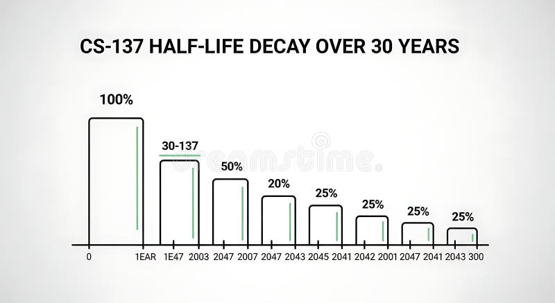
Free with trial A line graph illustrating the decrease in half-life over 30 years with bars representing percentage decay at different years, demonstrating long-term decline suitable for scientific, educational, or research presentations. Data analysis decrease illustrations Half-life Decay Over 30 Years Chart Showing Decrease in Value or Effectiveness. A line graph illustrating the decrease in half-life over 30 years with bars representing percentage decay at different years, demonstrating long-term decline suitable for scientific, educational, or research presentations
Free with trial Hand-drawn financial charts, graphs, and calculators perfect for business, finance, and accounting illustrations. These vector illustrations depict various tools used for data analysis and financial calculations. Data analysis decrease vectors Collection of Hand Drawn Financial Charts and Calculators. Hand-drawn financial charts, graphs, and calculators perfect for business, finance, and accounting illustrations. These vector illustrations depict various tools used for data analysis and financial calculations.
Free with trial This image features two minimalist icons representing financial or data trends. The left icon is a white line graph with circular data points and directional arrows, set against a solid black shield shape. The right icon presents the same line graph and data points within a black outline of a shield, on a white background. Both icons depict fluctuating data, with one showing a downward trend and the other an upward trend, symbolizing market volatility, analysis, and security. Data analysis decrease illustrations Line Graph Icon with Shield Symbol - Upward and Downward Trends. This image features two minimalist icons representing financial or data trends. The left icon is a white line graph with circular data points and directional arrows, set against a solid black shield shape. The right icon presents the same line graph and data points within a black outline of a shield, on a white background. Both icons depict fluctuating data, with one showing a downward trend and the other an upward trend, symbolizing market volatility, analysis, and security.
Free with trial Sales word with a decrease chart. Financial crisis. Data analysis decrease illustrations Sales word with a decrease chart. Financial crisis
Free with trial Sales word with a decrease chart. Financial crisis. Data analysis decrease illustrations Sales word with a decrease chart. Financial crisis
Free with trial Sales word with a decrease chart. Financial crisis. Data analysis decrease illustrations Sales word with a decrease chart. Financial crisis
Free with trial Sales word with a decrease chart. Financial crisis. Data analysis decrease illustrations Sales word with a decrease chart. Financial crisis
Free with trial Sales word with a decrease chart. Financial crisis. Data analysis decrease illustrations Sales word with a decrease chart. Financial crisis
Free with trial Sales word with a decrease chart. Financial crisis. Data analysis decrease illustrations Sales word with a decrease chart. Financial crisis
Free with trial Sales word with a decrease chart. Financial crisis. Data analysis decrease illustrations Sales word with a decrease chart. Financial crisis
Free with trial Black silhouette of descending bar chart with arrow, isolated on white background. concept of financial decline, statistics, economic downturn, data analysis, business graph. Data analysis decrease vectors Black silhouette of descending bar chart with arrow, isolated on white background. concept of financial decline, statistics
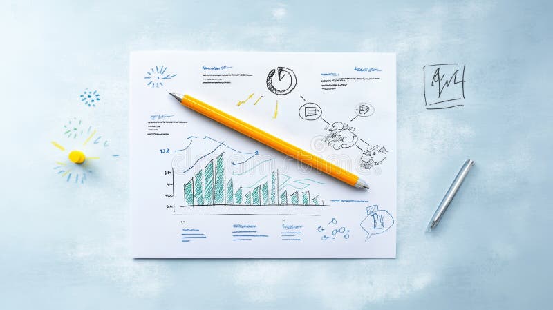
Free with trial Graph depiction on paper with a pencil ,Generative ai. Data analysis decrease illustrations Pencil and paper, a detailed illustration of graph for data analysis visualization. Graph depiction on paper with a pencil ,Generative ai
Free with trial Increase and decrease arrows on black background. Data analysis decrease illustrations Increase and decrease arrows on black
Free with trial This image shows a colorful 3D bar graph representing growth or progress. The bars increase in height, then decrease slightly before another sharp increase, indicating fluctuations in data. The wooden background adds a rustic and visually appealing contrast. Data analysis decrease illustrations Colorful Bar Graph on Wooden Background. This image shows a colorful 3D bar graph representing growth or progress. The bars increase in height, then decrease slightly before another sharp increase, indicating fluctuations in data. The wooden background adds a rustic and visually appealing contrast.
Free with trial This graph illustrates the fluctuation of interest rates over the last 12 months, ranging from 3. 5% to 7%. The line chart provides a visual representation of the trend, allowing for easy analysis and understanding of the data. The graph is a valuable resource for businesses, investors, and individuals looking to stay informed about the current state of the economy and make informed decisions about their financial planning and strategy. Data analysis decrease illustrations A graph showing interest rate fluctuation over the last 12 months. This graph illustrates the fluctuation of interest rates over the last 12 months, ranging from 3.5% to 7%. The line chart provides a visual representation of the trend, allowing for easy analysis and understanding of the data. The graph is a valuable resource for businesses, investors, and individuals looking to stay informed about the current state of the economy and make informed decisions about their financial planning and strategy.
Free with trial Set of twelve black and white icons representing business and finance concepts such as graphs charts analysis tools and targets isolated on transparent background. Data analysis decrease vectors Collection of business and finance icons including graphs charts and analysis tools for presentations and reports. Set of twelve black and white icons representing business and finance concepts such as graphs charts analysis tools and targets isolated on transparent background
Free with trial 3D render showcasing descending statistical bar graph. The bars are colored differently: purple, blue, and yellow. This graphic represents statistical data trend decreasing. Data analysis decrease vectors Colorful statistical bar graph rendering showing decrease on transparent background. 3D render showcasing descending statistical bar graph. The bars are colored differently: purple, blue, and yellow. This graphic represents statistical data trend decreasing.
Free with trial Simple line art business icons set featuring a magnifying glass, minus symbol, pie chart, and rising bar graph for financial data analysis. Data analysis decrease vectors Simple line art business icons set featuring a magnifying glass, minus symbol, pie chart, and rising bar graph for
Free with trial Simple line graph illustrating a negative trend, representing a decrease or decline in data. Perfect for presentations, reports, or website design. Data analysis decrease vectors Downward Trending Line Graph, Showing Negative Growth or Decline. Simple line graph illustrating a negative trend, representing a decrease or decline in data. Perfect for presentations, reports, or website design.
Free with trial Dec fading line graph illustration data analysis, statistics visualization, slope axis dec fading line graph. Data analysis decrease illustrations Dec fading line graph
Free with trial A diverse team of business professionals collaborating in a meeting. This vector illustration features five colleagues, men and women in corporate attire, gathered around a laptop and tablet, actively discussing a project. The scene, depicted in a clean, modern flat design style on a white background, is ideal for concepts like teamwork, data analysis, problem-solving, and strategic planning. The negative number shown can represent financial review, performance metrics, or tackling a business challenge, making it versatile for various corporate and financial themes. Data analysis decrease illustrations Business Team Collaboration Analyzing Negative Results Vector Illustration. A diverse team of business professionals collaborating in a meeting. This vector illustration features five colleagues, men and women in corporate attire, gathered around a laptop and tablet, actively discussing a project. The scene, depicted in a clean, modern flat design style on a white background, is ideal for concepts like teamwork, data analysis, problem-solving, and strategic planning. The negative number shown can represent financial review, performance metrics, or tackling a business challenge, making it versatile for various corporate and financial themes.
Free with trial A person analyzing stock market data on multiple computer screens, indicating financial trends, likely related to investments or trading. Data analysis decrease illustrations A man watches financial data on multiple computer screens in a dark office. A person analyzing stock market data on multiple computer screens, indicating financial trends, likely related to investments or trading
Free with trial This 3D rendered image shows a computer screen displaying various charts and graphs, including bar charts, pie charts, and line graphs. The data visualization is colorful and easy to understand, generated by AI for quick data interpretation. The design is simple and modern, ideal for presentations. Data analysis decrease illustrations AI-Generated Data Dashboard. This 3D rendered image shows a computer screen displaying various charts and graphs, including bar charts, pie charts, and line graphs. The data visualization is colorful and easy to understand, generated by AI for quick data interpretation. The design is simple and modern, ideal for presentations
Free with trial A woman analyzes stock market data using a magnifying glass, with a falling coin and downward trending charts indicating a potential loss. Data analysis decrease vectors Woman analyzing stock market data with magnifying glass tool. a woman analyzes stock market data using a magnifying glass, with a falling coin and downward trending charts indicating a potential loss.
Free with trial Declining steps with downward arrow symbolizing business market decrease economic downturn. Data analysis decrease vectors Declining steps with downward arrow symbolizing business market decrease economic downturn
Free with trial Trend melting line graph illustration analysis visualization, ice decrease, plot statistics trend melting line graph. Data analysis decrease illustrations Trend melting line graph
Free with trial Bar chart with a declining arrow, representing decrease, business, finance, economic recession. Data analysis decrease vectors Bar chart with a declining arrow, representing decrease, business, finance, economic recession
Free with trial Red arrow pointing downward over a dilapidated house. Concept of real estate market decline, property value decrease, and foreclosure. Data analysis decrease illustrations Red arrow pointing downward over a dilapidated house. Concept of real estate market decline, property value decrease
Free with trial Financial chart displays data points and lines indicating trends against a blue background and is useful for presentations. Data analysis decrease illustrations Financial Data on Chart. Financial chart displays data points and lines indicating trends against a blue background and is useful for presentations
Free with trial Clear graphic illustration showing a downward trend or progression with a red arrow pointing into a smaller contained space, ideal for business or data analysis. Data analysis decrease vectors Red arrow shows downward progress into smaller box. Clear graphic illustration showing a downward trend or progression with a red arrow pointing into a smaller contained space, ideal for business or data analysis
Free with trial Displaying green fluctuating data line moving across dashboard grid overlay, with red area graph. Financial, analytics, dashboard, data, technology, investment, digital. Data analysis decrease illustrations Displaying green fluctuating data line moving across dashboard grid overlay, with red area graph
Free with trial This isometric illustration shows a delicious breakfast plate alongside a stock market graph, representing the connection between food trends and market data. The visual, generated by AI, is perfect for illustrating articles about food market analysis or investment opportunities in the food industr. Data analysis decrease illustrations Breakfast Market Trends. This isometric illustration shows a delicious breakfast plate alongside a stock market graph, representing the connection between food trends and market data. The visual, generated by AI, is perfect for illustrating articles about food market analysis or investment opportunities in the food industr
Free with trial A cartoon illustration of a man interacting with a bar chart. The man is depicted in a simple, clean style, wearing a blue shirt and brown pants. He is holding a green bar, seemingly adjusting or interacting with the colorful bars displayed on a table. The illustration is suitable for conveying concepts related to data analysis, business, finance, and presentation. Data analysis decrease illustrations Cartoon Man and Bar Chart. A cartoon illustration of a man interacting with a bar chart. The man is depicted in a simple, clean style, wearing a blue shirt and brown pants. He is holding a green bar, seemingly adjusting or interacting with the colorful bars displayed on a table. The illustration is suitable for conveying concepts related to data analysis, business, finance, and presentation.
Free with trial Computer screen displaying detailed candlestick charts used for stock market analysis and investment decisions Perfect for illustrating finance and technology concepts. Data analysis decrease illustrations Analyzing Stock Market Data on Computer Screen with Candlestick Chart. Computer screen displaying detailed candlestick charts used for stock market analysis and investment decisions Perfect for illustrating finance and technology concepts
Free with trial Blue graphs and charts depicting financial analysis and market trends with fountain pen. Data analysis decrease illustrations Blue graphs and charts depicting financial analysis and market trends with
Free with trial Description: Simple line art illustration of a scatter plot graph showing an uneven distribution of data points. Perfect for presentations or reports. Data analysis decrease vectors Abstract Data Visualization: Scatter Plot Chart with Irregular Data Points. Description: Simple line art illustration of a scatter plot graph showing an uneven distribution of data points. Perfect for presentations or reports.
Free with trial Candlestick chart with red and white bars representing stock price changes over time. Red candles indicate price decrease, while white suggest price increase. Vertical lines, or "wicks," show high and low prices. A white line, possibly a moving average, intersects the candles, offering a smooth trend indication. The background is dark blue with faint grid lines and circular elements, enhancing the financial data visualization aspect. Data analysis decrease illustrations Candlestick chart showing stock market trends and financial analysis. Candlestick chart with red and white bars representing stock price changes over time. Red candles indicate price decrease, while white suggest price increase. Vertical lines, or "wicks," show high and low prices. A white line, possibly a moving average, intersects the candles, offering a smooth trend indication. The background is dark blue with faint grid lines and circular elements, enhancing the financial data visualization aspect.
Free with trial Broker trader analyzing economic crisis. Trade exchange, financial decrease, bed business strategy, digital asset, loss investment fund, online broker, stock collapse and crisis concept. Data analysis decrease illustrations Broker trader analyzing economic crisis. Trade exchange, financial decrease
Free with trial Tablet displaying financial stock chart against black background. Possible use Stock market analysis. Data analysis decrease illustrations Stock Market Data on Tablet Displaying Red Bearish Trend Chart and Figures. Tablet displaying financial stock chart against black background. Possible use Stock market analysis
Free with trial This vibrant 3D rendering showcases a bar chart and pie chart, illustrating data growth and proportions. Ideal for presentations, reports, or educational materials. The colorful design makes it visually appealing and easy to understand. Data analysis decrease illustrations Colorful 3D Bar Chart and Pie Chart Data Presentation. This vibrant 3D rendering showcases a bar chart and pie chart, illustrating data growth and proportions. Ideal for presentations, reports, or educational materials. The colorful design makes it visually appealing and easy to understand.
Free with trial Conceptual image depicting real estate market analysis. A magnifying glass focuses on a brightly lit house model, surrounded by other house models and a rising graph, all set on a reflective surface. The scene suggests research, investment, and growth in the housing market. Ideal for illustrating articles or presentations on real estate trends, property valuation, and housing market forecasts. Data analysis decrease illustrations Real Estate Market Analysis
Free with trial A dynamic display of market trends with charts and graphs in a cool blue color scheme. Data analysis decrease illustrations Financial market analysis with data charts and line graphs in blue tone. a dynamic display of market trends with charts and graphs in a cool blue color scheme
Free with trial This image showcases a dynamic graph, generated by AI, illustrating fluctuating data patterns. The abstract, wave-like design creates a visually engaging representation of complex information, perfect for presentations or reports needing a modern aesthetic. Its cool blue tones evoke a sense of calm. Data analysis decrease illustrations Abstract Data Visualization. This image showcases a dynamic graph, generated by AI, illustrating fluctuating data patterns. The abstract, wave-like design creates a visually engaging representation of complex information, perfect for presentations or reports needing a modern aesthetic. Its cool blue tones evoke a sense of calm